Enos Project - Dining Room Reveal

Today’s project reveal is a little bit EXTRA. We’re sharing details on how we created the transformation for the dining room in our Enos Project. And, we’re giving you lots of ways to apply these ideas to your own home (including sourcing and links).

First, the dining room in our Enos Project is different from some of our projects because our clients already owned some of the key pieces of furniture: the dining room table with matching chairs and bench, a console table, and the light fixture. We are often asked during discovery calls with new clients as to whether we work with existing furniture - now you know, the answer is YES. The follow-up question is always, will it decrease the cost of our design fee? For that answer, I’m copying and pasting a section from our FAQs (where you can find the answers to lots of common questions about our process, our fee and more):


No. The truth is that it’s as difficult (if not more difficult) to design a room around existing furniture as it is to design with a blank canvas. Existing furniture limits the sizes, colors, textures (etc.) of the pieces we add, which can make sourcing more time consuming. While this additional time spent sourcing is offset by needing to source less pieces, it is generally a wash. However, your budget for materials WILL be less! You need less, so you’ll spend less on the furniture itself.


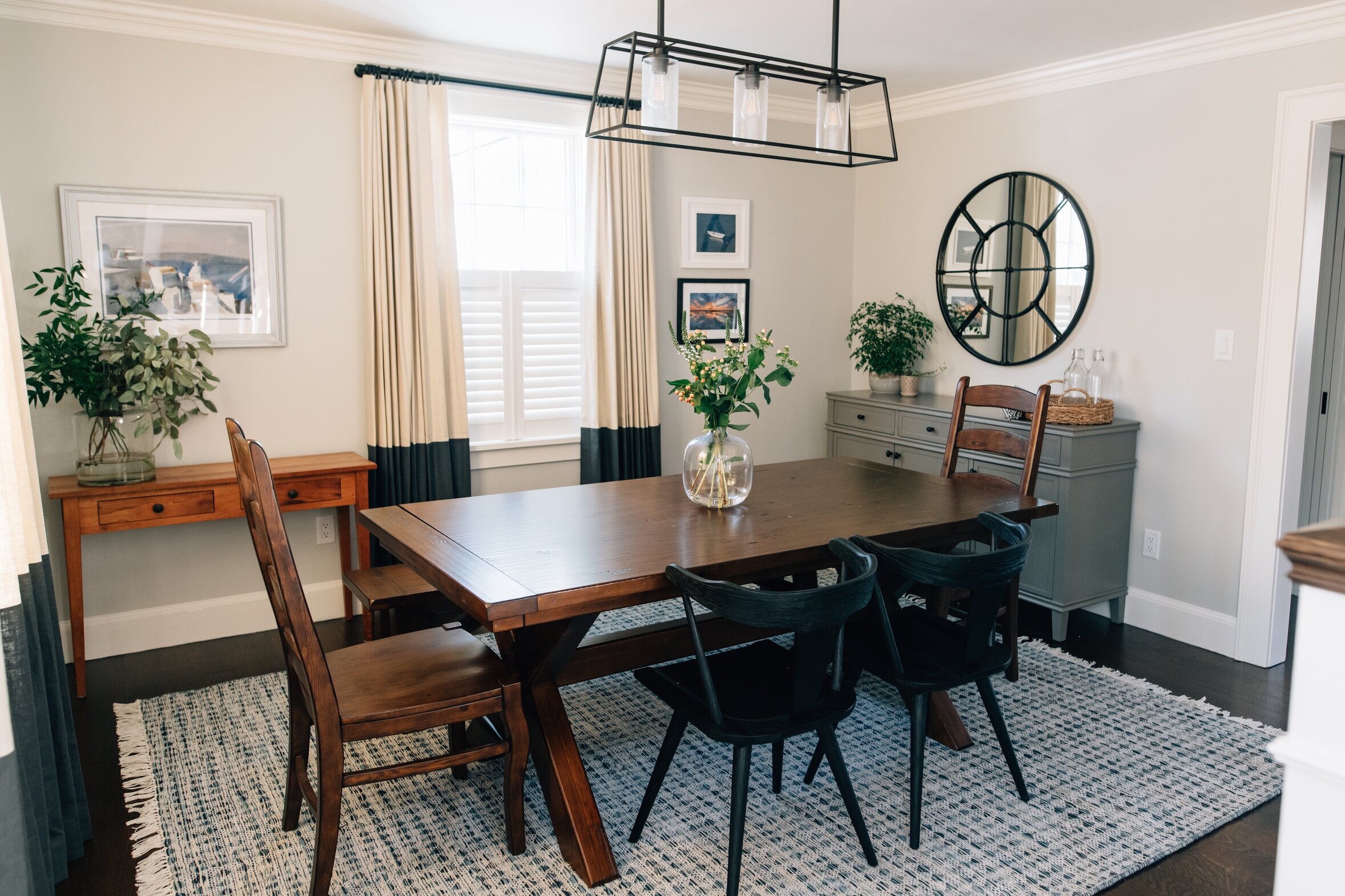
Back to our Enos Project Dining Room. Below are “before” photos.

Gray Oak Studio - Enos Project - Dining Room Before

BEFORE

Gray Oak Studio - Enos Project - Dining Room Before

BEFORE

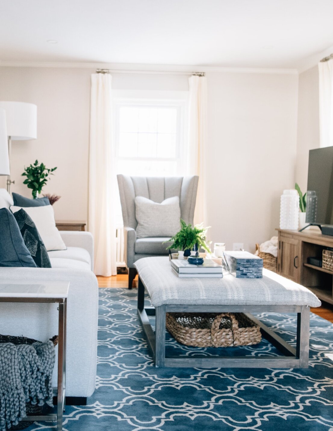
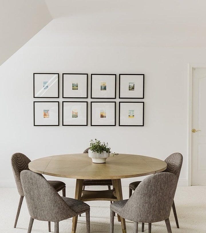
Alongside the existing furniture, we added an area rug, window treatments (plantation shutters and drapes), new dining chairs, a buffet, a mirror and decor. We also picked pieces from our Client’s existing art collection and decided where to hang them. The difference is dramatic.

Gray Oak Studio - Enos Project - Dining Room After

Let’s start with the rug. In this project, the existing dining table and chairs are very similar in color to the floor. If you scroll back up to the “before” photos you can see that the furniture was getting lost - it looked like a sea of medium/dark wood. The rug is key to creating contrast in this room. Its lighter blue and white palette, and pretty fringe, softens the more masculine tones and vibes of the rustic dining room set. On the function side, we chose an indoor/outdoor material with lots of varying color that will stand up to spills and traffic.

 
Gray Oak Studio - Enos Project - Dining Room Color Block Drapes
 

Next the window treatments. Wo-man do these make a difference. Plantation shutters on the lower half of a window are great for first floors where you want privacy from street traffic but still lots of natural light. The color blocked fabric with the dark lower third work so well with the dark wood dining table. In general, they also add to a cool, almost moody vibe. Dining rooms…like powder rooms…a great spaces to try something different than the standard “neutral and airy”.

The buffet is in a matte, gray painted finish. All other furniture in the room has a natural wood stain and we wanted to bring in a complimentary, but different, color and texture. The shade of gray is darker than the walls, but not nearly dark enough to compete with the dining table. We customized it with black knobs for a modern farmhouse feel. The finishing touch is this awesome, round, window pane mirror.

Gray Oak Studio - Enos Project - Dining Room Transformation - Gray Buffet

New dining chairs in a black stain (not paint) completely changed the vibe of the room. Talk about cool and moody. These beauties are awesome compliments to the existing set and elevate everything. One important note (as you consider these sorts of additions and changes in your own home) is that we chose chairs that were truly different from the existing chairs. They are different in color, style and proportion (shorter and wider). The mix feels (and, of course, is) very intentionally and results in a modern, eclectic style.

Gray Oak Studio - Enos Project - Dining Room Black Stained Windsor Chairs

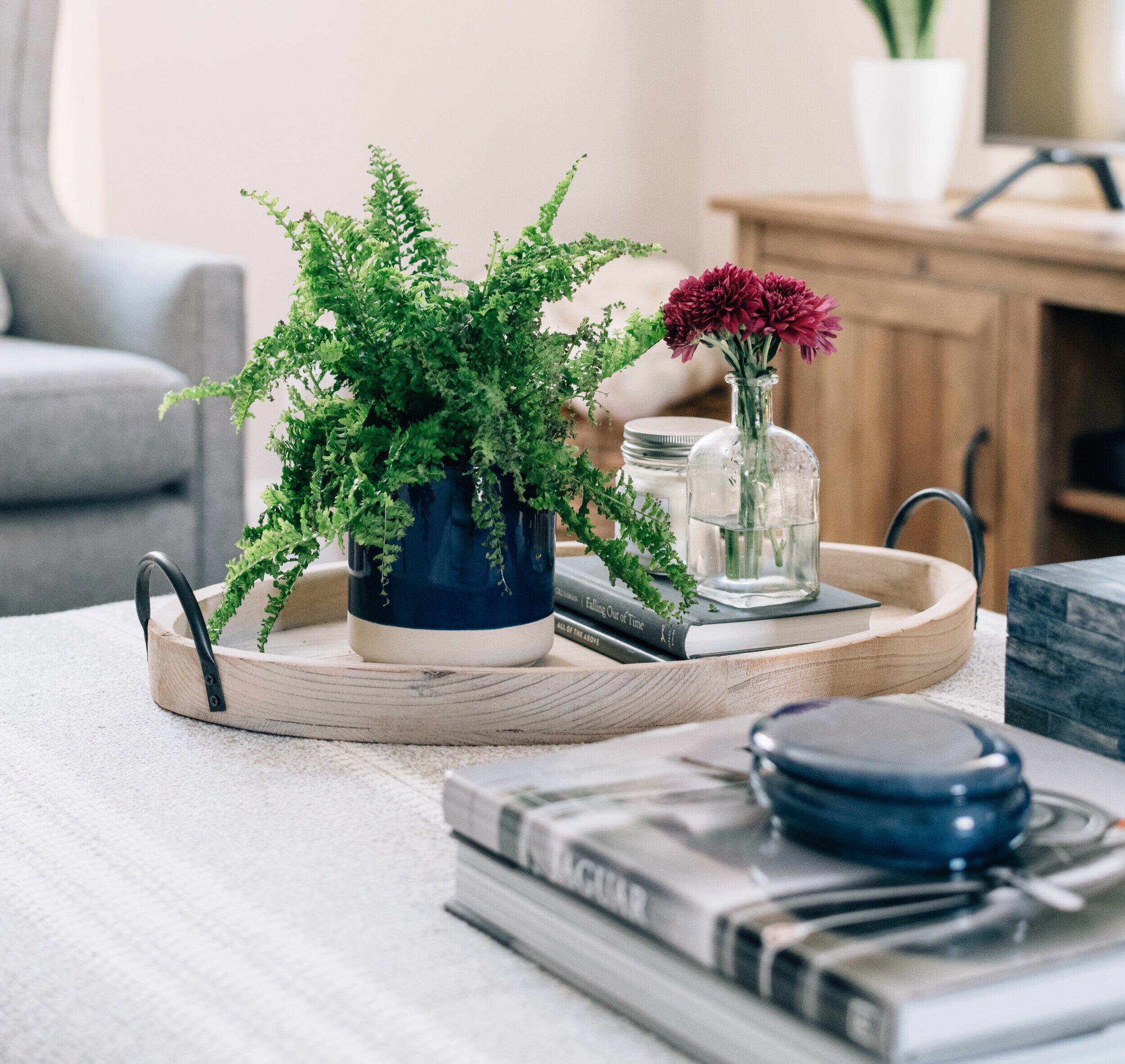
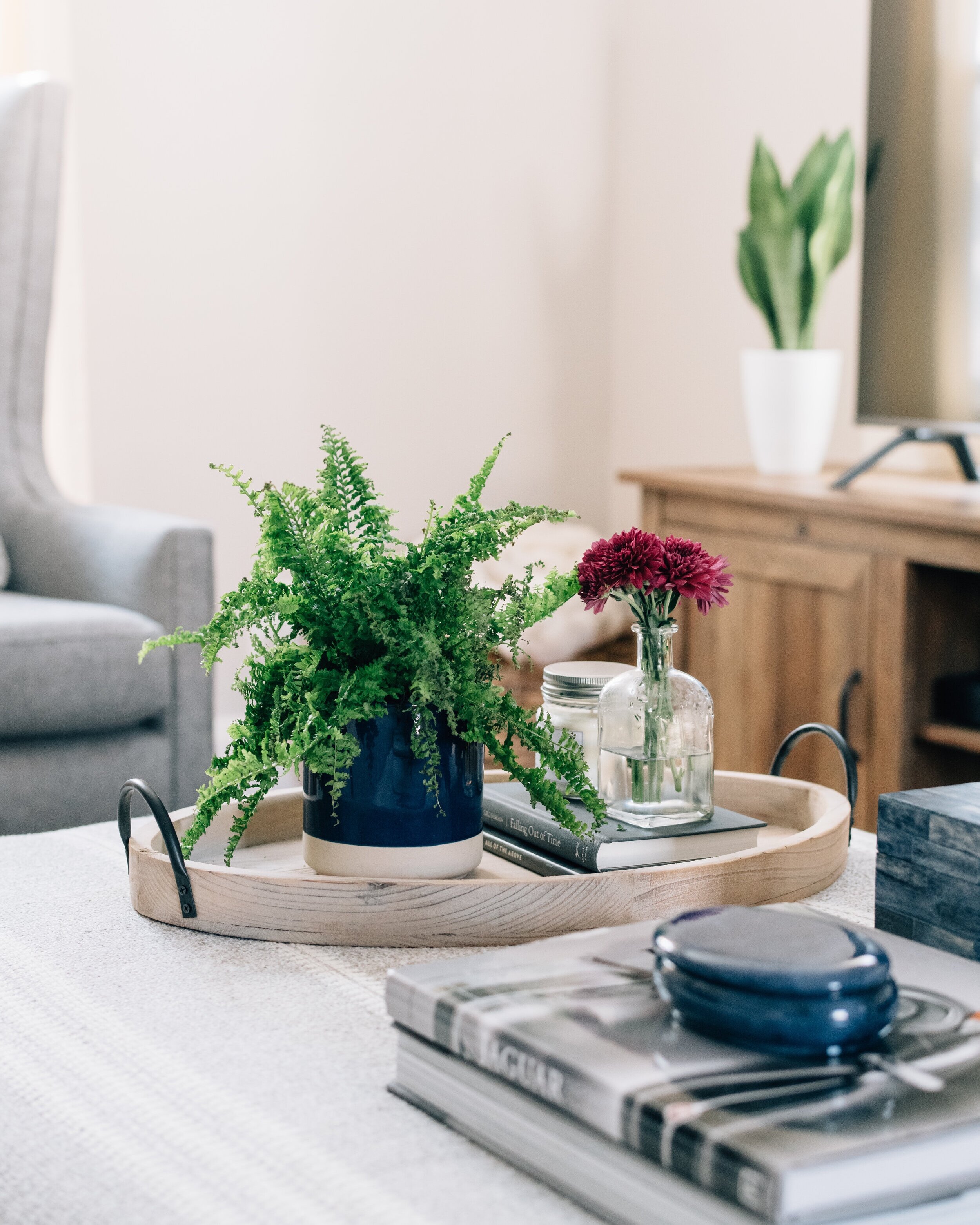
Last, but never least, we finished the room with some larger scale decor, mostly by way of greenery and plants. And, we chose art for the walls from our clients’ collection. The art was chose both for scale (size) and color. {Design Tip}: When you hang art, be sure to hang curtains first. They will drastically change the open wall space…which may lead to changes is the size of the art.

Gray+Oak+Studio+-+Enos+Project+-+Dining+Room+Transformation

And now, we have a bunch of product round-ups for you to bring this look to your own home. All the links are below. And, you can also head to our Pinterest page to see them with prices written into the pin description for the chairs and mirrors (we didn’t include prices for the rugs because they vary by size). We will also add more to this Pinterest page as we find it, so be sure to check back in for more options.

Indoor/Outdoor Rugs

Gray Oak Studio - Indoor/Outdoor Blue Gray White Rugs
Gray Oak Studio - Spring 2020 Dining Room Refresh

Every single chair above is on sale right now. Starting at the top left and going clockwise (click on number): 1 / 2 / 3 / 4 / 5 / 6

Round Mirrors

Gray Oak Studio - Round Mirror - Dining Room Transformation

Starting at the top left and going clockwise (click on number): 1 / 2 / 3 / 4 / 5

Finally, on a real note - we hope you’re staying safe and healthy. Our mantra is “One Day at a Time”. Just breathe and repeat. And, sometimes, it’s “One Hour/Minute at a Time”. We’re trying our best to stay informed, but also unplugged when needed. We’re trying our best to indulge in the fun and happiness of this rare secluded time with our families, but also not deny the fear and anxiety that is inevitable at times. It’s all a very delicate balance. And we need to give ourselves the grace to do it better some days than others. Be easy on yourself - we’re all just doing our best.

In the words of Anna (it always comes back to Frozen), “Do the next right thing.” That’s all we can do. One foot in front of the other. We’ll get through this.

Be back soon.

- Leah

*This post contains affiliate links*

Gray Oak Gives Back - Project Reveal (Part 2)

In today’s (long) blog post, we’re sharing the rest of our Gray Oak Gives Back transformation. We’re diving into the details of the coffee table, media center and sofa scene (with the mega grid gallery). Just like last time, we’re sharing details on our design decisions and shoppable links.

{If you missed the first half of the reveal - it’s here. And if you missed the fireplace transformation - it’s here}

Let’s start with the coffee table scene. It’s really an oversized ottoman scene. And we absolutely love it. One of the few “must haves” our client asked for was a soft surface to kick up her feet when she watched TV. She had a large ottoman in her original set up and was used to this feature.

We love the idea of ottomans in place of coffee tables, but for this project we also wanted to bring in furniture with negative space because the room is relatively small. Incorporating lots of negative space, the space around and between objects, makes a room feel airy and even bigger. The ottoman we chose, with an open wood base, was the perfect solution. And we just love the subtly patterned fabric that is neutral but still interesting.

 
Gray Oak Studio - Lowell Project Living Room
 

ottoman / rug / armchair

We styled the ottoman with some of our favorites: books, a box and a tray. We created three sections with each section having a purpose. For a deeper dive into the Rule of Three (a simple styling rule), check out THIS blog post.

9_Priscilla_Rd_121128.jpg

Coffee Table Book / Similar Box / Oval Tray

For coffee table styling in particular it’s important to make sure beauty and function are in balance. Unlike some styling surfaces (i.e. mantel, console table, bookshelf), a coffee table will be heavily used for cups, feet and a revolving array of things (a new magazine, eye glasses, etc.).

The tray is used to corral the small stuff - a favorite candle, a library book, a small plant, etc. The coffee table book is a conversation piece and a hard surface if your coffee table is actually an oversized ottoman. The box is a place to keep remotes and all the loose change you find in the cushions.

Gray+Oak+Studio+-+Coffee+Table+Styling+Tips

For the days you’re expecting company, our best tip to spruce up your coffee table scene is a bud vase and colorful flowers. They bring the happy, and make everything look a little more special and pulled together.

Ok, moving onto the media console. After much deliberation, we ultimately decided to place the media console and TV right in front of a window. It’s not a traditional choice, but in this space it works really well. And with the light colored wall (Balboa Mist by Benjamin Moore) and the airy drapes pulled close, you might not have realized it.

Here’s why we landed on this layout choice:

1) There was no wall for the TV. You can quick peek at our original Gray Oak Gives Back post to see an aerial view of the room layout - every wall has a window, fireplace or door with the exception of the wall that we placed the sofa. We like a sofa facing a TV where the primary use of the room is TV watching (makes sense), so the fireplace wall was the only option for the TV.

Now, you may wonder why we didn’t put the TV over the fireplace. Well, the rumor about interior designers not liking TVs above fireplaces is 100% true. Televisions above fireplaces are a last resort for two reasons. First, as a general rule, the middle of your TV should be approximately 55” off the ground (this isn’t an exact formula - the size of your TV and the distance that you’re watching are important factors). The height of the average mantel would put the average television way too high. Second, a fireplace is a natural and beautiful focal point of a room, which (ideally) shouldn’t be diminished by a big, black box.

2) This particular window was a good option to block because it faces a small side yard and the neighboring house. It isn’t visible from the street (we didn’t have to worry about curb appeal) and it isn’t visible from the backyard (again, an eyesore if you spend a lot of time in your backyard).

3) There is plenty of light in this room (windows on 3 different walls), so partially blocking some natural light doesn’t have any impact on the look or feel of the room as a whole.

Gray Oak Studio - Gives Back 2019 - Living Room Transformation

In terms of the media console itself, this piece adds warmth to a cooler palette (blues and grays are cool colors) and is in the modern farmhouse style our client loves. We also like that it has a mix of open and hidden storage. Finally, it’s a low profile piece in terms of short (blocking the least amount of window possible) and narrow (staying mostly in line with the depth of the fireplace).

Gray Oak Studio - Gives Back 2019 - TV in front of window

Media Console /Oversized Woven Tray (under ottoman) / Similar White Vase (left of TV)

Next, we turn to the sofa. The sofa we chose for this project has a beautiful, versatile style and is incredibly comfortable. When it comes to picking a sofa, the biggest piece of advice we give during our Designer for a Day consultations is to splurge because more money equates more quality (to a point). We could go nutty talking about the levels of sofa quality - kiln dried wood for the frame, 8 way hand-tied springs, channeled down wrapped cushions, the hand and rub count of fabric, etc. The important tip here is that a high quality sofa is insanely comfortable and will last a couple decades while a poor quality sofa will be terribly uncomfortable and need to be replaced in 5 years.

Gray Oak Studio - Gives Back 2019 - Living Room Transformation

Sofa / Floor Lamp / Similar Blue Table Lamp

Above the sofa, we created a big gallery wall. This is a large space and a great opportunity to bring character and interest to the room. Large scale art is gorgeous, but it’s also very pricey. A gallery of smaller frames is a great way to fill a big space without having to splurge and without having to commit to one piece of art.

A clean grid formation is an easy approach if you’re intimated by gallery walls. We also recommend these frames because they’re incredibly light weight and we were able to hang them using command strip velcro. When you use velcro strips you can take the frames off and make micro adjustments to get clean separation lines.

Gray Oak Studio - Gives Back - Gallery Wall in Living Room

The last vignette in the room to share is this sweet, tiered side table. We love the soft curves, two shelves and warm tone. It also falls into the “save” (opposite of splurge) category, which is always nice.

Gray Oak Studio - Gives Back 2019 - Side Table in Living Room

Side Table / Gallery Frames / Similar Pillow

And that is that! If there are any elements of the room you want to know more about that we missed, just let us know and we’ll be sure to follow-up. This project came to life because we met a special mom with a special daughter fighting a rare disease. Learn more about their fight and this transformation in a wonderful article written by a local magazine.

As always, thanks for following along!

- Leah

Gray Oak Gives Back 2019 - Project Reveal (Part 1)

Today we’re walking you through how we brought our Gray Oak Gives Back project from start to finish. We’re so proud of this one for all the feel good reasons we’ve been talking about from Day 1. And, because it came out so beautifully.

Gray Oak Studio - Gray Oak Gives Back Project Reveal

But let’s back up to where we started.

IMG_7703-3.jpg

Transforming the Function

Whenever we start a project, we have 3 lists of goals. The first list (that guides the other 2 lists) contains our function goals. How are we going to transform the room so it works for the family who lives there? Every space in a house should have a purpose. Sometimes that purpose will be to just look pretty. But more often than not, a room is used for a specific reason and all the design choices should cater to that reason.

When you have a room in your home that no one even enters, much less hangs out in and enjoys, it’s usually because the purpose of the room is undefined or the needs of your family have changed and the originally intended purpose doesn’t make sense anymore. Start with the questions: What will we do in this room? Why would we want to hang out here? When will we want to hang out here?

For our Gray Oak Gives Back project, we transformed a living room. The primary function of this particular living room was to gather with family and friends, watch TV and enjoy a fire. We also had some specific function requests from our Client. For example, she didn’t want a traditional coffee table - she wanted something soft to put her feet on.

With all the above in mind, here was the list of our plans to make functional transformations.

FIRST, we had several updates we wanted to tackle with the help of contractors:

1) The walls - Remove the 30-year-old wallpaper and repaint with a wall color that would both brighten and update the room.

2) The lighting - Remove sconces from wall behind sofa, relocate sconces above fireplace, and add recessed lights to the ceiling.

3) Fireplace Update - Update the fireplace from 1950 to 2020.

SECOND, we had a layout dilemma: Where to put the television. The angled, corner console wasn’t working, the fireplace mantel was too high to squeeze a TV above it (never our favorite choice even if it’s at a reasonable height), and all other walls were covered with doors or windows.

THIRD, we needed all new furniture and decor that created a better flow.

Transforming the Style

The second list contains our aesthetic goals. How do we want the room to look? This includes color palette, patterns, textures, furniture shapes and styles, etc. This list is a marriage between our Client’s vision for their room and Gray Oak Studio’s unique design perspective.

The specifics of the list are based on lots of conversations with our Client - the simple stuff, like color preferences (blue or red?), and the more complex stuff, like how should the room make them feel (calm or energized?). We also ask our clients to give us specific feedback on inspirational images and we share a Pinterest Board. For our Gray Oak Gives Back project, some of our aesthetic goals included transitional style furnishings, light/neutral palette with blue accents, nickel metal finishes and modern farmhouse touches.

Here are the mood boards we created, based on our aesthetic goals.

Gray Oak Gives Back - Mood Board - Transitional Living Room

You’ll notice that a few details changed from the mood board to the completed room…but more on that later.

Making it Unique and Personal

The last list is our unique and personal touches list. These are our ideas to add unique touches and create personal moments within the room that speak directly to the passions/history/hobbies of our client. We a bit of a broken record this point, but we feel strongly that there is a special difference between a beautiful room and your beautiful room. When our clients walk into a room, we want it to feel like theirs. The tiny, personal details we speckle throughout a room are key to this element. And our ideas for these touches begin from our very first client meeting.

For our Gray Oak Gives Back project, we knew we wanted to include frames for family photos and we were even able to surprise our client by secretly getting our hands on a family photo, printing it, framing it and hanging it on Install Day. Along the journey, we learned about a favorite trip to Italy she had taken and her husband’s passion for vintage cars. We brought in tiny nods to these loves through art and a coffee table book.

a spot for a special photo

a spot for a special photo

a coffee table book about vintage jaguars

a coffee table book about vintage jaguars

And now for the fun part - all the (shoppable) details on the choices we made.

When you first walked in the room, we updated an existing console table to a modern farmhouse-esque piece that is more proportional to the space (longer and narrower) and more functional (2 hidden drawers). We styled it with vintage books (our favorite), plants (also our favorite), some decor and a table lamp.

Table lamps are great for function. They provide soft, targeted light, the opportunity for color, texture, interest, and height. People tend to think of the horizontal space in a room and forget about the vertical space. Adding tall items draws the eye upward and either highlights existing high ceilings or gives the illusion of high ceilings.

In the before and after photos below, we had already moved an existing table.

Gray Oak Studio - Gives Back 2019 - Living Room Entry

BEFORE

Gray%2BOak%2BStudio%2B-%2BGives%2BBack%2B2019%2B-%2BTransformed%2BLiving%2BRoom

AFTER

Fresh paint and new furnishings play a huge part in this updated view, but also note the small change of removing the sheer covering over the French door. This is one of our favorite recommendations when we’re on a Designer for a Day. In most cases, this sort of “window treatment” doesn’t serve a function and also dates a room (big time).

And now let’s talk console table decor.

Gray Oak Studio - Gives Back 2019 - Living Room Transformation

In terms of function, we’re obsessed with the hidden drawers on this console table. Both sides have a long, narrow drawer. We also love the bottom shelf that’s perfect for storage baskets. And, in this case, adding some decor to the bottom shelf is a great way to distract from/hide the older radiator.

In terms of styling - here is a list of tried and true decor to consider: vases, frames, plants, books, lanterns/candle holders. And here are a couple quick tips. First, height on the sides of the table (i.e. a lamp, a tall vase with stems, etc.). Second, mix large and small objects. Here we placed one large basket on the lower right and a cluster of smaller objects on the lower left.

Gray Oak Studio - Gives Back 2019 - Console Vignetter
Gray Oak Studio - Gives Back 2019 - Console Table

Console Table / Lamp / Similar Storage Basket / Square Ottoman / Similar Wall Basket Decor / Similar Woven Stool / Lantern / White Vase

Next stop, the fireside reading chair. The scene might be our favorite. It’s just oozing cozy. And at the moment, in our freezing Massachusetts temperatures, cozy is everything!

This gorgeous armchair is an updated take on a classic wingback. The high back makes it a great chair for a stand alone moment in a room. If you’re placing a chair by itself (not next to another chair or sofa or other larger piece of furniture), it needs to have the size/proportional to hold it’s own. We had fun stacking some lidded baskets instead of a traditional side table and, of course, added a pouf for a footrest option (or another seating option if there’s a crowd).

Gray Oak Studio - Gives Back 2019 - Reading Nook

Armchair / Knit Pouf / Rug / Similar Stacked Baskets / Throw Pillow / Similar Throw Blanket

If you’ve made it this far into the post, you can understand why we’re going to stop here and come back next week with the second half of this room transformation. We’ll cover the media center, the coffee table and the sofa. And we’ll recap the fireplace transformation in case you missed it!

Gray Oak Studio - Gives Back 2019 - Living Room Transformation

Until next week!

- Leah