Gray Oak Gives Back - Project Reveal (Part 2)
/In today’s (long) blog post, we’re sharing the rest of our Gray Oak Gives Back transformation. We’re diving into the details of the coffee table, media center and sofa scene (with the mega grid gallery). Just like last time, we’re sharing details on our design decisions and shoppable links.
{If you missed the first half of the reveal - it’s here. And if you missed the fireplace transformation - it’s here}
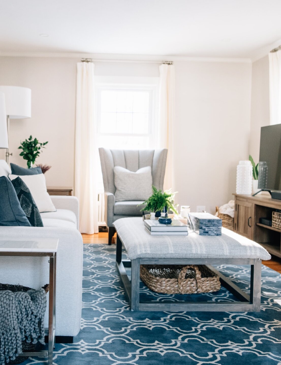
Let’s start with the coffee table scene. It’s really an oversized ottoman scene. And we absolutely love it. One of the few “must haves” our client asked for was a soft surface to kick up her feet when she watched TV. She had a large ottoman in her original set up and was used to this feature.
We love the idea of ottomans in place of coffee tables, but for this project we also wanted to bring in furniture with negative space because the room is relatively small. Incorporating lots of negative space, the space around and between objects, makes a room feel airy and even bigger. The ottoman we chose, with an open wood base, was the perfect solution. And we just love the subtly patterned fabric that is neutral but still interesting.
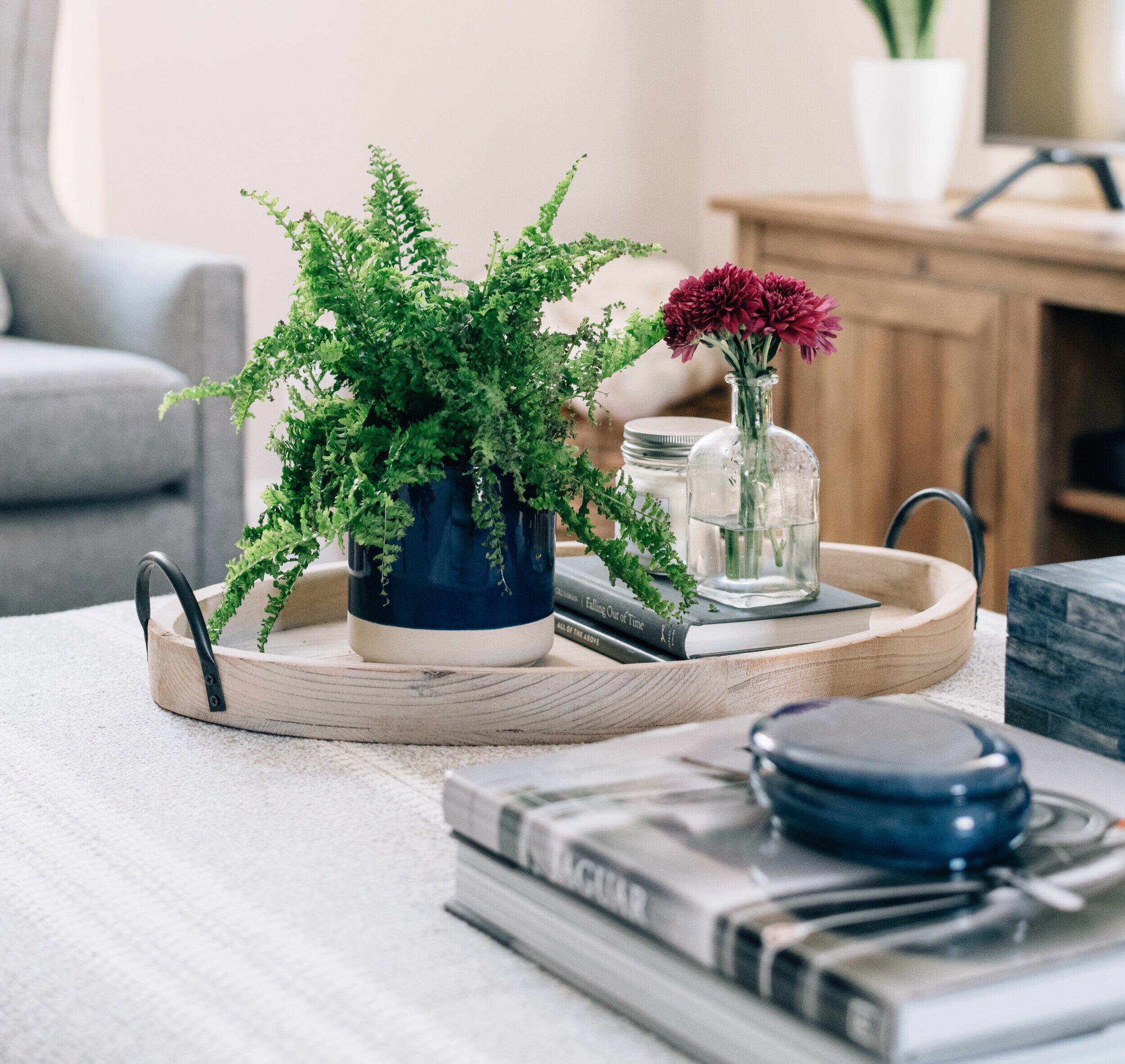
Coffee Table Book / Similar Box / Oval Tray
For coffee table styling in particular it’s important to make sure beauty and function are in balance. Unlike some styling surfaces (i.e. mantel, console table, bookshelf), a coffee table will be heavily used for cups, feet and a revolving array of things (a new magazine, eye glasses, etc.).
The tray is used to corral the small stuff - a favorite candle, a library book, a small plant, etc. The coffee table book is a conversation piece and a hard surface if your coffee table is actually an oversized ottoman. The box is a place to keep remotes and all the loose change you find in the cushions.
For the days you’re expecting company, our best tip to spruce up your coffee table scene is a bud vase and colorful flowers. They bring the happy, and make everything look a little more special and pulled together.
Ok, moving onto the media console. After much deliberation, we ultimately decided to place the media console and TV right in front of a window. It’s not a traditional choice, but in this space it works really well. And with the light colored wall (Balboa Mist by Benjamin Moore) and the airy drapes pulled close, you might not have realized it.
Here’s why we landed on this layout choice:
1) There was no wall for the TV. You can quick peek at our original Gray Oak Gives Back post to see an aerial view of the room layout - every wall has a window, fireplace or door with the exception of the wall that we placed the sofa. We like a sofa facing a TV where the primary use of the room is TV watching (makes sense), so the fireplace wall was the only option for the TV.
Now, you may wonder why we didn’t put the TV over the fireplace. Well, the rumor about interior designers not liking TVs above fireplaces is 100% true. Televisions above fireplaces are a last resort for two reasons. First, as a general rule, the middle of your TV should be approximately 55” off the ground (this isn’t an exact formula - the size of your TV and the distance that you’re watching are important factors). The height of the average mantel would put the average television way too high. Second, a fireplace is a natural and beautiful focal point of a room, which (ideally) shouldn’t be diminished by a big, black box.
2) This particular window was a good option to block because it faces a small side yard and the neighboring house. It isn’t visible from the street (we didn’t have to worry about curb appeal) and it isn’t visible from the backyard (again, an eyesore if you spend a lot of time in your backyard).
3) There is plenty of light in this room (windows on 3 different walls), so partially blocking some natural light doesn’t have any impact on the look or feel of the room as a whole.
In terms of the media console itself, this piece adds warmth to a cooler palette (blues and grays are cool colors) and is in the modern farmhouse style our client loves. We also like that it has a mix of open and hidden storage. Finally, it’s a low profile piece in terms of short (blocking the least amount of window possible) and narrow (staying mostly in line with the depth of the fireplace).
Media Console /Oversized Woven Tray (under ottoman) / Similar White Vase (left of TV)
Next, we turn to the sofa. The sofa we chose for this project has a beautiful, versatile style and is incredibly comfortable. When it comes to picking a sofa, the biggest piece of advice we give during our Designer for a Day consultations is to splurge because more money equates more quality (to a point). We could go nutty talking about the levels of sofa quality - kiln dried wood for the frame, 8 way hand-tied springs, channeled down wrapped cushions, the hand and rub count of fabric, etc. The important tip here is that a high quality sofa is insanely comfortable and will last a couple decades while a poor quality sofa will be terribly uncomfortable and need to be replaced in 5 years.
Sofa / Floor Lamp / Similar Blue Table Lamp
Above the sofa, we created a big gallery wall. This is a large space and a great opportunity to bring character and interest to the room. Large scale art is gorgeous, but it’s also very pricey. A gallery of smaller frames is a great way to fill a big space without having to splurge and without having to commit to one piece of art.
A clean grid formation is an easy approach if you’re intimated by gallery walls. We also recommend these frames because they’re incredibly light weight and we were able to hang them using command strip velcro. When you use velcro strips you can take the frames off and make micro adjustments to get clean separation lines.
The last vignette in the room to share is this sweet, tiered side table. We love the soft curves, two shelves and warm tone. It also falls into the “save” (opposite of splurge) category, which is always nice.
Side Table / Gallery Frames / Similar Pillow
And that is that! If there are any elements of the room you want to know more about that we missed, just let us know and we’ll be sure to follow-up. This project came to life because we met a special mom with a special daughter fighting a rare disease. Learn more about their fight and this transformation in a wonderful article written by a local magazine.
As always, thanks for following along!
- Leah
