New Year, New Design Style?
/Here we are again, at the beginning of another year - can you believe it is already 2022?! This past year went by so quickly!
As the new year begins, I’m sure you’ve heard people talk about new goals and aspirations. Just like creating new goals for the year, you may find yourself wanting to tackle new design projects around the house. So today, we’re going to tackle the topic of finding YOUR personal interior design style. Because before you can dive into those new projects, you need some clear direction. Knowing your style is the best place to start.
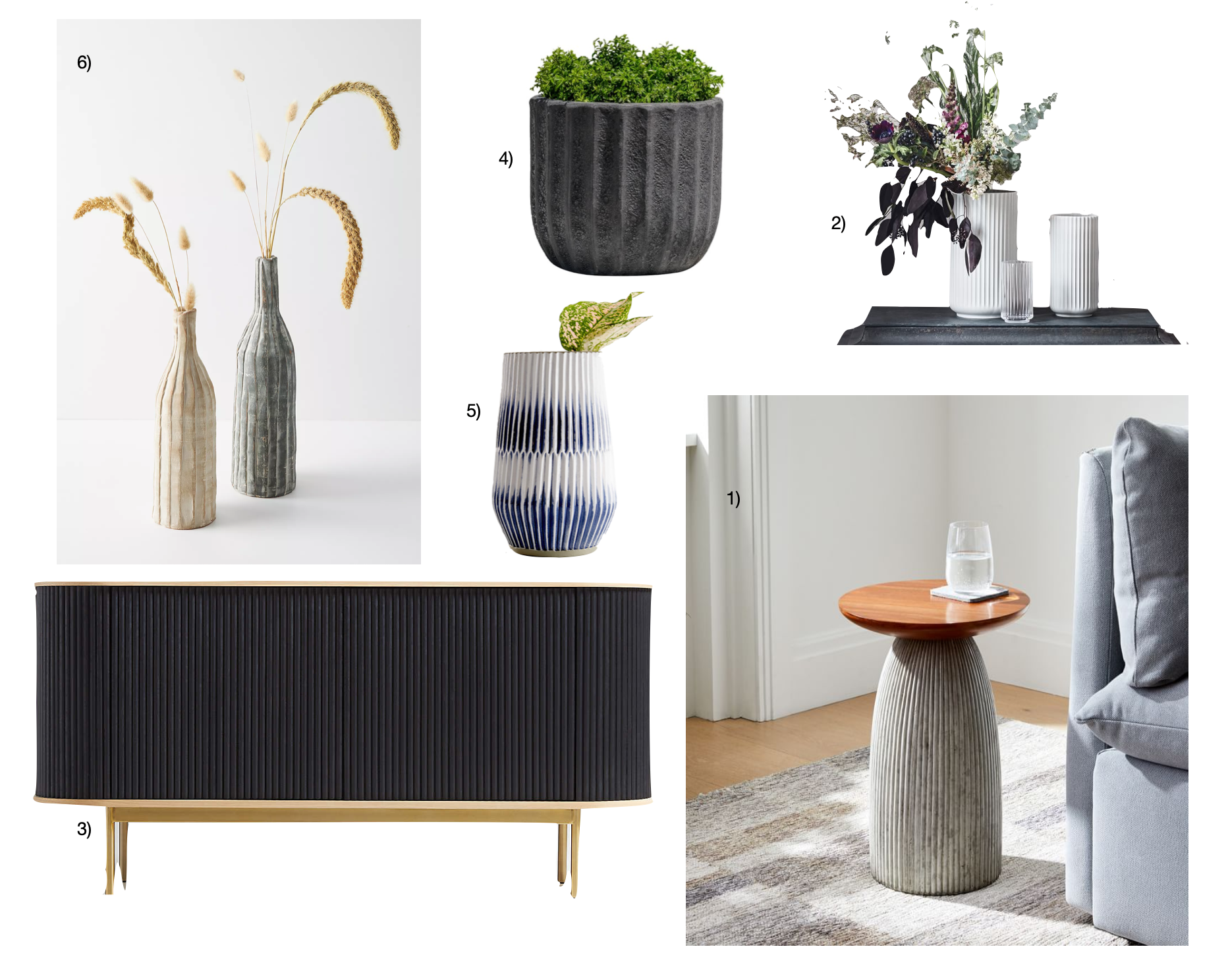
To start, we recommend using Pinterest. It’s a great tool. There’s a surplus of beautiful images and you’ll be able to hone in on your favorites (and thereby your style) as you scroll. Make a new folder with the title of the room you’re working on or the specific area (stairway landing, first floor hall, playroom gallery wall, etc.) or item (dining table, foyer console table, etc.). Then start pinning. Don’t overanalyze. Just pin what you like. Everything you like.

When your folder has at least 20 photos, it’s time to pare down. Go through the images again, this time with a critical eye. For example, if it’s a console table, consider all the aspects - function (enough hidden storage?), size, color/stain, hardware finish, design details, etc. You’re not picking the console table quite yet, you’re just eliminating pieces that have an element you don’t love.
Finally, do some analysis. Look at the photos that remain as a collection. Are all the tables white washed? Do they all have a lower shelf? Are the rooms light or dark? Colorful or neutral? What is the most common color you see? What is the hardware finish? Are all the coffee tables round? You get the idea. There will be repetition of certain elements. You may be all over the road on the color of the sofa, but 50% of the rugs are jute. There will be some patterns, find them.
Once you find the patterns, the elements that you have a clear vision will anchor your room. Whether it’s wall color or a piece of furniture. Start with all your must haves. And then, piece by piece, layer each item in. When you have a truly buttoned up plan, it’s finally time to start executing.
This is all fine and good, you say, but what words do you put in that little Pinterest search bar to find the right images? “Living room” feels way too generalized. And it probably is. So, we’re here to help. We are going to breakdown some categories of interior styles. It’ll get you started on figuring out your style and also give you some buzzwords to search.
Bohemian (BOHO)
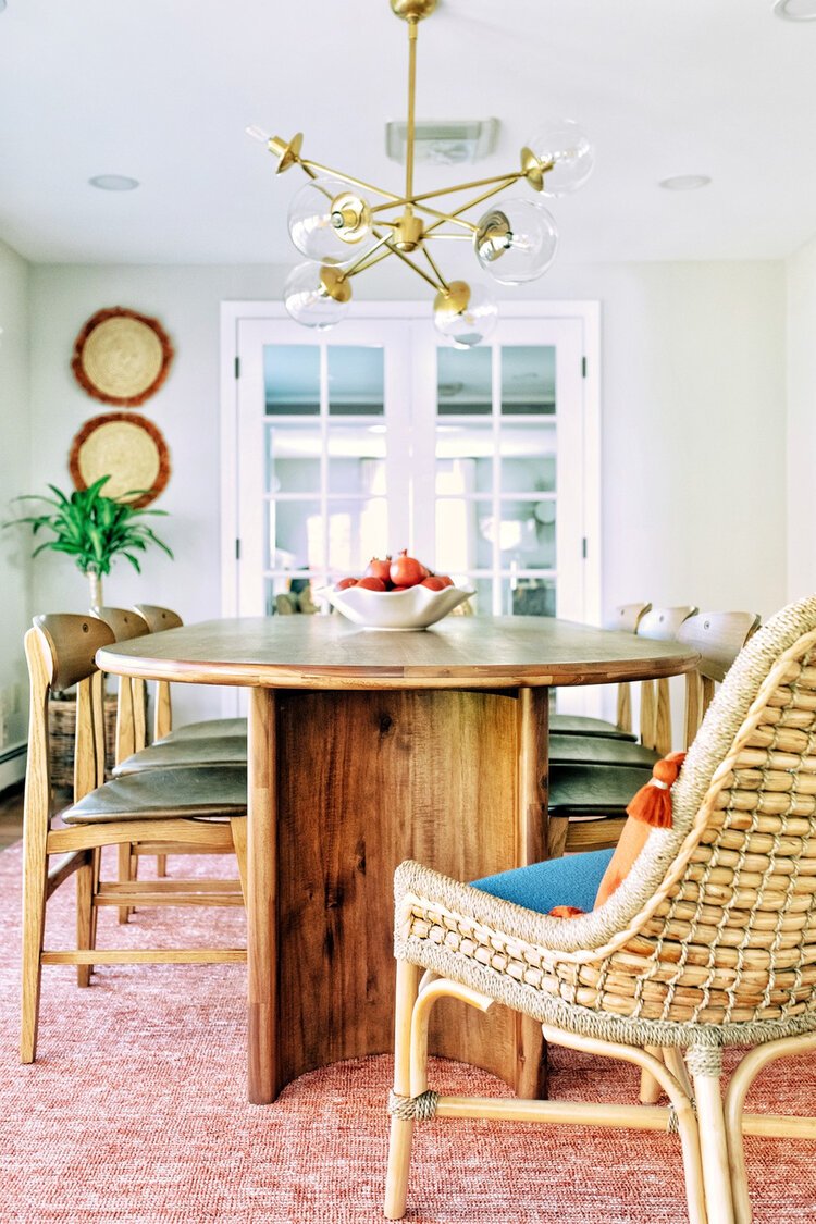
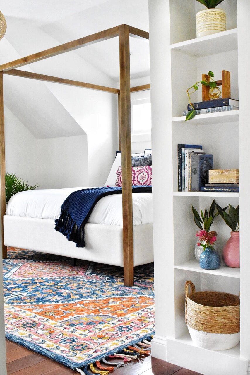
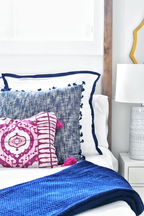
canopy bed / bedroom rug / similar pink ikat pillow / red dining room rug / wood dining chairs / dining table
Bohemian, or Boho, style is defined by varying, organic textures and vibrant color. There can be lighter, neutral elements, however, it’s more often a rainbow of fun. It is also sometimes referred to as Global style when it mixes elements that are culturally inspired, like an ikat pattern or Moroccan lantern. There are few “rules” of Bohemenian spaces - it’s more about mixing and layering all the things without worrying about matching and coordinating.
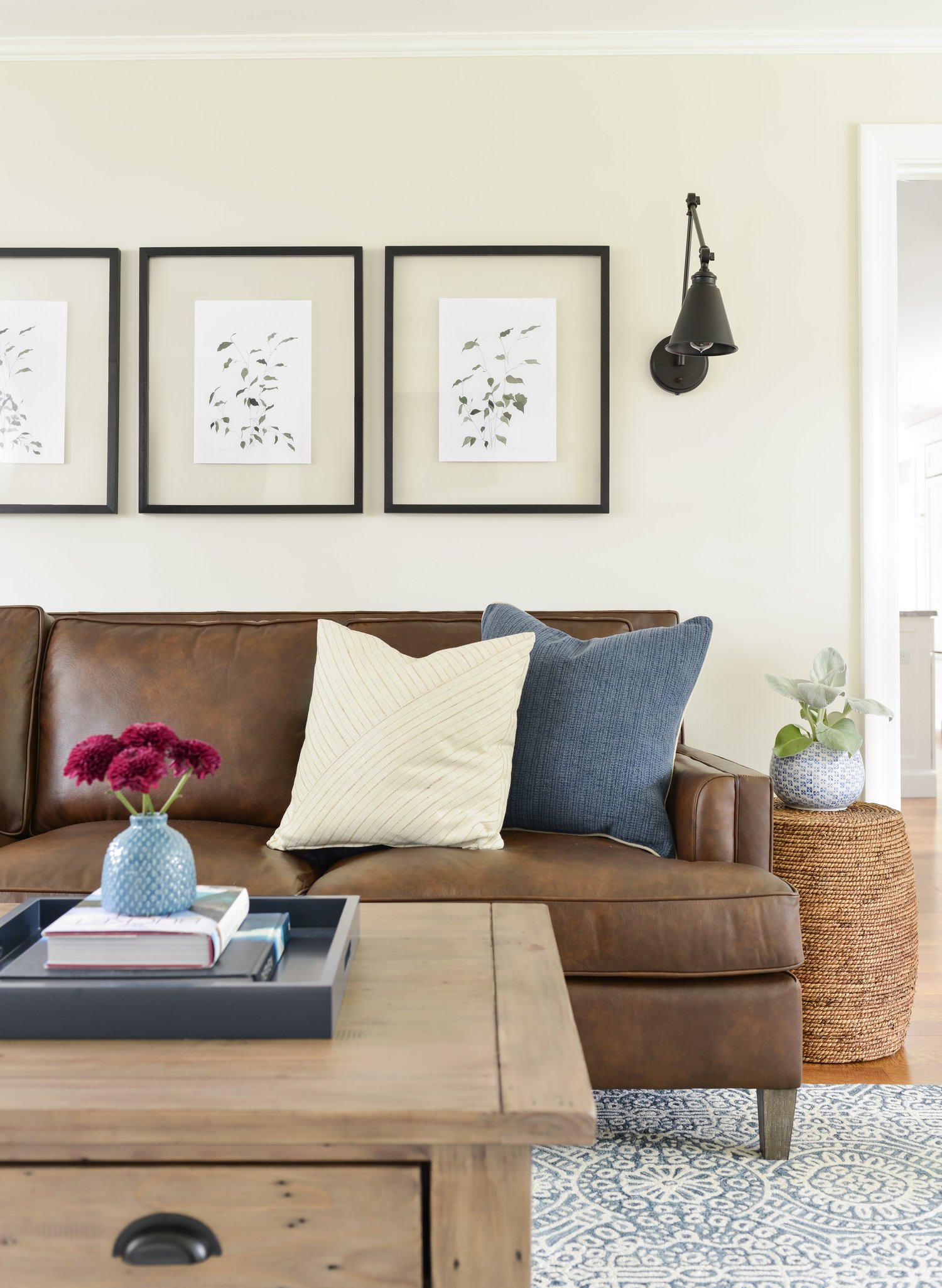
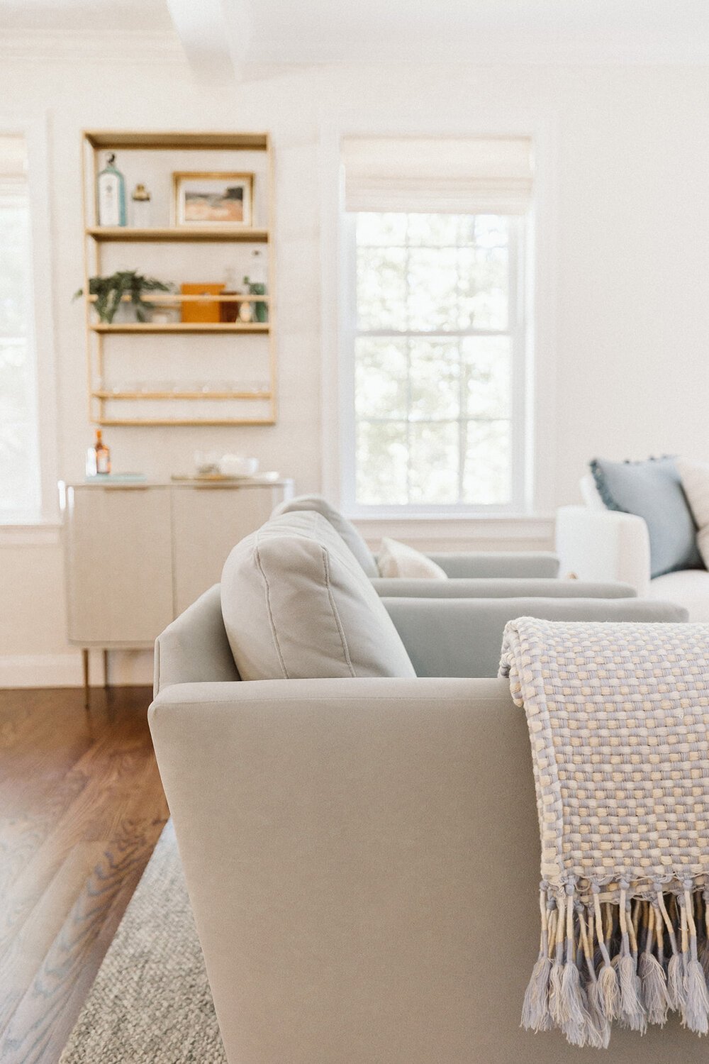
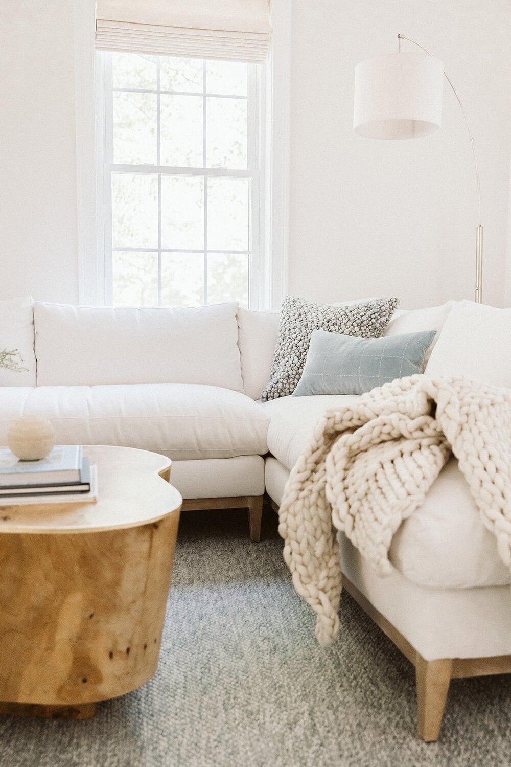
Transitional
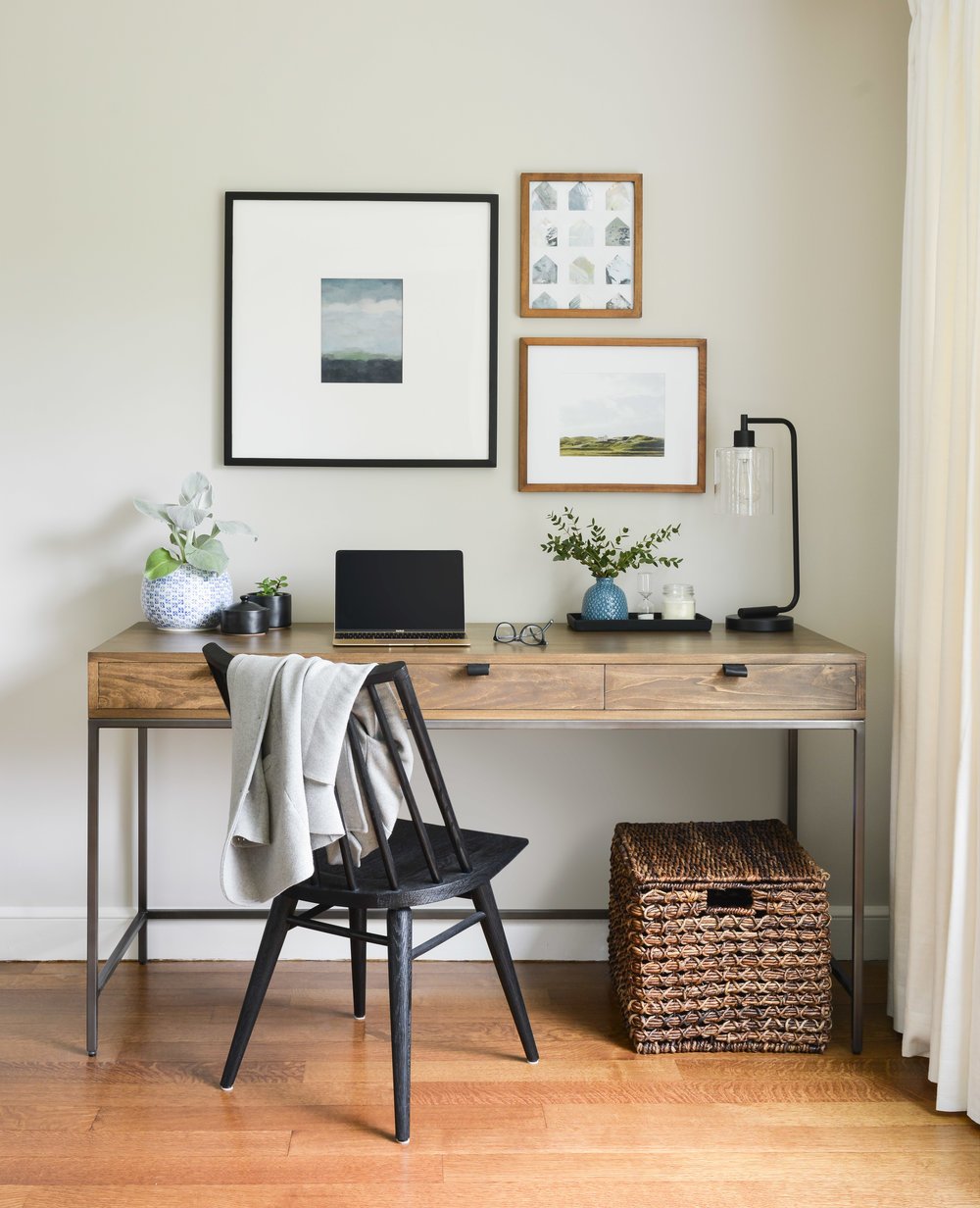
black frame / desk chair / desk /
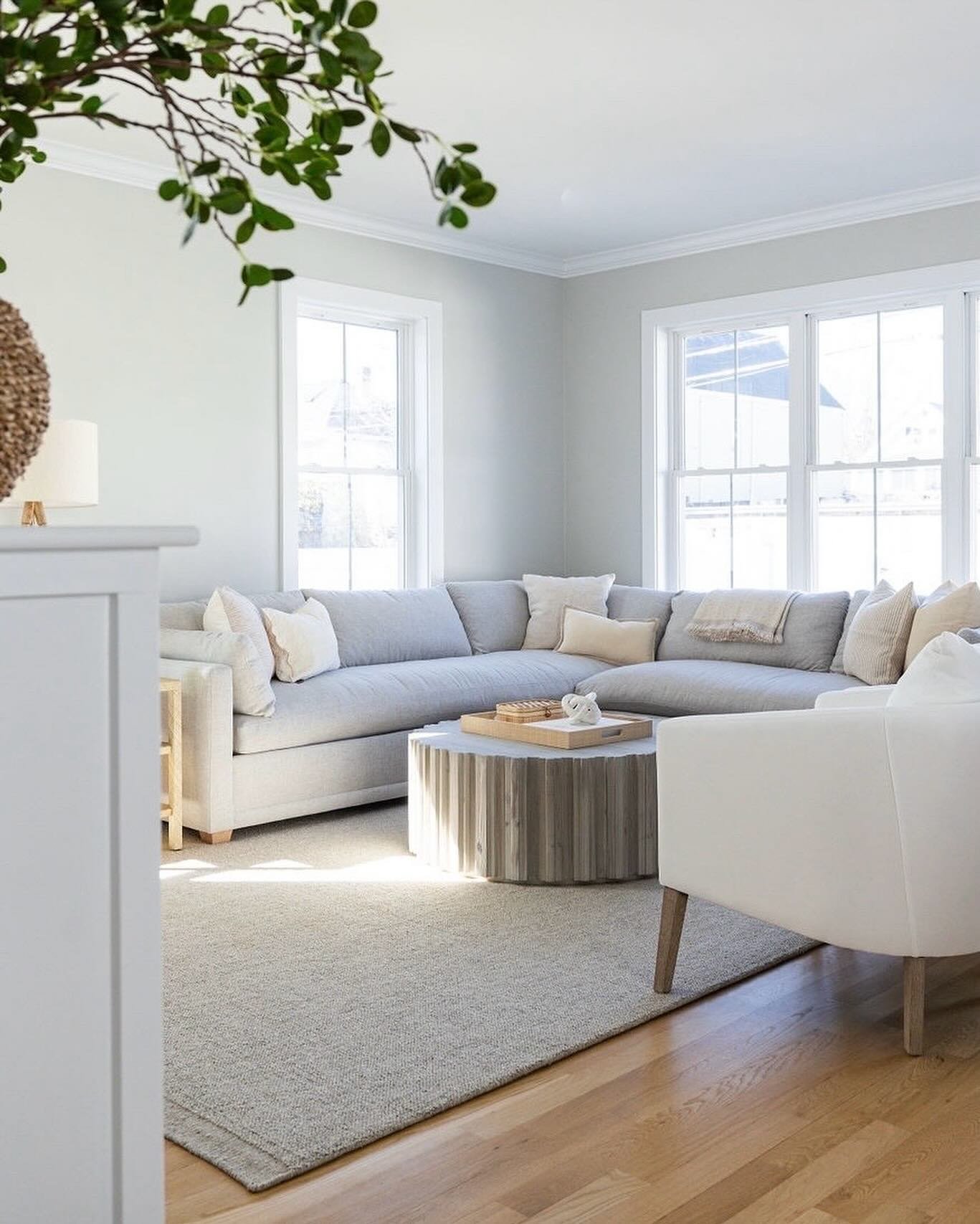
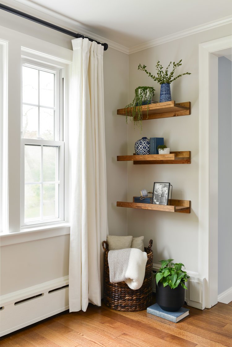
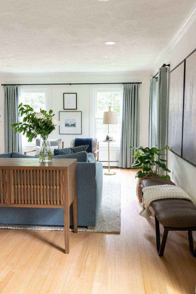
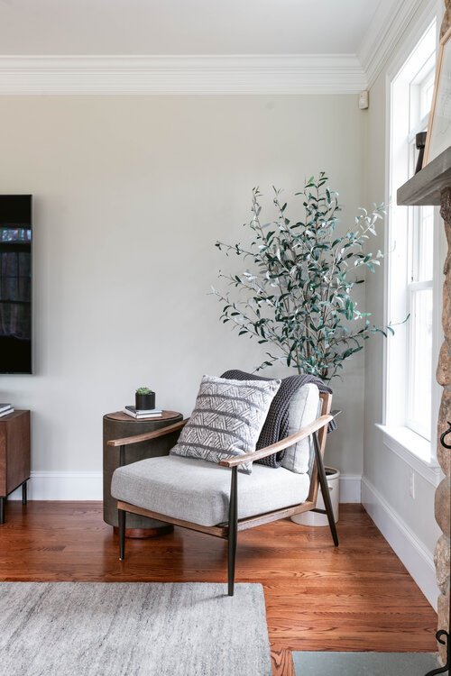
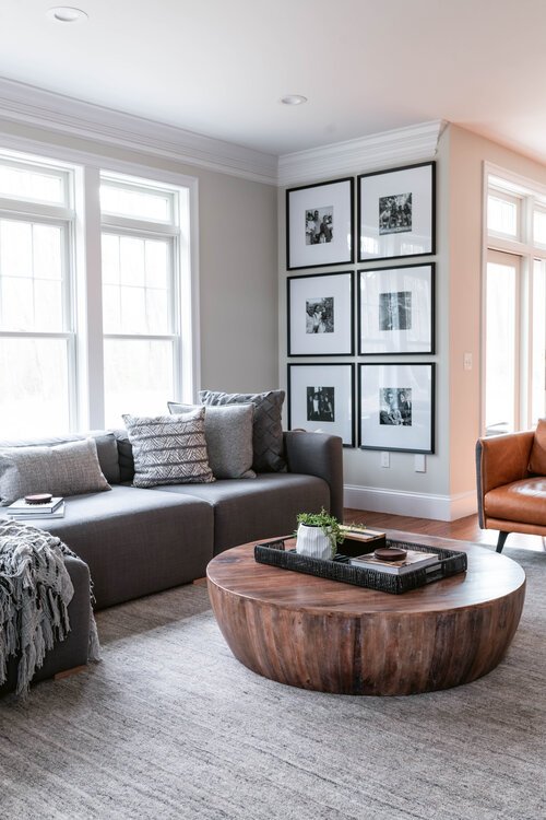
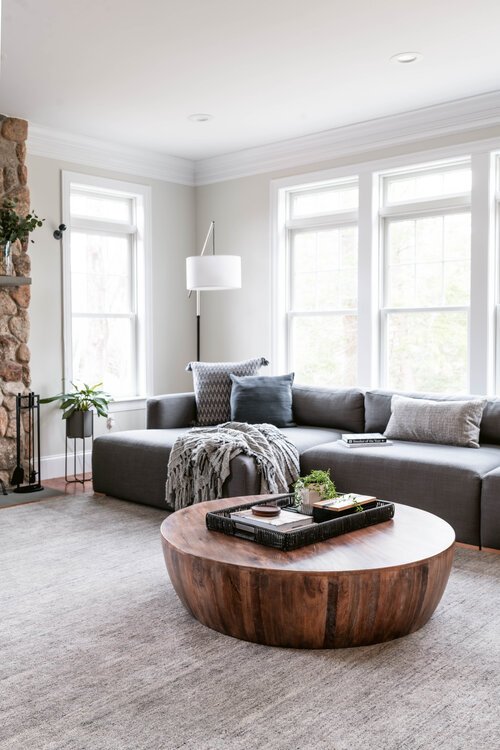
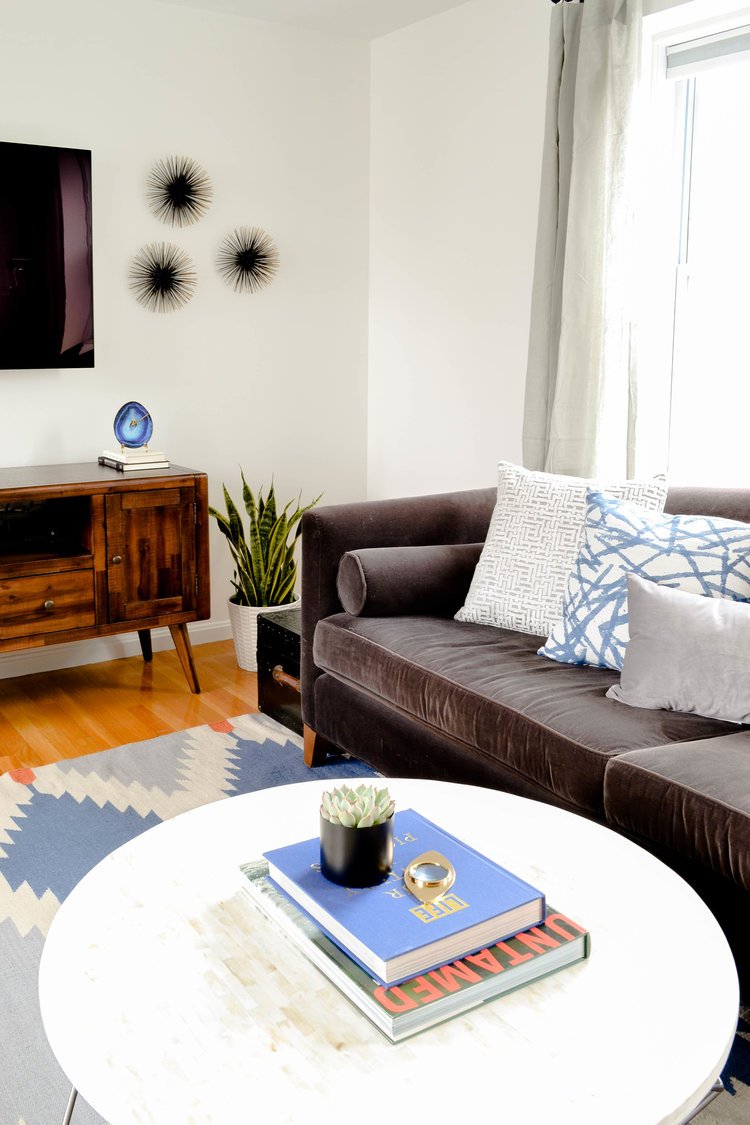
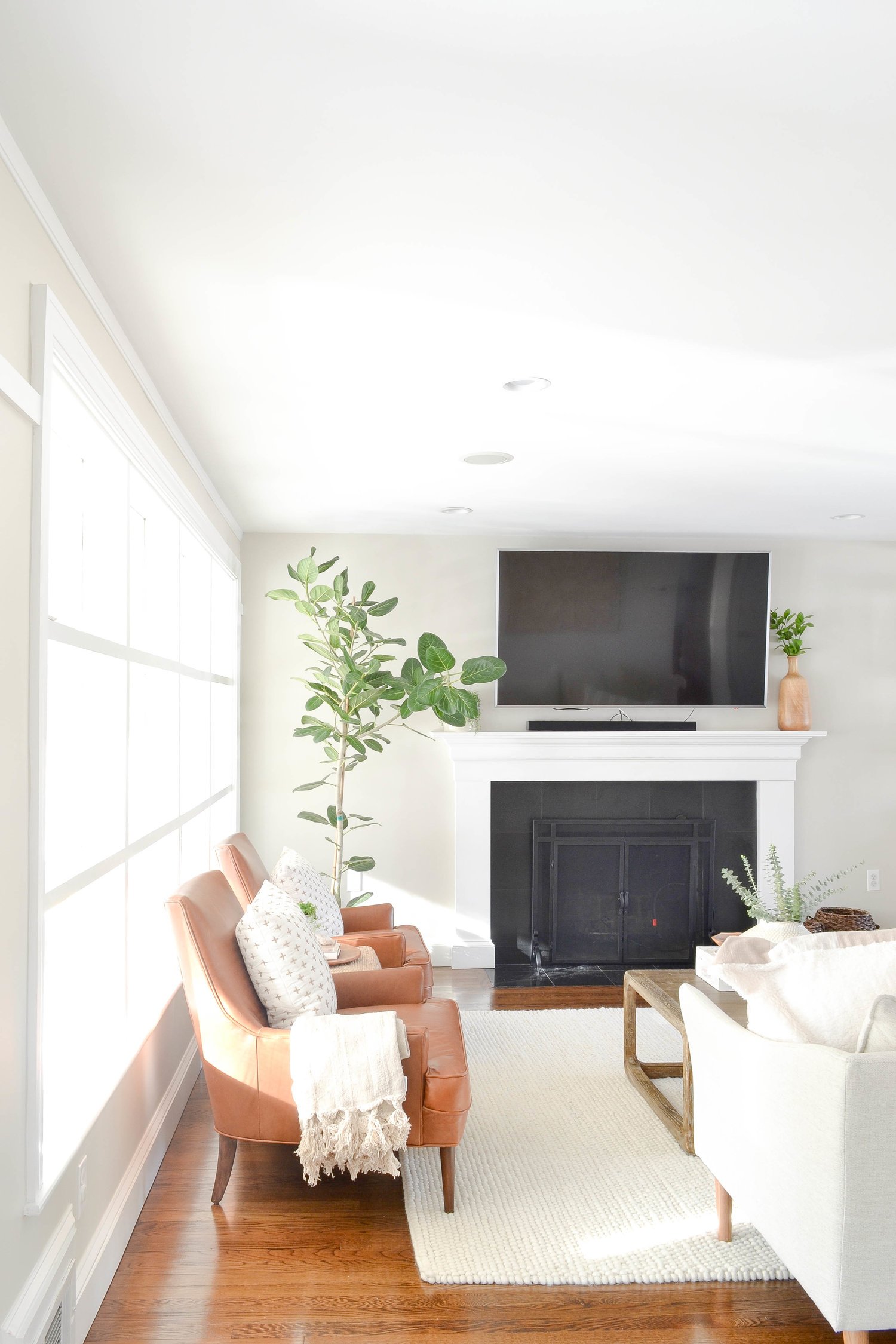
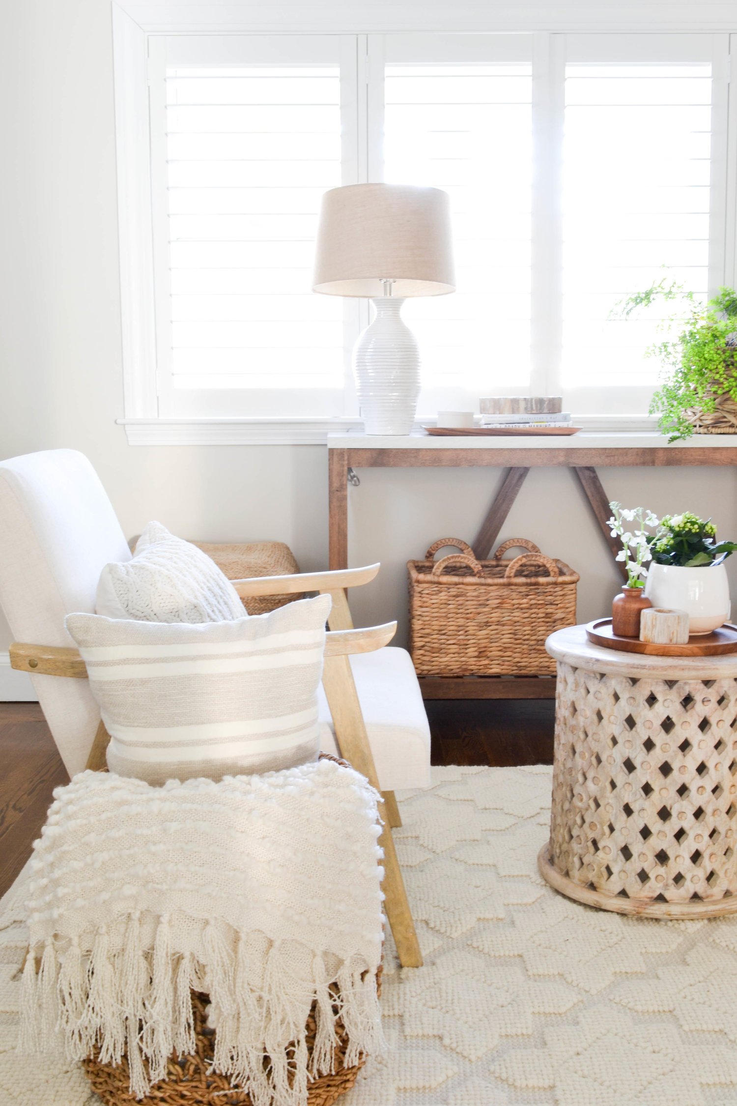
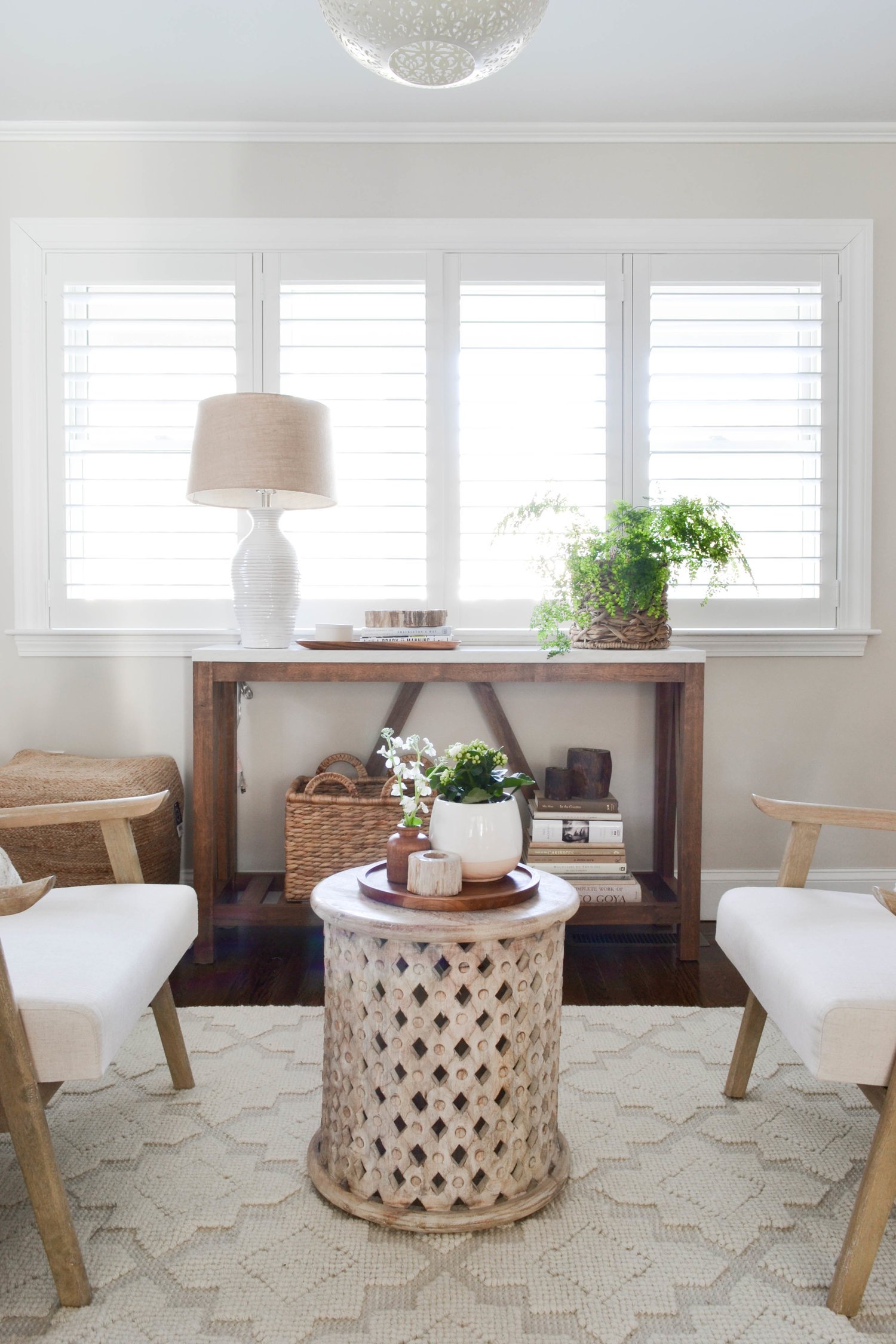
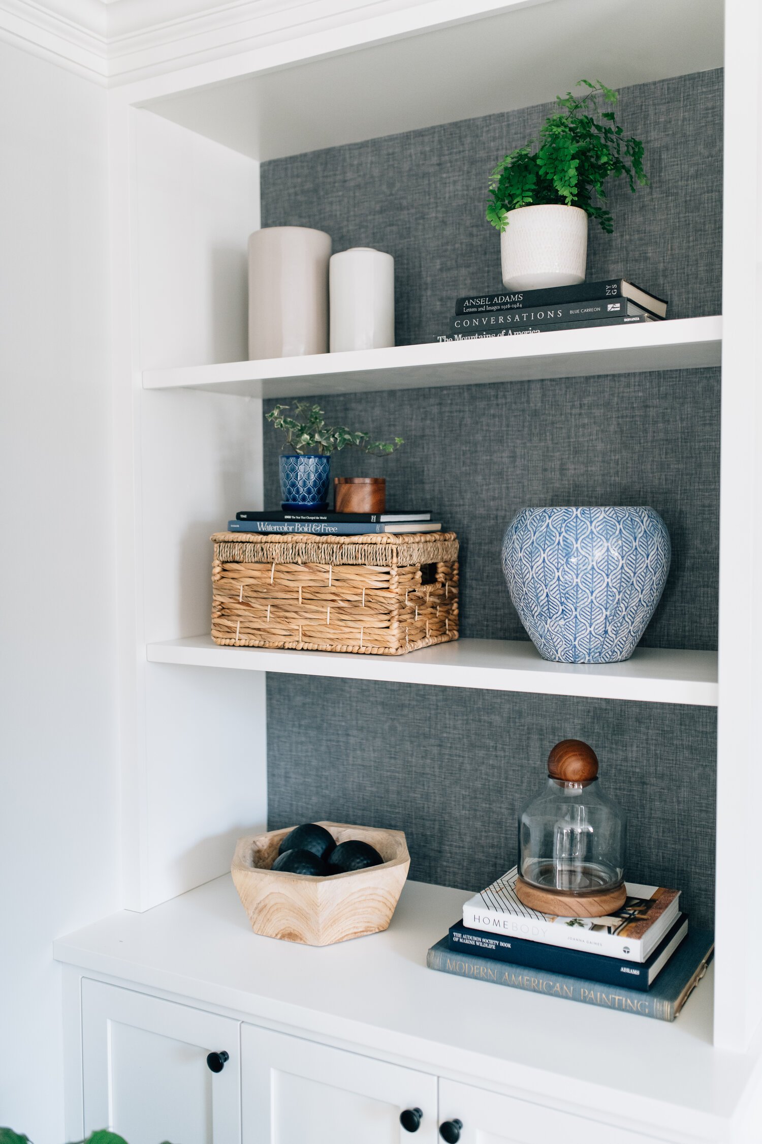
Transitional style is probably the most popular style of the moment. And, it’s more often than not used as the foundation for our projects even when we sprinkle in other styles. By definition, it is an updated traditional style - classic ideas made modern. It takes all the shapes and design ideas that have existed forever and makes them a bit more casual and comfortable. This lends to straighter lines and larger scales. While colors can vary, it’s commonly based in a neutral palette (whites, grays, beiges, creams and everything in between) with darker accents in organic colors. The idea of “organic color” are those colors commonly found in nature - forest green, navy blue, rust orange. On the other hand, hot pink won’t read Transitional.
Modern
Modern style airs on the side of minimalism while implementing clean lines and a monochromatic color palette. Monochromatic means that you are sticking to a color scheme that consists of mainly tints or shades of neutral colors. It is important that modern spaces remain uncluttered with simple, yet functional pieces. Furniture without much (or any) adornment are key. To warm up a modern space, just add natural wood.
Rustic & Industrial
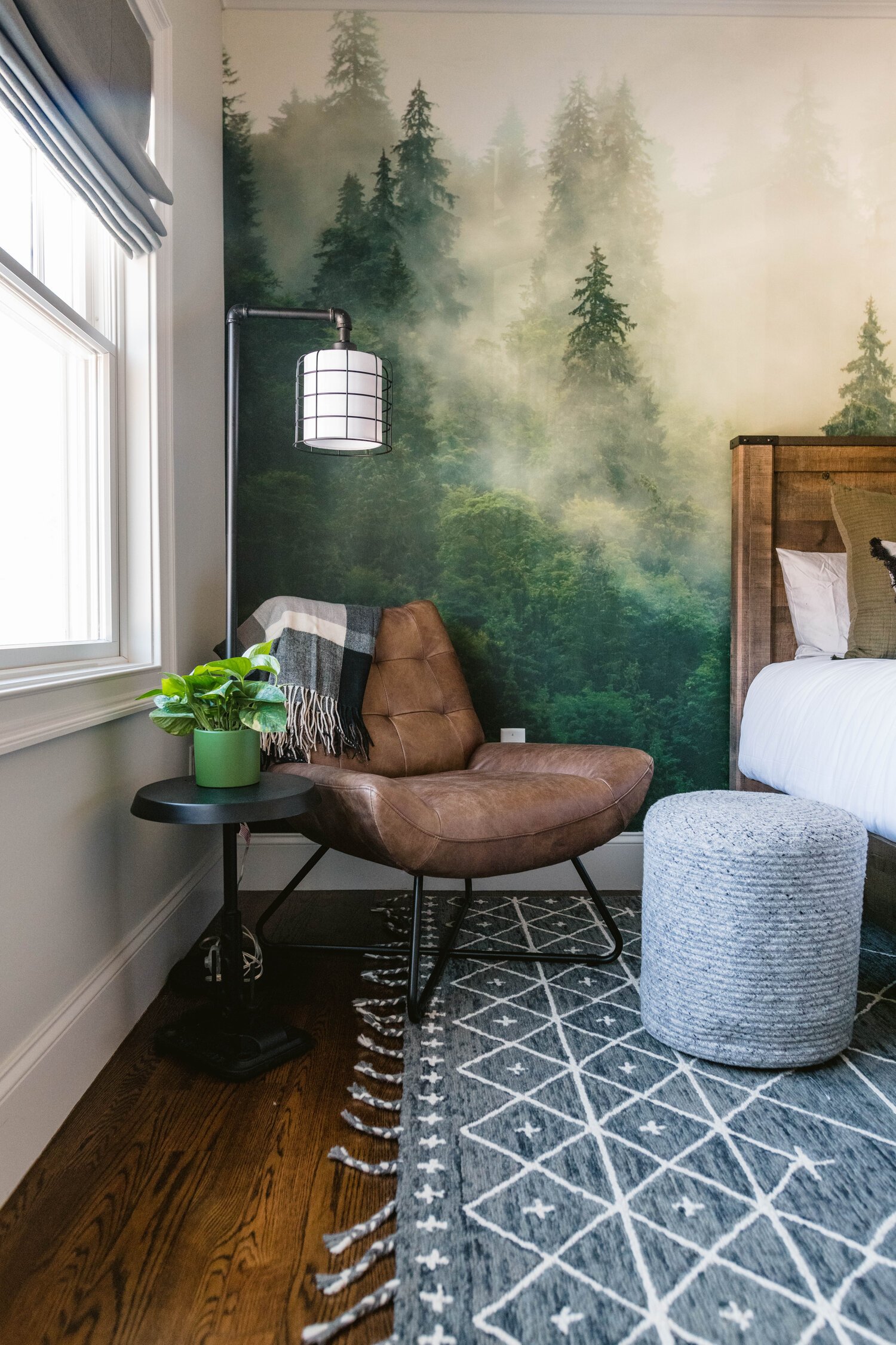
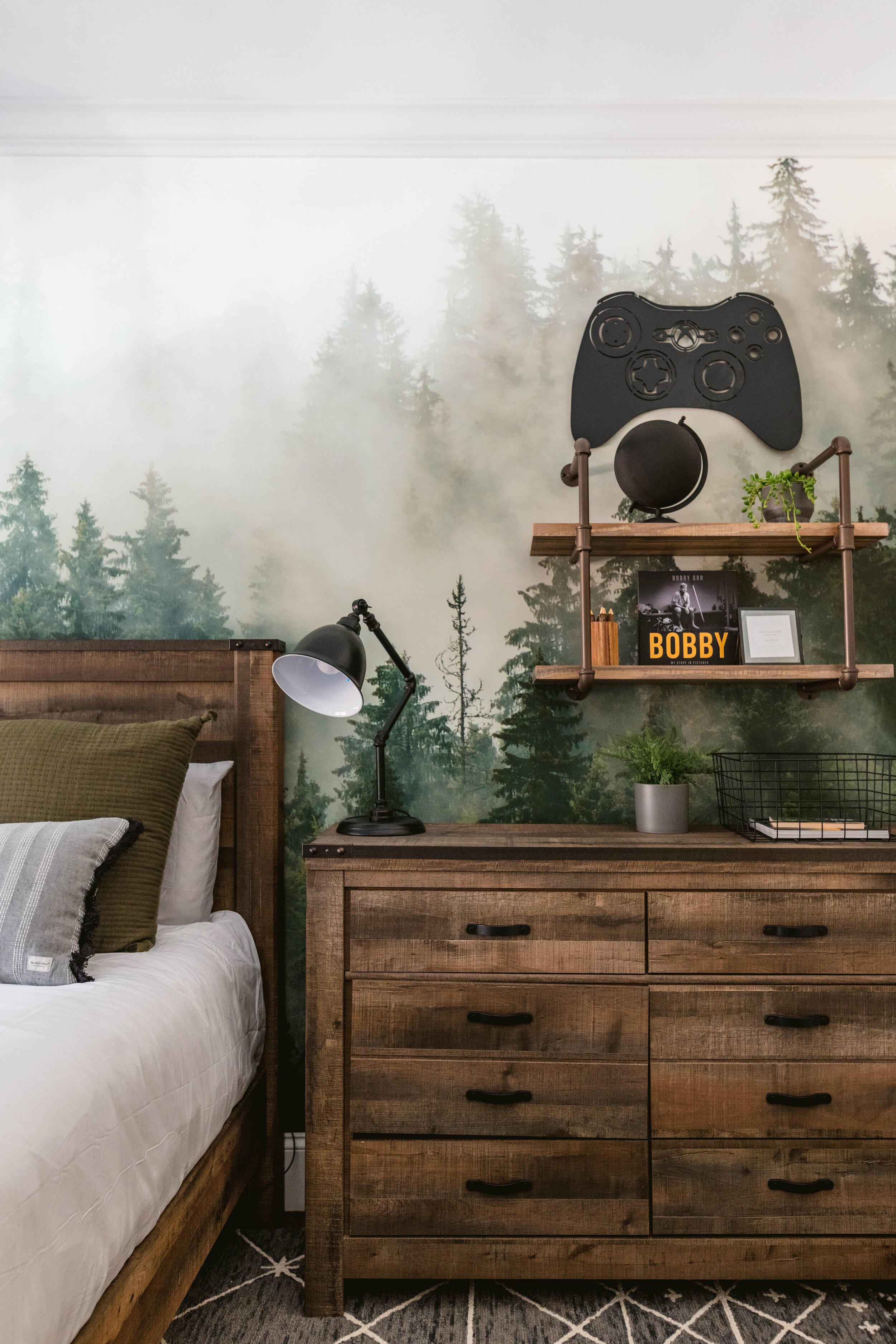
rug / leather chair / hockey stick hook rack
Industrial style takes inspiration and pieces from old factories and industrial spaces. For example, exposed rafters, thick iron piping, brick and concrete. Think of cogs, gears, cranks and elements that almost have a machine like quality. Nothing that looks visually breakable or delicate. Rustic style implements natural and raw materials. The wood is not overly smoothed, the fabrics are not tightly woven. This is the mountain cabin vibe. Maybe there are even some antlers involved.
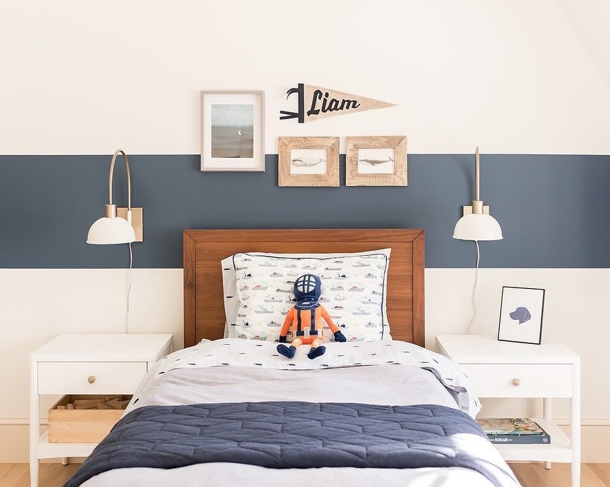
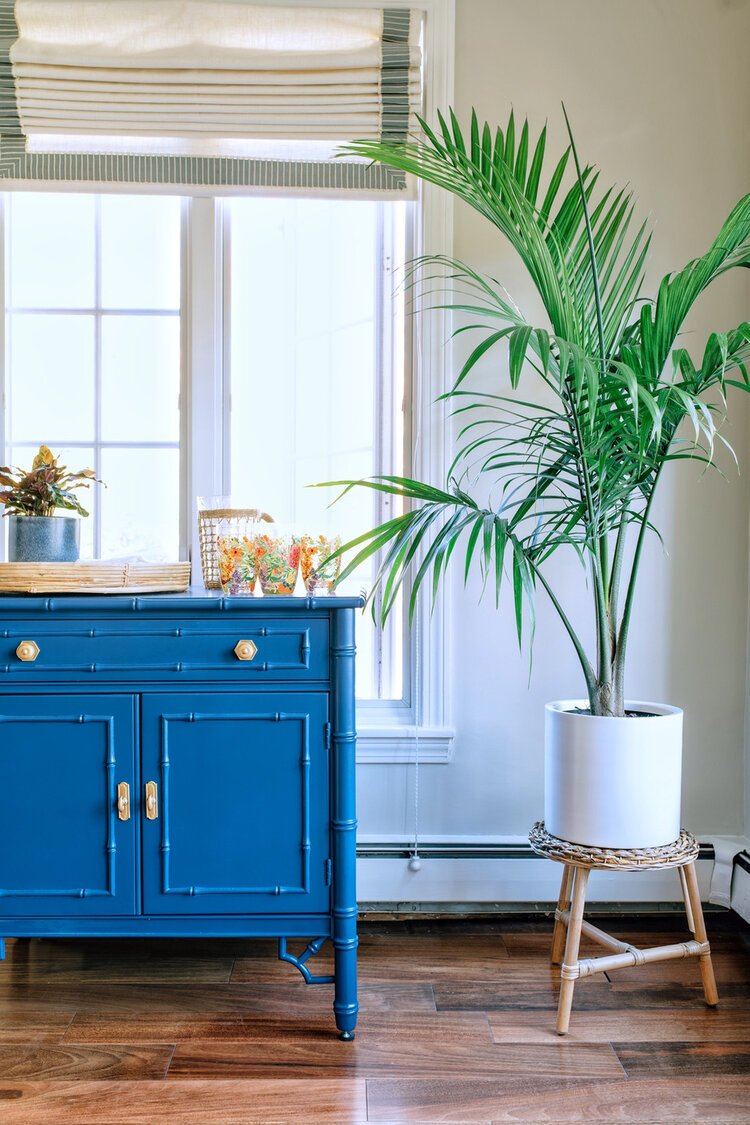
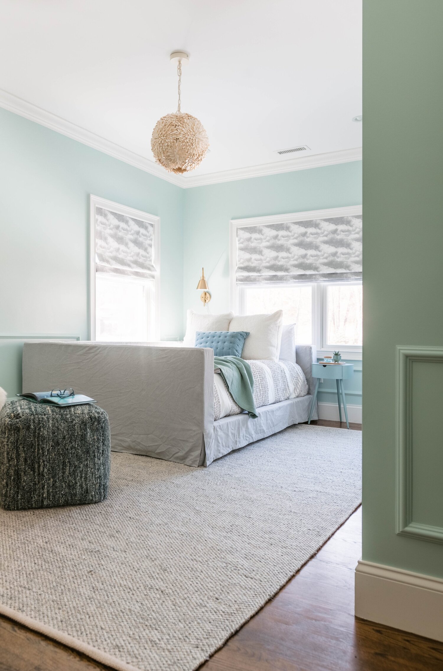
Coastal


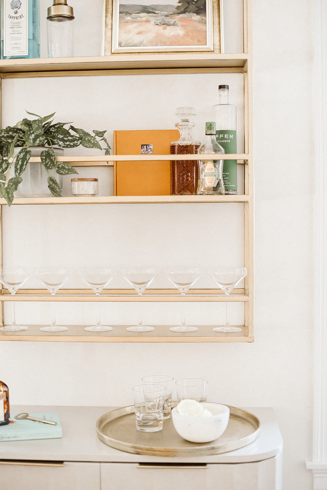

gray bedroom rug / twin bed / wave wallpaper / brass wall mount bar
Coastal style is beachy and nautical and all things ocean. When it’s applied to non-beach front homes, it’s the non-kitschy version of all these ideas. Rather than shell framed mirrors and nautical flag art, think colors of the beach (beige, tan, blue, white) and natural materials associated with the water. Rope like material - jute, sisal - and not actual ropes. Capiz light fixtures and not conch shell decor. Wave and nautically derived patterns are great too.
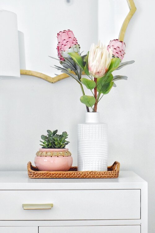
Glam Coastal

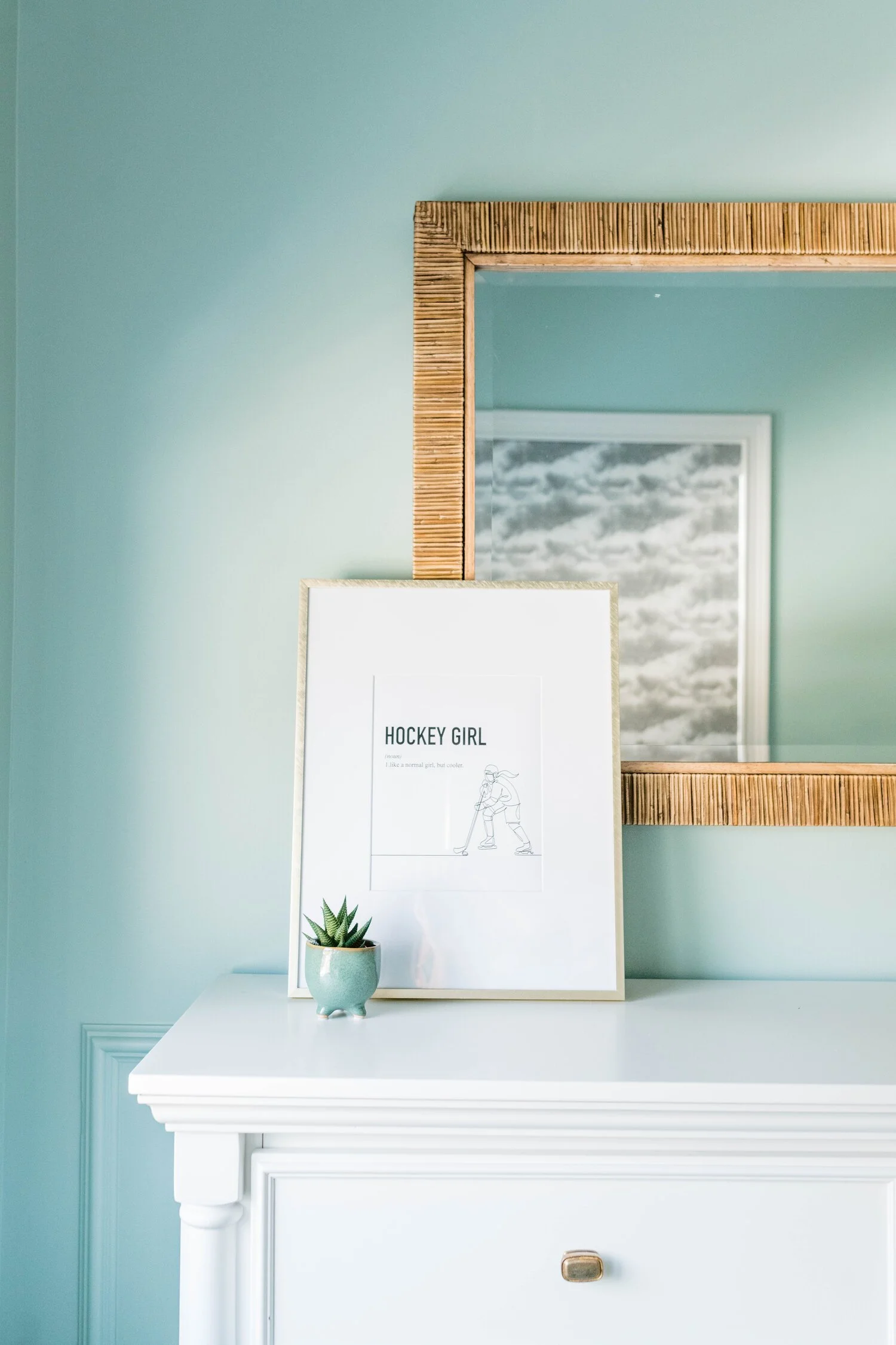

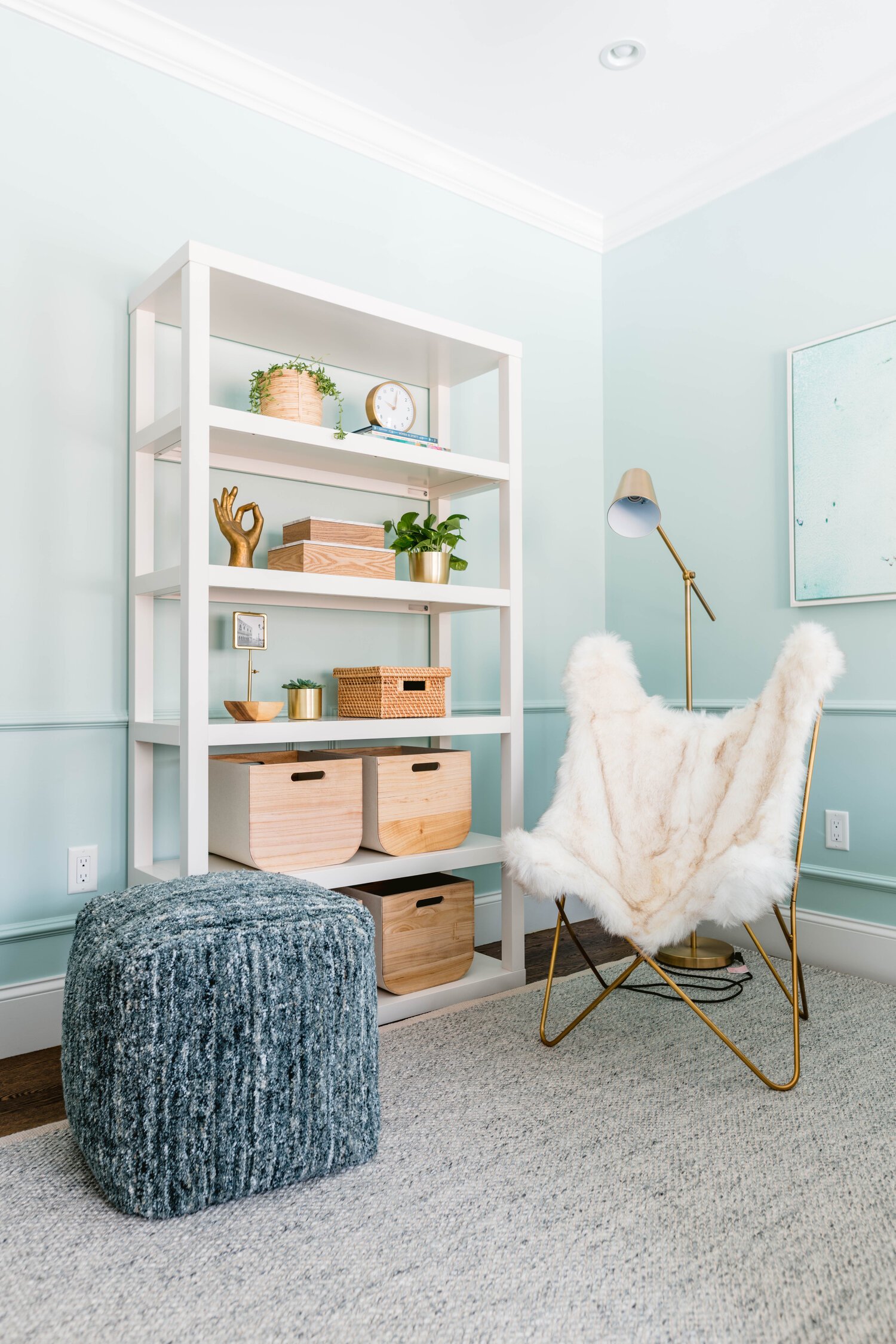
pink indoor/outdoor office rug / white bedroom etagere / aqua nightstand / brass plug-in sconce
This is a mash up style of sorts. We’re sharing it because we get a lot of requests about these type spaces and it’s a bit different than a standard coastal vibe. There are feminine, glam vibes. You can immediately see how these spaces differ from the coastal spaces above - there is more brass, gold, pink and turquoise. Those are the keys and, good news, that’s all there is to leaning into this version of coastal.
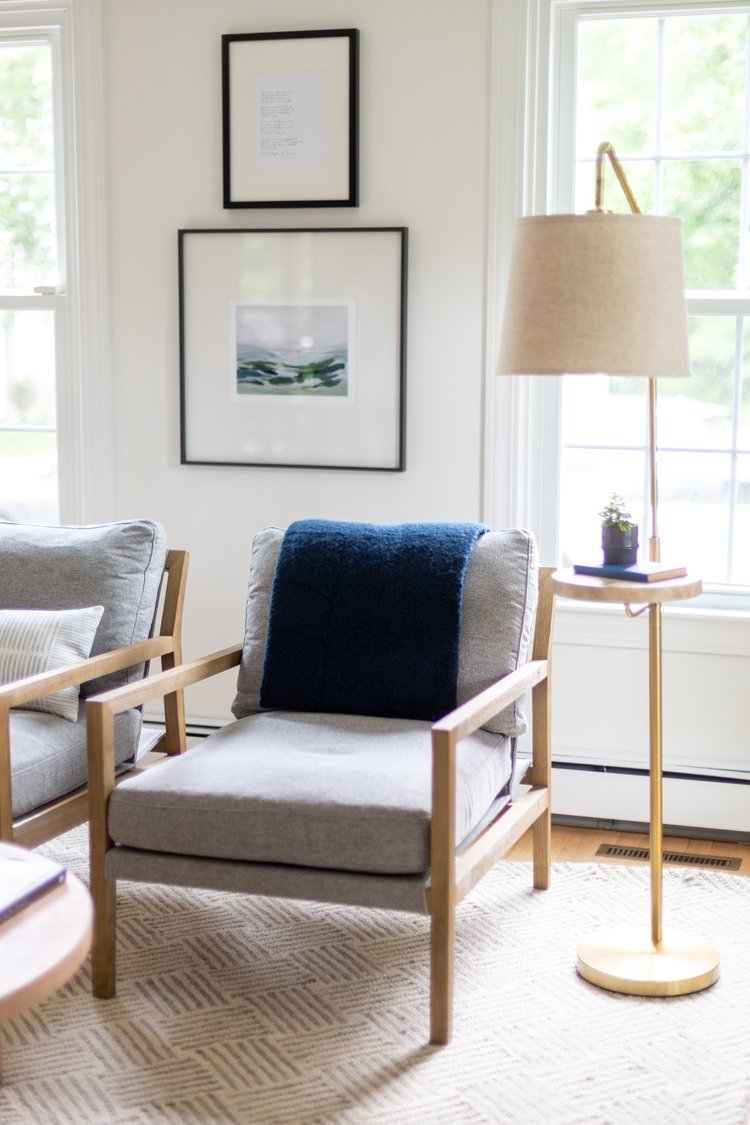
Mid-Century Modern

marble top coffee table / blue bookshelf / small walnut side table
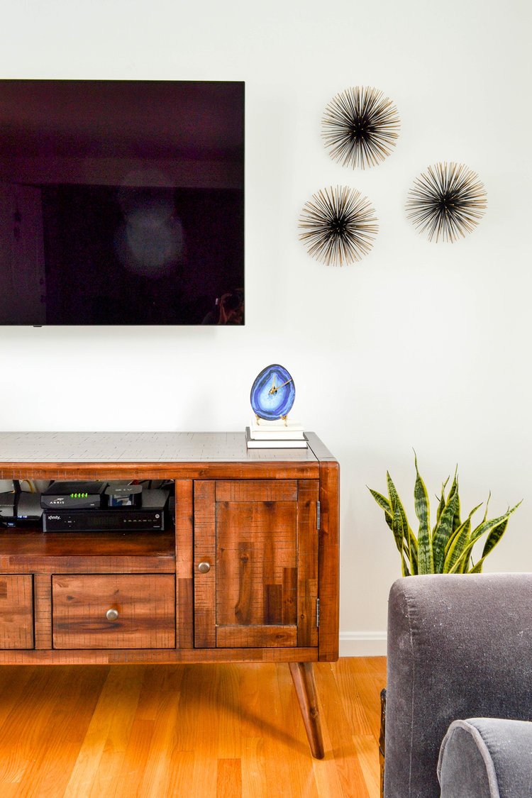
Mid-Century Modern style is a throwback to furnishings popular in the mid 20th century (1940s-1960s). The lines are straight, but angled. Whereas modern furniture is all about the 90 degree lines, midcentury is not. The color palette is also saturated and blocked. The patterns are graphic and bold. There is nothing delicate feeling about this style. And, yet, the furniture is not quite as chunky and large as modern pieces.
Scandinavian


nesting coffee table / sheep ottoman / knit ivory star rug / white side table / leather chair
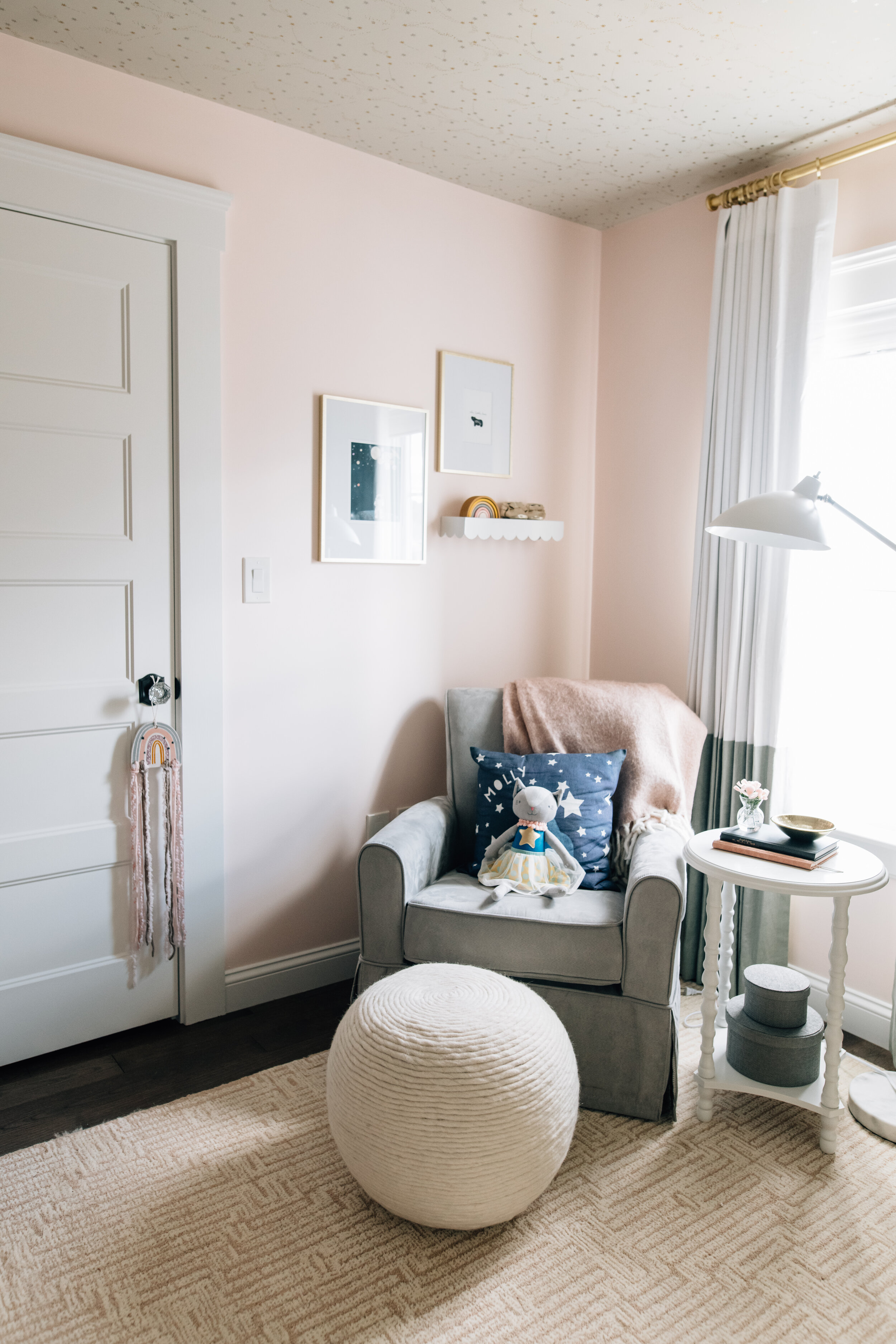
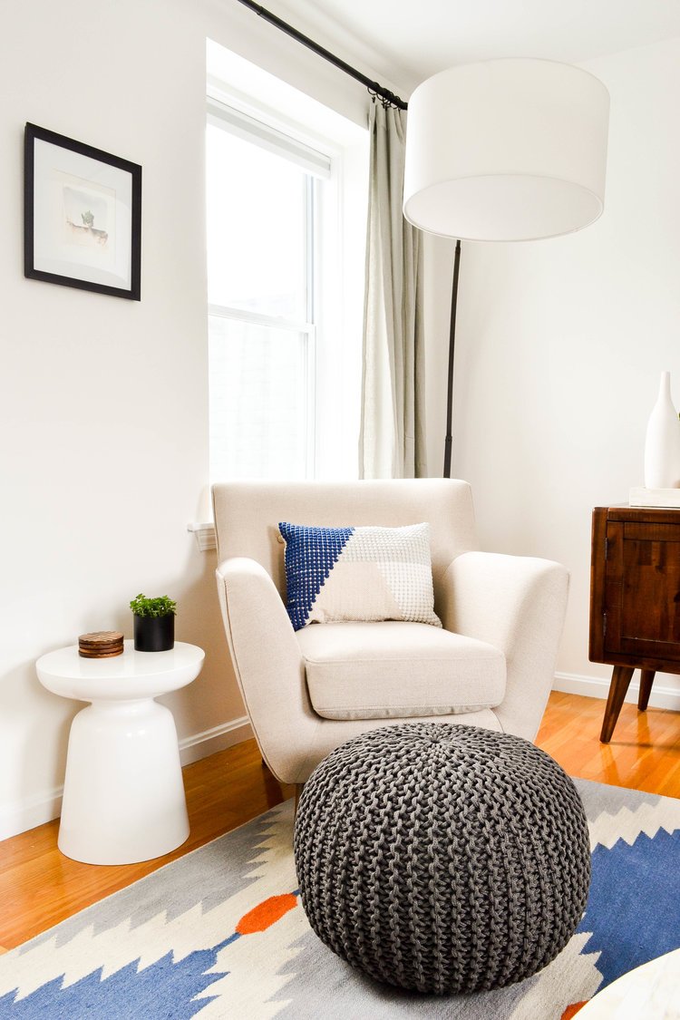
Scandinavian style is minimalistic and simple, while still incorporating texture. The color palette is often pale and neutral as it creates an airy, yet inviting vibe. This style originates from a design movement in Norway, Denmark, Finland and Sweden. Since these countries generally run colder, creating a cozy space is key. As an easy reference point, IKEA is a Scandinavian company that sells Scandinavian style furnishings. The value is in functionality and simplicity without creating stark, cold spaces. Chunky knits, pelts, sherpa and boucle are commonly used textiles to add warmth.
MODERN Farmhouse
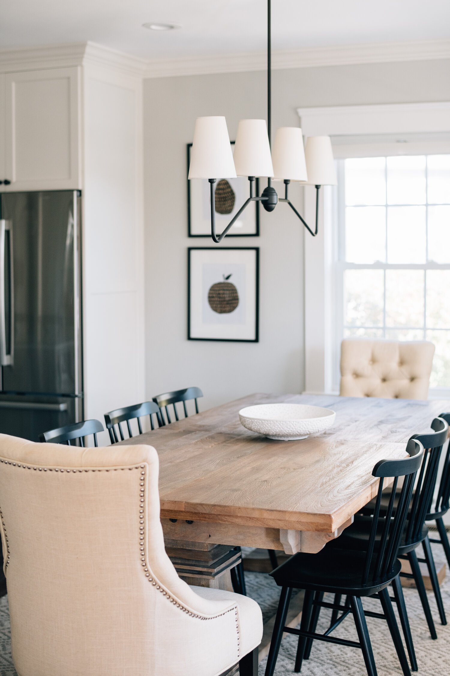

apple and pear art / black Windsor chair / ladder dining chair / blue faux grasscloth / blue gray diamond rug
You kind of know what Modern Farmhouse style is because it was so wildly popular for the past decade. The biggest associations with this style are shiplap, mixing in found pieces (vintage/antiques), natural wood, and turned furniture legs. Nothing says farmhouse like a trestle table! And while it has completed its trend cycle and is officially out, there are elements of Modern Farmhouse that are sticking around - matte black, iron, Windsor chairs, planked accent walls. And mixing antiques will never go out of style.
We hope these breakdowns give you some relevant keywords to search on Pinterest and find your personal interior style. Remember that before you can begin your bedroom refresh or your living room overhaul or whatever your new year project may be, you need to make a plan. And knowing your style is fundamental to making that plan and making it a success.
One last word of advice - remember there is a difference between your style and a style that you appreciate. You can love the way something looks, but it doesn’t mean it belongs in your home.
Until next time!
- Nisha
*This post contains affiliate links*