Lessons from Before and After - Mixed Up Molding

Today’s blog post is inspired by our Fairchild Project. It’s a lesson in how molding and paint can change everything. Plus we’re going to share some thoughts on window treatments and cased openings. It’s a bit of a design lesson and we’d love to hear whether this type of content interests you (versus shopping round ups or project reveals) - leave a comment with your thoughts!

Ok, here we go. Below is a photo of where we started.
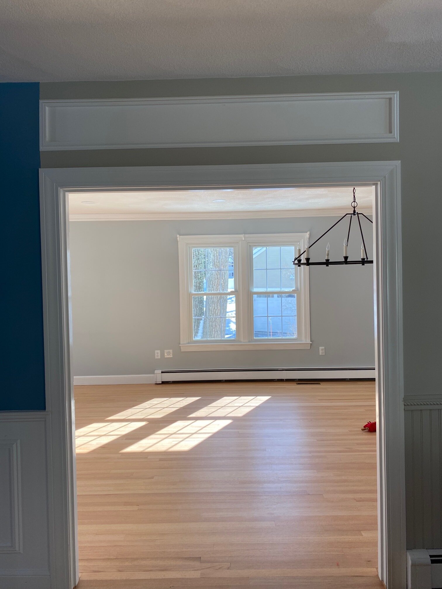
 
BEFORE

BEFORE


In this 6 foot stretch of wall we have 3 wall colors and 5 types of molding (two different types of box molding, trim around the cased opening, beadboard, and chair rail. It’s very confused. It’s way too much.

Here is a labeled version of the photo so you don’t miss any of the madness.

Wall paint and molding transformation - Boston based interior designers

 Lesson 1: One wall = One color

We’re talking about the wall, not the trim (not baseboard, not door/window trim, not crown molding) and not the ceiling. The trim and ceiling will most often be white or maybe a different contrasting color or maybe everything will be the same color (that conversation is for another lesson!). And yes, there will be the occasional wall with stripes and wallpaper with a million colors. But, without further confusing the matter, the rule in its most simple form is that each wall should be one color only. You switch colors at natural and intentional places. A new room can be a new color. If you’re painting an accent wall, you switch colors at the corner.

In this before, the blue wall ends at one side of the cased molding without any natural stopping point. It’s not a corner and there is no full floor-to-ceiling-trim to define the end. The painter had to freehand a straight line in two spots. If you have to free hand the end of one color and the beginning of a next, don’t.

Lesson 2: Pick a molding and stick to it

Pick one style baseboard, one style crown molding, and one style window and door trim for your home. Then if you’re going to do decorative molding on the wall - shiplap, beadboard, box molding, etc. - pick one per room. Too many different ideas will fight with one another and become a distraction. You don’t want people to wonder if something was on purpose. Good design looks (and is) intentional.

Now let’s talk about the after.

Fairchild-50.jpg

We resolved the paint problem by continuing the blue to both sides of the wall, ultimately ending the blue at a corner (not pictured). We resolved the molding mixup by removing most of it. We 86’d the box molding above the cased opening. It was connected to nothing…just sort of floating up there. We also removed all the beadboard and the chair rail. Not only is the beadboard and chair rail (on the right in the original) different from the box molding (on the left) in actual look and construction, it’s also a different in style. Box molding is a traditional woodwork. Beadboard with that specific chair rail has a cottage/country feel.

Why did we choose the box molding over the beadboard? A couple reasons. First, the box molding continues down the hall and is a big presence in a connected area of the home. Second, box molding is traditional (aka classic) and not niche or trendy. Classic elements mix with everything. They play nicely.

Two more quick lessons while we have you.

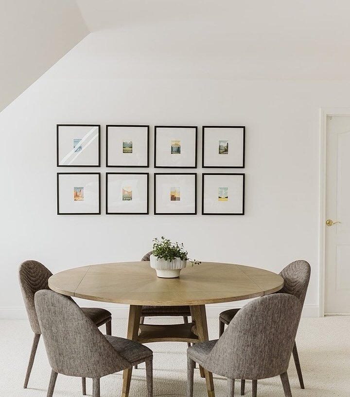
Lesson 3: Drapes make a room feel taller

We are the first to concede that drapes are not for every room. We don’t use them everywhere and we don’t love them everywhere. However, in a dining room with short (or just not tall) ceilings, they are magic. Check out the side-by-side below.

Without the visual context that curtains provide, the room looks squat. Add the curtains and everything is taller and bigger. Curtains draw the eye up and finish the space. Hence, the second half of this lesson is to install your curtain rods as high on the wall as they will go!

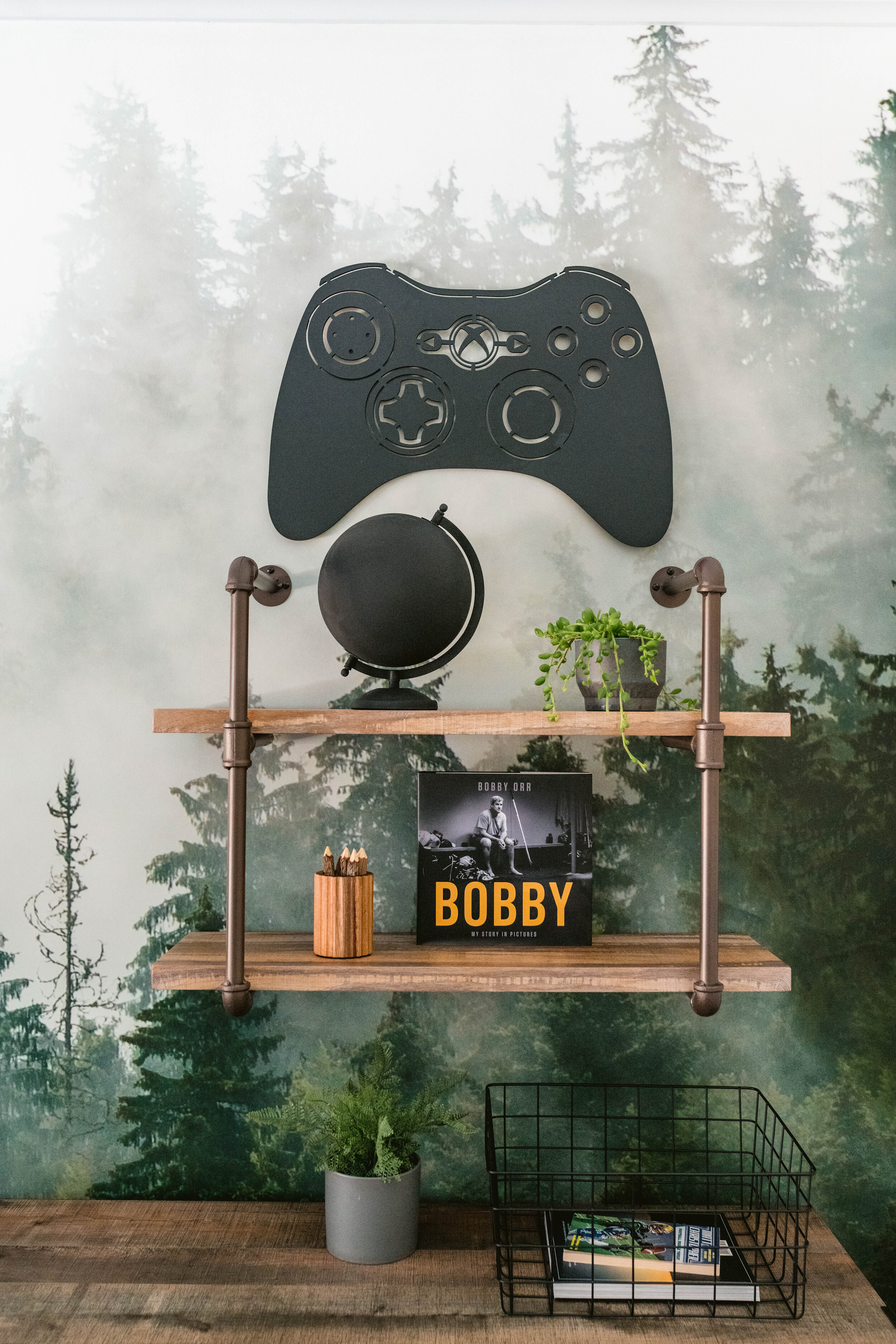
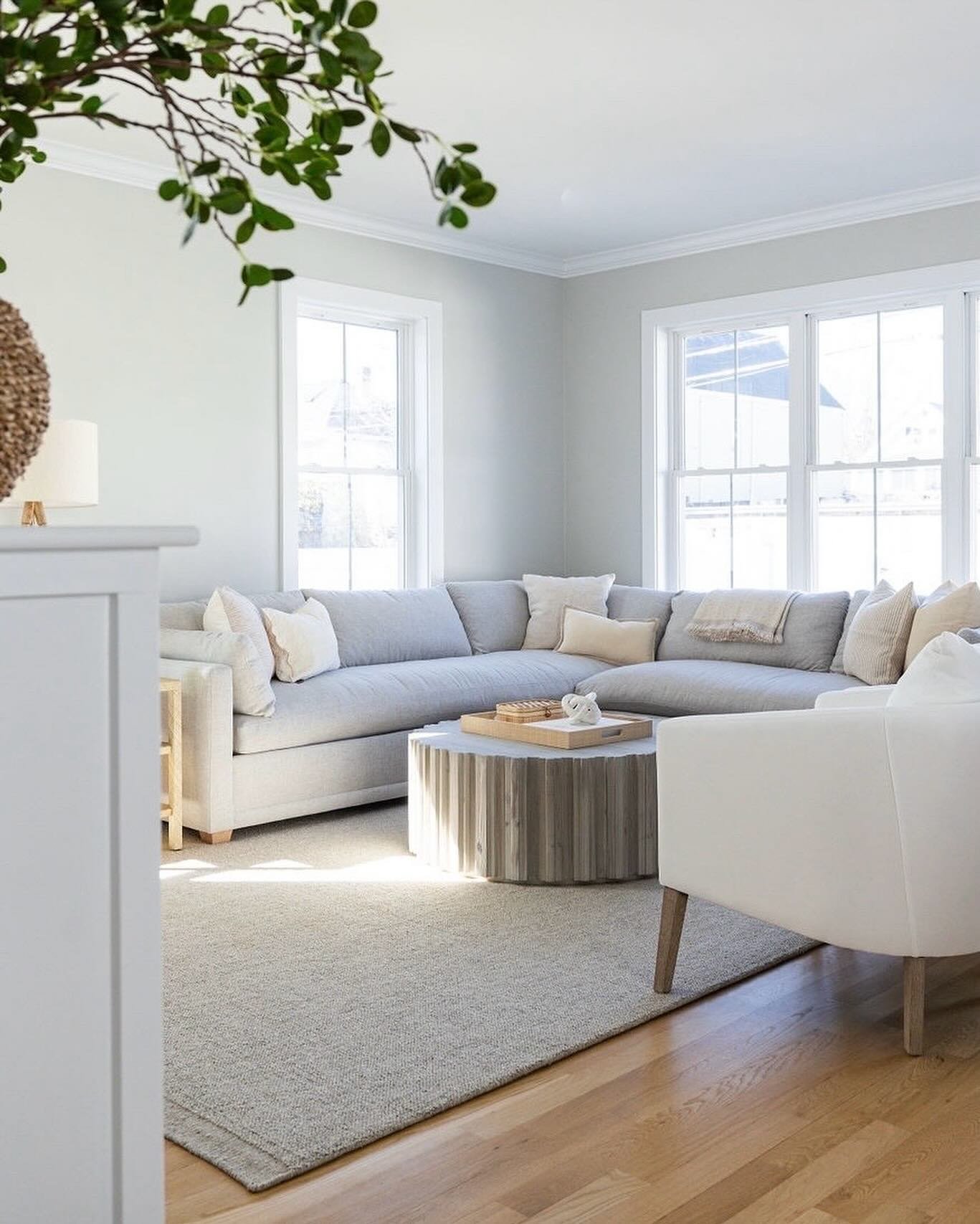
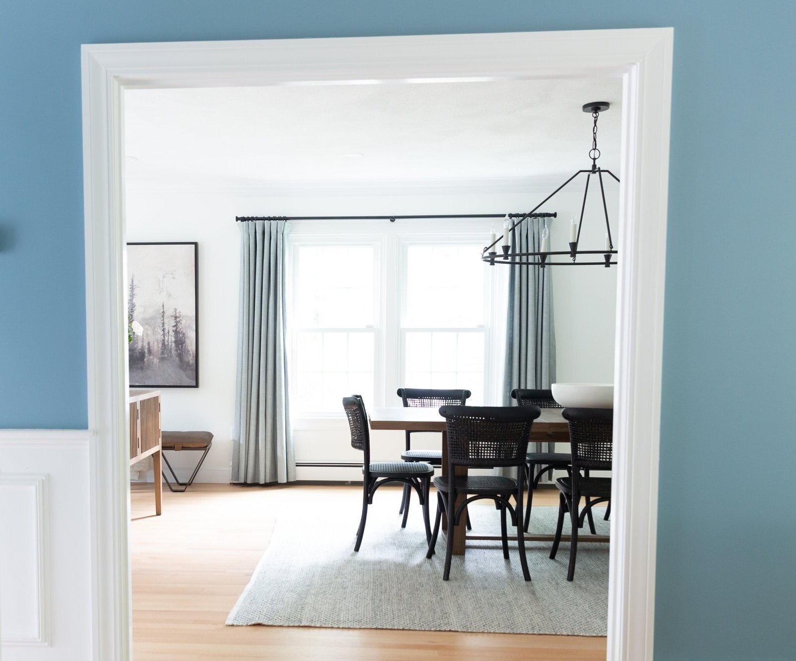
Lesson Four: Use a Cased Opening Like a Picture Frame

The glimpse of a room that you see through a cased opening should be intentional. We’re coming full circle back to Lesson 1 because it really is all about being intentional with your choices. You can center something in the cased opening - a fireplace, a table, a sofa, an oversized piece of art. Or you can give part of the furniture story, purposefully revealing only half the scene. It’s the same principal as photo composition. Sometimes asymmetry and the thing not pictured are just as good (if not better) than the carefully centered portrait.

In our furniture plan for the dining room, you see half the dining room table and half the chandelier through the cased opening. It wouldn’t have been nearly as beautiful if you saw just one candlestick of the chandelier. That’s not enough to give you a sense of what’s happening. It also would have been a fail if the cased opening framed a mostly empty part of the room. Unlike a fully open concept space, a cased opening requires you to consider what will be seen when looking from one room through a somewhat constricted lens to the next room. So, compose your vignette purposefully.

Design School is out for the day. Now go and enjoy your weekend!

- Leah

* this post contains affiliate links*

Sevinor Project - Girl's Bedroom Revealed

Last week we shared the details behind the boy’s bedroom from our Sevinor Project, today we’re talking through our design choices for the girl’s bedroom. For this project, our (young) client asked us to incorporate turquoise and lots of fluffy/fuzzy stuff. And the rest was up to us!

In this room, the layout was the the biggest challenge. It’s a relatively small bedroom and every wall has a door or window. In order to maximize the floor space and allow for multiple functions within the room, we specified a day bed. Without a large headboard, we were able to tuck it into a corner of the room and free up plenty of room for a bookshelf and reading nook.

The reading nook incorporates four key elements that each and every decent reading nook should have (no judgment if you’re down an element or two, now you know). One: a chair. This faux fur butterfly chair is the epitome of retro coolness. Two: a lamp to illuminate the situation. Three: a pouf for feet or a friend. Four: a surface for a drink or to rest a book, in this case it’s the bookshelf. Rather than add another piece of furniture to the small space, the shelf is on double duty.


For the color palette, we were off to a great start with turquoise and white (sherpa, faux fur). We added gray and expanded “turquoise” to all related shades from aqua to teal. These colors organically created an ocean vibe. We then added woven and natural wood details - the globe chandelier, the rattan wrapped mirror and some decor on the bookshelf - to play into the beachy feel. When colors coexist in nature (ocean and sand), they will pair up just as beautifully indoors. Naturally paired colors will also feel comfortable and inviting.

The custom roman shades are one of our favorite design moments in the room. We used a cloud fabric in the soft white and gray to tie into the neutral foundation of the room. It’s just a touch whimsical without being juvenile. With tween (and teen) spaces there is a fine line between creating something youthful and intentionally theirs without crossing over to the hokey or overly trendy. Our best piece of advice here is to reduce the number of colors and lighten the shades - choose muted and soft versus neons and saturated gem tones. In other words, go with the black and white poster of Harry Styles instead of the color. Sigh, shrug.


With the daybed in place, we wanted to include all the function of a proper bedroom set up without all the footprint. With this, we specified a wall mounted sconce that can be turned on and off from in bed, just like a lamp without the required surface space. We also chose a small, round nightstand. The petite size is, of course, key, but the round shape is also really important. In this tighter space, there are no sharp corners to lean into. AND there is still a big drawer. AND it’s aqua. This is what we call a design unicorn.

similar plug-in sconce / other similar plug-in sconce

For art in teen bedrooms, go fun and budget-friendly. Art is a great opportunity to bring personality to any space and teenagers have quite a bit of personality…right? And remember that art doesn’t just have to go on the wall. Smaller framed pieces can sit on a dresser (like we did below) or in a small frame on a nightstand or bookshelf.

And that’s a wrap on our Sevinor Project reveal. For more ideas on decorating kid spaces, check out the nursery from our Prospect Project (blush, blue and brass - with a wallpapered ceiling), the boy’s bedroom from our Prospect Project (ocean themed) and the playroom from our Brigham Project (pink and sage with lots of furniture that can transition to a teenager hangout).

Have a wonderful rest of your week!

- Leah

*This post contains affiliate links*

Sevinor Project - Boy's Bedroom Revealed

Today we’re flashing back to March, when we finished the boy’s bedroom of our Sevinor Project. This room was recently featured in The Globe Magazine (!!!) and in waiting for the article to come out, we had to keep our behind the scenes scoop to ourselves. But now that it’s published, we’re excited to share the details. All the things that made it special that you can apply to your own home. We love the idea of providing some inspiration for you to execute in your own way, at your own pace, on your own budget. So let’s do this.

But first…sorry, false start…we thought it was worth talking through how/when/why we share sources from our client projects. We are asked about details from our projects a lot. And we love it. We love hearing about what wall color or rug or lamp really resonated with you. It is, however, important for us to balance providing inspiration with respecting our clients. Of course no project is made by a single piece of furniture, and furniture/wall colors/light fixtures will look tremendously different in one room to the next for any number of reasons…but it still doesn’t feel right freely to pass along our unique, purchased creative plans. Even a single element of them. With all that in mind, the decision we have made is to share sources from projects that are at least 6 months old. And even with that buffer zone, some sources are unsharable (whether custom or just finder’s keepers).

With that out of the way, let’s talk tween boy bedrooms.

Gray Oak Studio - Boston Interior Design Studio - Teenage Boy's Bedroom

similar wall mural / other similar wall mural

When the tween (or teen) years are upon your semi-little one, bedrooms don’t need a concrete theme. No more “Winter in Arendelle” or “Trains, Trucks and Planes” motifs. It’s more about colors, textures and a feeling. Much more the way an adult room is designed. Except the feeling might be a bit extra - moody, bright, quirky, serene, you get the idea.

For this bedroom, we transitioned from a Star Wars theme to a calm, nature inspired space. Our young client was really drawn to rustic interiors with planked wood and masculine, industrial details. We incorporated both and anchored the room with a dramatic wall mural - the foggy forest.

BEFORE

BEFORE

3SevinorRd_Bedrooms_144634.jpg

AFTER

We incorporated three colors in this room - green, black and gray. Three colors is all you need for a well rounded palette. And really all you want. More contrast can be layered with finishes - wood tones and metal. Here, the rustic wood is full of ranging tones and textures and adds a whole other “color” to the mix.

similar task lamp / other similar task lamp

When it comes to kid spaces, it’s important to sprinkle in lots of decor that is personal and brings true joy. And isn’t expensive because taste and hobbies change quickly and often. Here we added nods to our clients love of hockey and video games throughout the room with art, a functional hook rack and a video game controller wall decor (that has LED lights and is controlled by remote!). How meta…a remote control that is controlled by remote. Mind blown.

It was really important to us to add a sitting area to the room. This is a key function difference between the toddler/little kid bedroom and the tween/teen bedroom. A spot to hang with a friend and a seat that isn’t the bed is a must. This tufted, leather, slipper chair is the coolest and we added the pouf for a surface/foot rest/extra seat. The accent table doubles as a surface for the person in the chair and a minimal nightstand.

When it comes to smaller rooms - and this a relatively small room - it’s important to use multi-functional furniture. Like the pouf and the accent table, the dresser is also taking on two roles. Of course it’s essential clothing storage, but it’s also a nightstand.

We loved adding the floating pipe shelf because you can still see the mural and it’s an opportunity for a bit more decor (read = personality). Don’t be scared of layering art or shelves or wall decor on top of your wallpaper. You don’t want to completely hide the wow moment, but layers of any kind add interest.

We kept the bedding simple because we didn’t want to compete with the foggy forest. This is a great time to point out that most rooms need only one focal point. Everything else is a supporting actor. With the wallpaper being the star, we were sure to keep other areas of the room a bit quieter. Had we simply painted the wall, we may have chosen and loud, colorful, interesting bedding scene.

similar euro pillow / similar lumbar pillow

However, supporting actor roles don’t have to be boring. People win Oscars for supporting roles. Which brings us to the rug. It has a pared down version of the room’s color palette (white and gray), but the bold pattern and modern fringe make it something special. (Scroll up to see a closeup of the fringe).

We could talk about our projects endlessly. What have we missed? Let us know in the comments. And check out the article in The Globe Magazine for more behind the scenes of this design.

More reveals to come!!!

- Leah

*this post includes affiliate links*