Wednesday Five - 25

Hi There! I finally pulled off a Wednesday Five! And it sort of feels like I’ve moved a mountain. Taking the past few months off blogging was not part of the plan, but it had to be. Sonia and I have been full force on client work and I’ve been squeezing in work on my own home renovation. Oh, and March was full of puke and fevers.

So, yeah. It wasn’t even a choice to ignore this blog for a bit, it simply happened. And thank goodness it did. Having one less thing to manage was relieving and necessary. Here’s the thing (that I know you know): we can’t do it all. And I find it pretty annoying (to put it in non-hostile words) when someone pretends that we can and tries to tell us how. If we want to do it all halfway and sloppy, and make silly mistakes, and not sleep and feel endless crazy, them maybe we could attempt to do it all. But, if we allow ourselves the grace of prioritizing and taking a breath instead of charging onto the next thing, then the truly important things will get done. In time.

And now, let’s dive in.

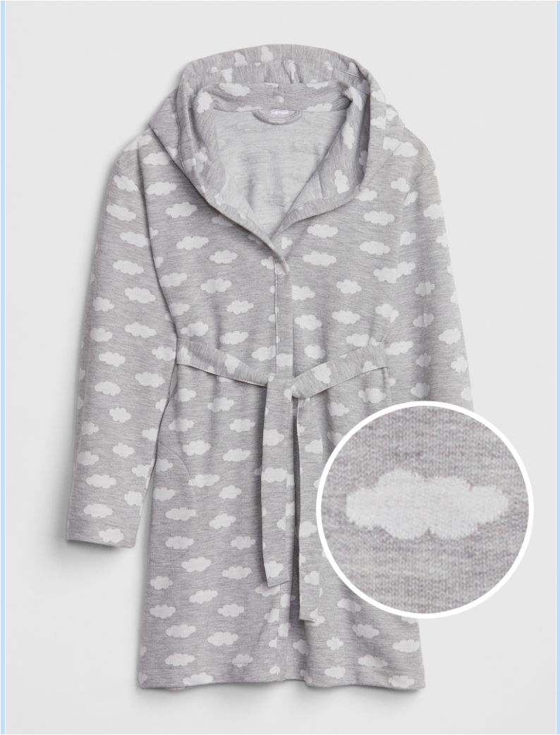
1. Are anyone else’s kids bathrobe obsessed? My daughters love them some bathrobes - a good terrycloth one out of the shower, a thick fleece one with some slippers to cozy up and lounge, a pink one with ruffles because. And so I’ve become quite the connoisseur of little girl bathrobes and can personally vouch for all three of these (if you’re in the market). Click photo for sources.

2. Way back in December, we breathed a huge sigh of relief upon learning that Joanna and Chip Gaines would be back on TV. There weren’t details as to how and when, but it was promised by Chip himself. We recently got some of those details: they’re not coming back for a show, they’re coming back as a whole friggin channel. This is the least surprising news I’ve heard in a long time (unlike all this scandalous stuff about Prince William and Kate!!!). They’re taking over the DIY Network and, I imagine, giving it a serious Magnolia makeover. It’s underway and planned for release/start/don’t-know-the-phrase in 2020.

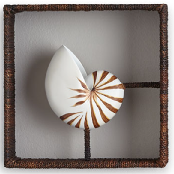
3. Did you know that Jonathan Adler has an affordable home decor line that’s available on Amazon.com? Well he does and it is. Here are some of our favorite pieces. We used the glass knot in a recent project. It’s a great shelfie piece.

Gray Oak Studio - New House by Jonathan Adler Roundup

candle holder / white glass knot / blond wood cocktail table / black and white “wink” tray / pedestal table / upholstered dining chair / grid box

4. We have two installs scheduled for the next two weeks. Love us some installs. Be sure to check out our Instagram feed and stories for behind the scenes.

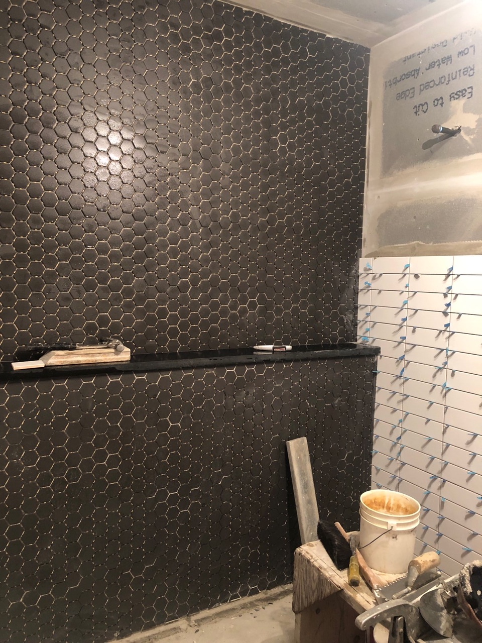
The first is a bathroom! Here is what it looked like the last time we showed you progress.

Gray Oak Studio - Wednesday Five - stacked white subway tile wall
Gray Oak Studio - Wednesday Five - Black hex tile bathroom

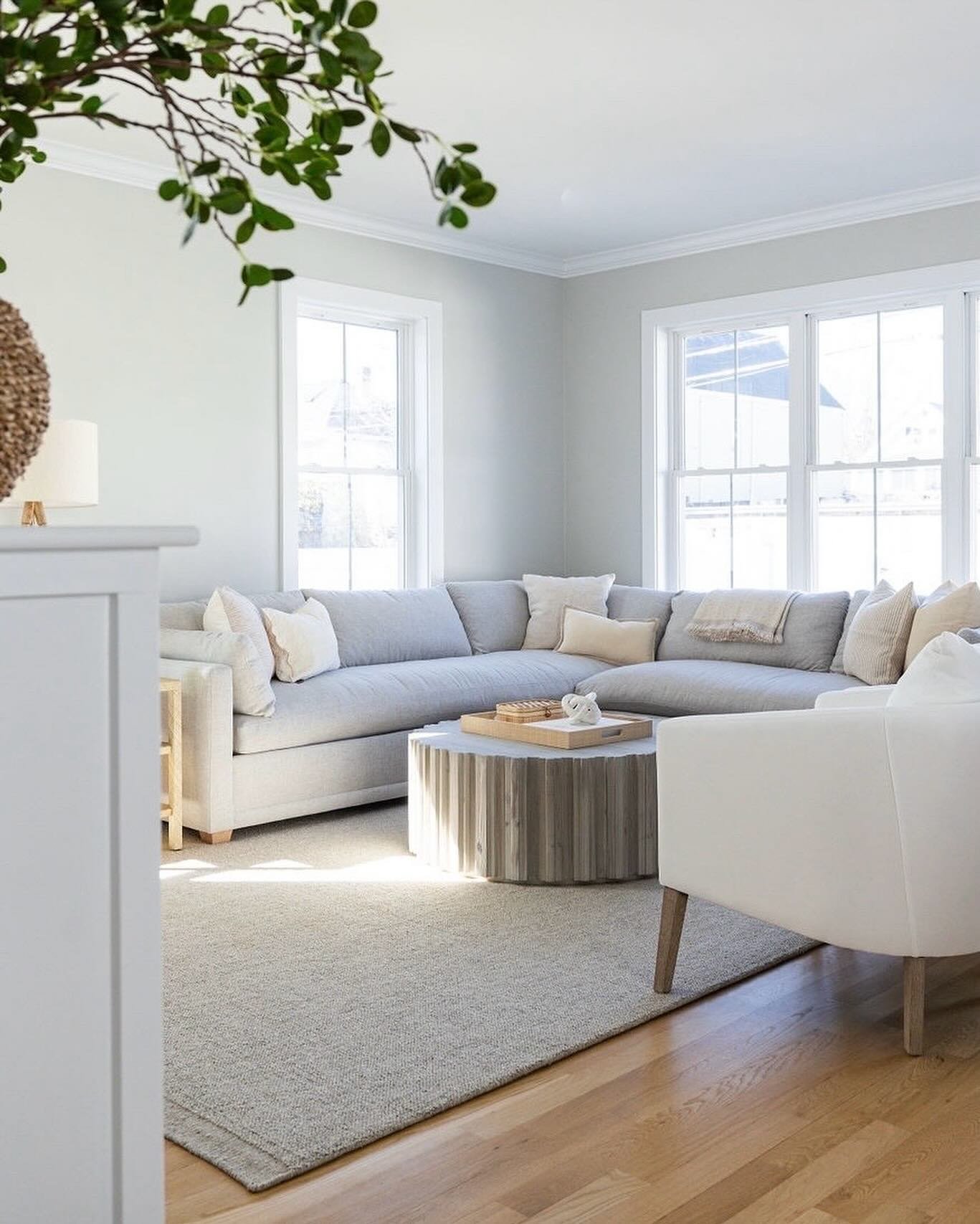
And the second is a family room with an incredible fireplace transformation. Here is what it looked like at the beginning of last week.

Gray Oak Studio - Wednesday Five - Lovell Family Room Before Photo

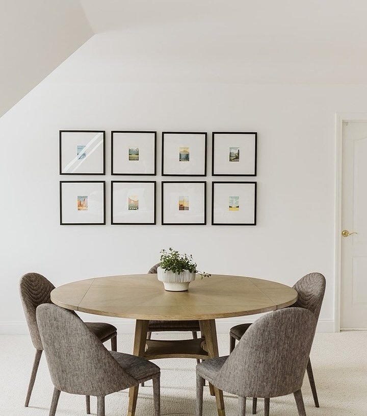
5. Let’s quick chat about the Rule of Three, shall we? It’s design theory that groups of 3 are more appealing than groups of 2 or 5 or 9…or any other number. The theory has a couple layers, but boiled down - the human eye prefers seeing things in three because it helps us decipher the center, a comfortable focal point.

If you’re interested in learning more, here and here are some quick articles. The easiest way to begin incorporating the Rule of Three into your home is your surface styling - a coffee table and or console. You probably don’t have to add much or subtract much, just cluster things a little differently. Here are a couple quick examples of the Rule of Three in our design.

We used three books under this lovely Monstera plant in on Dover Project. And, the mirror, framed print and plant also act as a cluster of three.

 
Gray Oak Studio - The Rule of Three in Interior Design
 

And here are a cluster of three white vases on a console from our Homestead Entryway. While this frame gallery has far more than three items, there are three mirrors within the bigger plan (check it out our blog post reveal to see - here).

 
Gray Oak Studio - Rule of Three - cluster of white vases


That’s all for this week. Maybe we’ll be back next Wednesday…sign up for our email subscription and you’ll be the first time find out (ahem, shameless plug).

- Leah

* This post contains affiliate links*

High Point Market - Spring 2019 Trends

It’s been a long (LONG) time since I’ve shown face on the blog. For no reason other than we’ve been wonderfully busy with client projects. We have our first master bedroom projects underway (2 of them!), our first bathroom project (gut reno) scheduled for install in a couple weeks, a commercial office almost completed, a family room (our favorite) with another fantastic fireplace transformation and lots of fun consultations. Oh, and I’m also in the middle of a massive, amazing renovation to my own home (check instagram stories for updates).

You get the point.

But, after a whirlwind weekend at our first trip to High Point Market, I needed to make time to share all the amazing things we saw. It was designer Disney Land…and we can’t wait to go back.

Because High Point is a market for wholesale buyers, the trends we spotted will hit the retail market in a few months (end of summer/fall). But, I’m including pics (and links) for examples of each trend that are currently available. So, you’ll be ahead of the curve. Speaking of curve…

Curved Furniture

We spotted curvy sofas, accent tables, consoles, you name it. Most were a concave curves, but there were some convex too. This was probably the trend that we had the hardest time loving. There was a fun 80’s throwback feel to it, but…there was an 80’s throwback feel to it. In the right application, it could be show-stopping. We’ll have to see how long this one lasts.

Textured Furniture

Furniture covered in lacquered linen, lacquered raffia, shagreen and leather were absolutely everywhere. E-VERY-WHERE. Cane fronted consoles and cane chairs were everywhere. Brushed and hammered and otherwise manipulated metal was everywhere. Cerused and weathered woods are still everywhere. Conversely, smooth anything furniture is most definitely out.

Cane front console table

Cane front console table

Lacquered linen covered chest

Lacquered linen covered chest

Shagreen top desk

Shagreen top desk

Resin Top Tables Molded to Look Like Wood

If I got $1 every time a sales rep told me that the table we were looking at was not made of wood (though it looked like it), but instead made of resin that was poured into a mold made from wood…I would have been a bazillionaire. It actually became comical. Sonia and I had a hard time faking our amazement after a while.


Drink Tables

These tiny guys are the new pouf. Forget something cushy for your feet, you now need something mini for your drink.

Gray Oak Studio - High Point Spring Market 2019 -  Drink Table Trend

Object Wall Art

Object wall art and 3-dimensional art ruled. Which meant that shadow boxes also ruled. We saw framed mini Turkish rugs, framed faux vegetables, framed agate, framed gold leafed leaves (ha), framed…everything. It felt like tobacco baskets, macrame and juju hats were the gateway object wall art, and now the sky is the limit.

 
Rice paper

Rice paper


Gold Leaves

Gold Leaves


Seashell

Seashell


LED Chandeliers

Tech in lighting is happening. Some of it feels very Star Wars. Get ready.

 
may the force be with you

may the force be with you


Solitaire Lights

These are mini flushmounts that are used in place of recessed lights. The trend of regular flushmounts replacing canned lights has been happening, but these guys are mini - the size of recessed lights. Like curved sofas, we think they could be really awesome if done right.

Green

Saturated blue tones and soft blush tones were still very prevalent. But, green was queen. Big time. We saw it on all sorts of upholstered pieces, leather included, in rugs, in art, in decor. It seemed to be incorporated in every “new to market” vignette.


This guy is coming out in Green leather later this year (probably august)

This guy is coming out in Green leather later this year (probably august)


So, what do you think? What will you incorporate into your home? What will you admire from a far? And what do you think is just bananas?

- Leah

(with Sonia...we spotted the trends together…duh)


Hutchins Project - Living Room Reveal

It’s been a long while since I’ve written a project reveal post, so I apologize if I’m a little rusty.

Today, I’m breaking down a family room we installed in December for our Hutchins Project. First order of business: is there a difference between a family room and a living room? Not really, but kind of. They’re mostly synonyms. Both terms conjure ideas of a sofa, a coffee table and a media center with a television. A family room is just a bit less formal than a living room. In fact, a family room is sometimes referred to as an “informal living room” in architectural plans. In designing a family room, we focus on creating a space that can be enjoyed by all family members and we take special considerations for the wee ones.

With the (little) kid-friendly factor in mind, we designed this family room with lots of soft corners and lots of storage, but still incorporated all the elevated touches and beautiful details that make it feel polished. It’s sort of like the dress that goes seamlessly from day to night.

Gray Oak Studio - Hutchins Project Family Room Reveal

For this project, we were asked to incorporate the existing sofa, armchair, rug and media center - all the large furniture. In this regard, this room was not a typical project for us. But, we love a good challenge.

Before we even considered the elements we would need to bring into the room, we changed the layout. The sofa and armchair were originally next to each other, both facing the media console. We shifted the armchair to the opposite side of the room to create seating more conducive to conversation (without detracting from TV viewing angles!).

{Design Tip}: Perpendicular seating, versus caddy-cornered seating, is best for conversation because no one is craning their neck, and, the right angles created by the furniture arms are modern and clean.

Unfortunately, we forgot to take a true “before” photo because during our initial meeting with these sweet clients we moved the armchair immediately after shaking their hands and introducing ourselves. “Hi, I’m Sonia.” “Hi, I’m Leah.” Awkwardly long pause as we make eye contact, know exactly what needs to be done, quickly consider if it’s too soon to start moving their furniture, then ask even though it definitely is too soon, “Would you mind if we moved your armchair? It’ll just take a sec…”

In the “before” photo below, we had already shifted the armchair. So just imagine the armchair next to the sofa, also facing the television, on the side closer to the camera (not the window side).

 
Gray Oak Studio - Hutchins Project BEFORE photos
 

After (immediately) tackling the layout, we dove into the design. With this being a family room we had a few goals in mind: storage, comfort and beauty. We added storage with two floor baskets and four baskets in the media console. We envisioned the floor baskets as catch-alls for random toys that sneak out of the playroom. Pop a snuggly blanket over said random toys and the clutter is hidden for guests or for your own sanity.

 
Gray Oak Studio - Hutchins Project Family Room Reveal
 

In addition to creating storage, the baskets in the media console were also great for creating a more simple, clean visual that doesn’t compete with the television. Because when you’re watching Trolls for the 157th time, you need to be able to focus. I kid. But truly, styling open shelves around a television is a different ball game than styling a bookcase.

A media console is already filled with the TV, cable box, stereo equipment and some other necessary uglies. Keeping the surrounding decor simple will create visual comfort in this naturally busy element of the room. Using a simple color palette and larger decor is key. Here, we switched out the silver knobs for matte black, and kept the palette to brown (woven baskets and wood vases), blue and white. The greenery is our only true color. For decor, we repeated just a few items: baskets, books and vases/planters.

Gray Oak Studio - Hutchins Project
Gray Oak Studio - Hutchins Project Family

The cozy factor was met and exceeded with two overstuffed, wool ottomans. They have fabulous texture that is great for kicking up your feet or launching off onto the sofa superman style. Throw pillows and blankets also added to the cozy vibe while remaining functional for all that impending fort building. And the long, linen curtains added to a comfortable, inviting feel of the room.

 
Gray Oak Studio - Hutchins Project Reveal - Family Room
 

At last - how did we make it pretty? We started with a fresh coat of paint on the walls - Nimbus by Benjamin Moore. We also added a beautiful (and textural…cozy vibe) light fixture and two lamps. The addition of any type lighting is an opportunity for beauty and function. Finally, we created “movable” vignettes. These were pretty little nooks and crannies that made the room feel polished, but could be removed and easily hidden away when fort building is underway. For example - All the smaller decor (vases and books) on the tray on the ottoman can be relocated to another surface or hidden in a media console basket without much work.

Gray Oak Studio - Hutchins Project Family Room Reveal

Here is a side-by-side of before (left) and after (right). LOVE seeing the full impact of each design element brought together is one awesome transformation.

Gray Oak Studio - Hutchins Project Family Room Reveal - BEFORE
Gray Oak Studio - Hutchins Project family room reveal

If you’re interested in reading other client project reveals - click here. And, otherwise, until next week!

- Leah