Windsor Project - Entryway (again)

Today we have a quick update on the Windsor entryway. Technically, it's not an update...we just didn't have photos ready for you when we shared the original reveal (click here to check that out). Now we can show you the whole thing.

DSC_0563.jpg

And now you can see this little nook.

DSC_0561.jpg

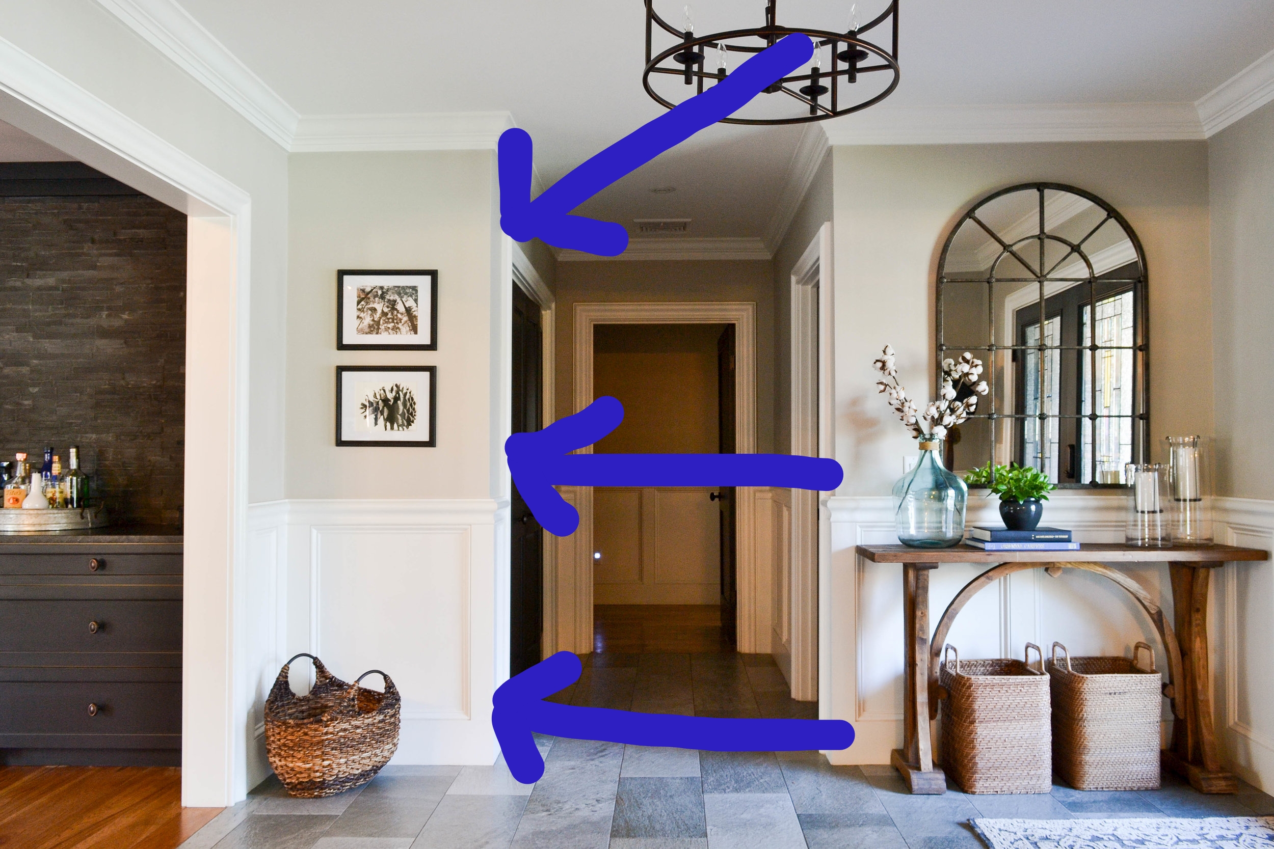
Both photographs are from Minted.com and we love them. So much.

Minted is one of our go-to sources for gorgeous, affordable art. The budget friendly factor is one of the biggest perks, but there are actually quite a few reasons we heart Minted. The website is super easy to navigate. You can filter the massive portfolio (color, medium and style) and find exactly what you didn't know you needed within minutes. Real artists with amazing talent create the pieces. And, the quality of the print is fantastic. We often get our own frames, but have been really happy with their frames as well. So, there's our plug...though we're not being paid to make it...or even given a secret promo code. Minted, if you're reading this, (in the words of Maui) You're Welcome!!!

 
DSC_0560.jpg
 

Back to the photos themselves. Other than the fact that they're just so pretty, they're also full of texture. And you know how much we love texture in entryways. Any image of nature is a good image...well, that might not be true...anyway, bringing the outdoors inside is good for the soul whether it's a fiddle leaf fig tree or a black and white photo of a pinecone. 

DSC_0564.jpg

So that's our update - some awesome, inexpensive art.

More Windsor Project reveals will continue over the next couple weeks. It's about time, right? We have details on the dining room and those amazing chandliers you may have seen on Instagram or Facebook. We also have details on the living room and the cathedral ceiling that we gave a huge makeover. 

Hope you're having a great week! Source list is below.

- Leah

Pinecone Photograph - Minted.com

Forest Canopy Photograph - Minted.com

Black wall frames - We found these at a Michaels store and can't find the same online, but here is another good choice from Joann Fabrics

Basket (below framed photos) - HomeGoods

Console table - Houzz (get %5 off with our code: 4E318)

Rug - Magnolia Home

Mirror - Houzz (get 5% off with our code: 4E318)

Pendant light - Boston Interiors

Recycled glass jug - Houzz (get 5% off with our code: 4E318)

Cotton stems - Terrain (We got ours at Anthropologie but they're sold out. Boo. Thankfully the dried cotton stems at Terrain are seemingly identical!)

Hurricanes and candles - HomeGoods (here are two similar ones from World Market: here and here)

Baskets - West Elm

*This post contains affiliate links*

Leah's Kid's Bathroom - It's Done.

This reveal has been a long time coming. Especially for me.

Technically, it was usable back on September. But then there was the window treatment. I had so much trouble with the window treatment. More on that later. For now, let's start here.

DSC_0597.jpg
YAY!!!!!!!!!!!!!!!!!!!!!!!!!!!!!!!!!!!!!!!!!!!!!!!!!!!!!!!!!!!!!!!!!!!!!!!!!!!!!!!!!!!!!!!! 

You would be screaming too if you had started building this bathroom a year ago. A YEAR AGO. 

Don't you just want to climb the step stool, brush your teeth, wash your hands, water the plant and then brush your teeth again?

DSC_0600.jpg

I'll try to be brief in walking you through the design choices, but be prepared to indulge me a little. It did take a year after all.

So, once the layout logistics were handled (catch up on that here and here), I dove into the design. There were, however, some logistics to the design as well (as is the case in most spaces) that needed to be considered upfront...before I went on a Target shopping spree. First, the room doesn't get a ton of light. The one, good-sized window is west facing and blocked by some tree shade. Second, I had no flat walls to work with, except for in the shower. The toilet, vanity and towel rack had to fit on walls with quirky jogs. Third, my tiniest family members are the primary occupants of this bathroom. The space needed to be easy and comfortable for wee ones.

To handle the low light factor, I kept the palette white and bright. And white. The walls are Simply White by Benjamin Moore and all the tile is white, not to mention the bathtub and toilet. I did break it up with gray grout, gray and black accents, and wood. But, white is the dominating factor.

DSC_0672.jpg

I also used chrome for my hardware and fixtures to help brighten things up. These days chrome is the less favored choice when compared to polished nickel because it has a cooler blue undertone and, as a result, vibes less with popular warm finishes like bronze and brass. Meanwhile, polished nickel has a warmer, yellow undertone, hence it plays well with other warm finishes. But chrome, with its blue undertone, is extra bright and extra reflective. It's also simultaneously modern and classic, which is exactly what I wanted. And, in further defense of chrome (because it's my favorite), it plays really well with matte black. 

 
DSC_0650.jpg
 

Once I figured out how to use the funky walls in my favor, they ended up being a silent hero of the room - adding charm and character. The vanity fit into the nook that was once a built-in bookshelf. 

Let me quickly digress about the vanity - it's a hodgepodge of things I love. It's a classic shape in a traditional vintage maple stain. I sold the granite top and beige sink it came with and opted for an almost completely white quartz top and white sink. And, I replaced the hardware with some chrome hexagon knobs.

DSC_0602.jpg

I'm in love with these little knobs. 

DSC_0661.jpg

The built-in shelving to the left of the vanity was formerly part of the room on the other side of the wall. It was a narrow nook on one side of a back closet wall. Didn't make much sense in the closet, makes so much sense for extra storage in the bathroom.

DSC_0641.jpg

The window treatments...oh, the window treatments...were the bane of this bathroom for the last couple months. I tried many different options. Again, logistics played a large hand in this problem/decision. The window is unusually big and unusually low for a bathroom. For the sake of privacy, I needed something with true coverage. On the flip side, I wanted a treatment that allowed some natural light even when drawn for privacy. This ruled out most traditional shade options (I went through a bamboo shade moment, but it would have been drawn the entire day and zapped the little light available to the room). 

This cafe curtain lets light in all day long from above the curtain rod. There are no cords for little kids to play with (makes me so nervous). And, I magically found a fabric pattern that I love. The final result was a little DIY project that I'll follow-up on in a later post. So easy, I swear.

DSC_0607.jpg

And now, the other side of the room.

DSC_0632.jpg

You already saw some the tile accent wall behind the vanity - the shower pattern is the same. It's a slightly enlarged subway tile (4" x 8" instead of the classic 3" x 6"). I love designing with repetition, it's one of the simplest ways to create a cohesive feeling. It's just important not to repeat so much that it's in-your-face...or boring.

DSC_0621.jpg

The low marble shelf in the shower is easy for kids (and adults) to grab what they need. And, the hooks (versus towel bar) are easy for kids to hang their own towels and pink, bear bathrobes. 

DSC_0627.jpg

Speaking of repetition, here's another black framed photo of an arctic animal (my kids love arctic animals) and another dragon plant in an IKEA planter. Dragon plants are great at filtering air and IKEA planters are the best budget planters around.

DSC_0641.jpg

A year was a long, long time. BUT, the bathroom is everything we wanted it to be. So...I suppose it was worth it...though you won't catch me (or my husband!) DIYing another bathroom again soon (or again, period). 

Here a source list with nearly everything (feel free to comment with questions on anything I missed!):

Wall and molding color - Simply White by Benjamin Moore (eggshell on walls, gloss on molding)

Floor tile - 2" white porcelain hexagon tile

Wall tile - 4" x 8" white porcelain subway tile

Grout color - DeLorean Gray

Vanity - Fairmont Designs

Vanity faucet - Symmons

Vanity knobs - Rejuvenation

White planter - IKEA

Hand towel ring - Pottery Barn

Medicine cabinet - Pottery Barn

Sconces - Houzz (get 5% off with our code: 4E318)

Gray storage bins - Target

Acrylic tissue box - Amazon

Curtain fabric - Joann Fabric

Curtain rod ring clips - Amazon

Door knob - Amazon

Toilet - American Standard

Bathtub - American Standard

Shower curtain rod - Target

Shower curtain - Urban Outfitters (on sale!)

Shower faucet and handheld system - Symmons

Towel hooks - Rejuvenation

Black frame (above toilet) - West Elm

Black frame (above hooks) - HomeGoods

Toilet paper holder - Pottery Barn (on sale!)

Step stool - HomeGoods

Rug under step stool - HomeGoods (but I found one HERE that may be replacing it)


Thanks for watching along as this yellowed, grassclothed No Man's Land transformed into the best room in the house...and the only completed room in the house. On to the next space!

-Leah


*This post contains affiliate links*


Q and A with Gray Oak

As we've navigated this first year of business...technically first 6 months...we've started to hear some of the same questions about our design process and interior design in general. Today we thought it could be helpful, and maybe even fun, to answer some of these questions about how Sonia, Michele and I get our design on. Here we go...

Question - "Do all three of you work on projects together?" 

Answer - YES! We do! We think this is one of the biggest benefits that set us apart from other design teams: clients get three unique, creative perspectives packaged in one, cohesive vision. To streamline our process, there's always a project lead who is the primary point of contact for a client and takes the reigns on major decisions. But, it is very much a collaboration.  


Question - "How do you decorate a house in a style that's not your style?"

Answer - It's not as tricky as you might think. In fact, decorating out of our own design style is usually when we have the most fun. Between Michele, Sonia and I, we have three different personal styles, but we also all love good design in whatever form it takes. A good parallel is fashion. I think we've all admired the clothes of someone else at one time or another, even if we knew it was something we wouldn't wear ourselves. It's the same for interior design. You decorate your home in a certain style because it suits your space and budget and, simply, makes you feel comfortable. But, that doesn't mean you don't walk into a friend's home, which is decorated completely different, and genuinely admire their style...maybe even covet their kitchen island pendants. We love tapping into our clients' aesthetic and creating the style and function that means "home" to them.

 
DSC_0420.jpg
 

Question - "Should I wait to get an interior designer until my kids are older?"

Answer - Nope. We are all moms to young kiddos. Between the 3 of us, our oldest is 8 and our youngest will be born early 2018! Being part of young, busy families, we deeply understand and appreciate the importance of practicality in design. We'd venture to say that designing for families is where we shine. We think about who is going to use the space, whether their hands will be covered in goo or their walking skills are still on the upswing. The goal isn't to have a magazine-worthy home at all hours of the day, the goal is to have a beautiful home that works for the way your family uses it and can be gorgeously pulled together/put away for guests and hosting and special occasions. In other words, we don't follow the "kids can't go in this room ever" style of decorating. 


Question - "How do you choose paint colors?"

Answer - We do a lot of research, we stay on top of trends and we get samples! Whether we get large pre-painted swatches or actually paint little patches on a wall, we try the color in the room before we commit. The amount of natural and artificial light in a room has a huge impact on how a color will read and sometimes one color can appear totally different in two different rooms. With that being said, we have also become well-versed in some staple neutrals that look great in just about any home. 


Question - We get a lot of technical questions about furniture height and curtain length and crown molding shape. Yes, most of these questions are from our moms, looking for some free advice, but we think a lot of people have these type questions and wonder how they play into interior design. 

Answer - Part of interior design is understanding and implementing the little, technical elements of design that make a world of difference in the practical use of a room. Having a seriously gorgeous rug under your dining room table doesn't outweigh the annoyance of pulling your dining chair out and having 2 legs on the rug and 2 legs off the rug and being off balance and spilling your soup. A proportionally sized rug is functionally important and it also looks great. When we design a space we prioritize beauty, of course, but we do so within the context of what functionally works for the space (ceiling height, window size, etc.). 

And that's that...for now. If you have any burning questions about our design process or interior design in general, fire away! Thanks for reading.

- Leah