Outdoor Pillow Roundup

Quick little midweek post for you today. With basically every store, ever, having a sale on all things outdoors, we couldn't help ourselves but scope out the pillow situation. You know how we love pillow hunting...errrr, shopping. And, buying a few new outdoor pillows is an easy, and relatively cheap, way of refreshing your outdoor situation. You might be able to hold off new furniture for another year?! Maybe?

All of these patterned pillows are from World Market. I'm an extra big fan of the white and black leaf outlined pillow (it's sunbrella!).

Patterned outdoor pillows.jpg

black and white leaf / cactus / turquoise tile / green leaf / indigo tie dye / pink and green scalloping

World Market is currently having a 15% off sitewide sale! I actually took advantage and bought the Praiano couch (below). It gets great reviews on the World Market website and Chris Loves Julia (DIYer Julia Marcum) has had the wood version in her backyard for a couple years and has good things to say. So, if you're in the market...the World Market...for an outdoor couch, think about it. 

Okay, back to outdoor pillows. So, there's all sorts of outdoor pillows out there made of all sorts of a fabrics. And I'm not talking about stripes versus solids. I'm talking about the type of fabric and it's ability to withstand the weather. At the end of the day, we always come back to Sunbrella. We've had success with non-Sunbrella pillows, but have come to find that Sunbrella reliable, it's tried and true. 

So, naturally, below is our round-up of Sunbrella pillows (side note: some of the pillows above from World Market are also Sunbrella: the green leaf, black and white leaf and the indigo tie dye). Each individual pillow is under $60.
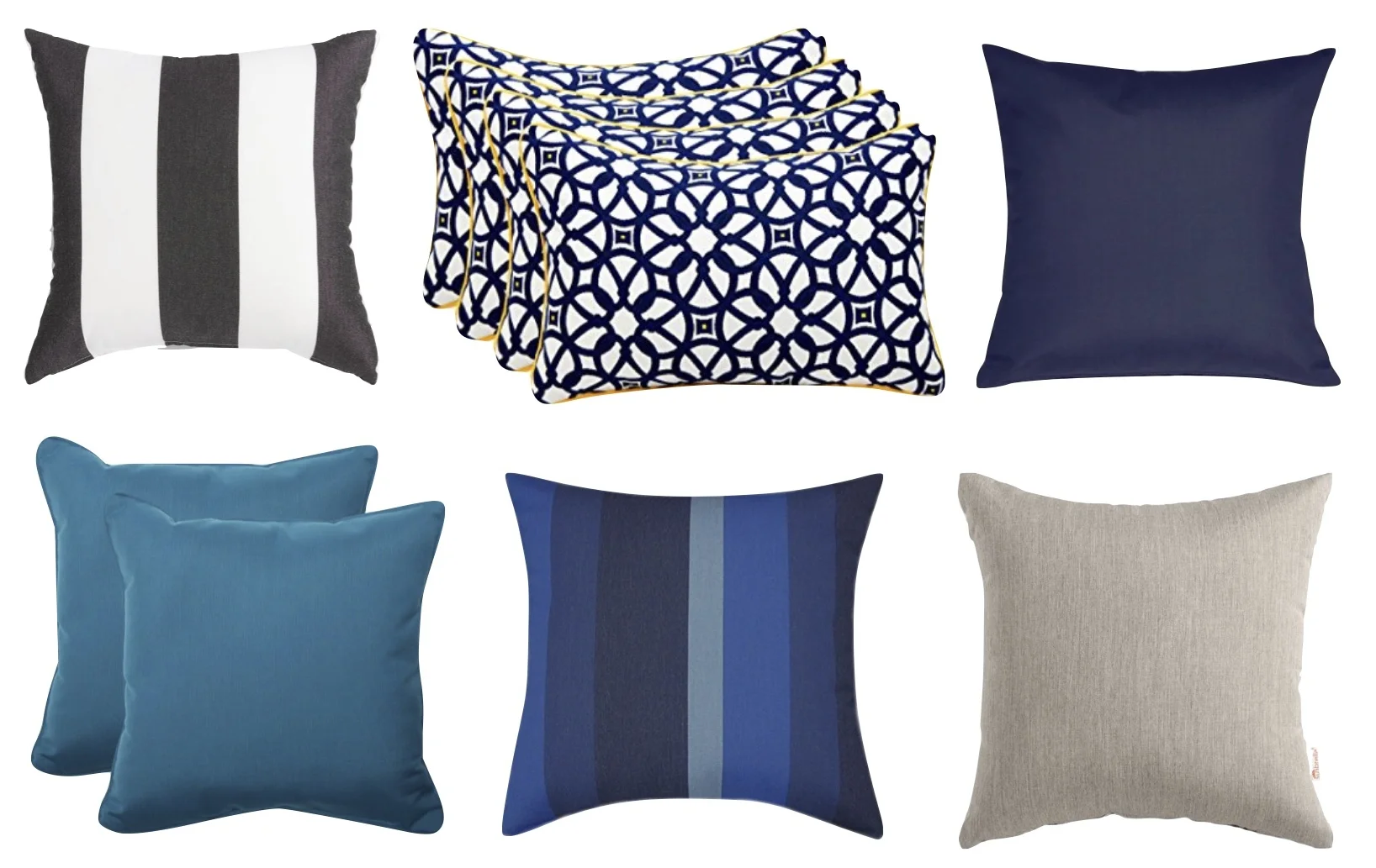
Outdoor Sunbrella Pillows Roundup.jpg


thick black and white stripenavy blue pattern with orange welt (set of 4) / navy blue solid (use our code to get 5% off: F9859) / teal blue solid (set of 2)multi blue stripe / khaki solid


Have a great rest of your week and a fabulous weekend! Part 2 of the Pearl Street Project reveal coming on Monday.

- Leah (and Sonia & Michele)


Pearl Street Project Reveal - Part 1

After a bunch of sneak peeks on social media (we couldn't help ourselves), today is the full reveal of our Pearl Street Project. Technically, Part 1 of the full reveal.

This project is different than anything we've previously tackled because it is a city condo versus a suburban house, and for one other crazy reason...which I'll get to. The city condo factor immediately presented some considerations: smaller rooms, multifunctional spaces and storage needs. We'll chat about each factor between this post and next week's (part 2 of the reveal), but let's start with a photo.

Gray Oak Studio Pearl Street Project living room

All of our designs start by determining the central style of the room. A room is never one style - it's usually a mix of several - but centralizing a room around one general feel/theme/style brings cohesiveness. The most important key to determining the style of a room is, of course, getting to know our client. To do this we talk to our clients about colors they love, stores where they shop, and ask general home design questions (i.e. "how do you feel about color on the wall?" or "is Fixer Upper your favorite show?" or "gingham: love or hate?"). We also take a good look at the current set up of their home - the colors and pieces they instinctively drawn to. 

Our Pearl Street Project client has a modern, clean style but isn't afraid of color and eclectic accents. Basically, a dream client! And so, the central style of this project is mid-century modern. But don't miss the layered sprinkles of boho and global stylings.

Pearl Street Project Midcentry Modern living room full view.jpg

For this project, we brought in all the furniture with the exception of the couch and the dining room chairs. People often ask if they're allowed to keep some of their existing furniture - if our interior design process is all or nothing. For us, making a home beautiful and functional does not mean putting all existing furniture on the curb and lighting a match (though some of us dream of doing so now and then). Incorporating important, existing pieces into our design is part of our job. And, as I just mentioned, having those pieces is useful in discovering that central style of our design.

Here is what this room looked like before.

Pearl Street Project Before Living Room.JPG

A side-by-side always helps with a comparison.

Gray Oak Studio Pearl Street Living Room Before
Gray Oak Studio Pearl Street living room after

You'll notice we changed the layout. With the new layout, we fit the maximum seating the space could handle without overcrowding. In smaller rooms people instinctively think they should get small furniture and use is sparsely. In fact, that can make a small space appear even smaller. {Design Tip}: The rules of proportion don't change just because a room is huge or tiny. Use furniture that fills a space without stuffing in too much or leaving pieces lonely and ungrounded. 

 
Pearl Street Project view upon entering.jpg
 

We love the pair of armchairs (one is above) because they're a great combination of sleek and comfortable. They are something you want to curl up in, but they don't take up a ton of space. And, bonus, they have these beautiful legs that add some negative space. All rooms need a balance of big, heavy pieces and airy, "see through" pieces. 

Speaking of airy furniture, this origami coffee table and leggy media console also add to the balance. And the media console does so without sacrificing storage. Look at all those cabinets and drawers. Double win. Wall mounting the television also freed up great space on top of the console for storage (a low profile basket or box would be our recommendation) or just for display of some pretties.

 
Pearl Street Project Origami Coffee Table.jpg
 

I'm sure you've noticed the colorful dhurrie rug. It's a beauty. We often use blue as a neutral, but for this project it's definitely an accent color. The saturated tone is a great pop against the beiges and grays that ground the style. Oh, and there's also the orange. LOVE, love, love the orange. It's so happy. The painting that was originally where the TV is now wall mounted (scroll up to see) was inspiration for the color palette, including the orange. 

Other than this project being in a city condo, we had one other, unusual, consideration - the ceiling of the entire apartment is configured with radiant heat. Wrap your head around that one. We couldn't (and neither could our client). This meant we couldn't add recessed lighting or ceiling fixtures. Nothing. Nada. Our only option was to update existing light fixtures...and there were no existing light fixtures in the living room. #bummer

And so, standing lamps became our next best choice. And if standing lamps are your sole source of lighting in a room, you go big. Hence the awesome arc lamp. And we also added a complimentary cutie in the opposite corner of the room.

Gray Oak Studio Pearl Street living room arc lamp
Gray Oak Studio Pearl Street living room standing lamp

The art in the room was already part of our client's collection, which just gave the pieces a new home. In the photos above you can see where we hung everything. In the photos below you can get a closer peek at the art itself. The artist, Jacob Higginbottom, is local and so very talented. 

Gray Oak Studio Pearl Street project Jacob Higginbottom art 1
Gray Oak Studio Pearl Street art Jacob Higginbottom 2

We also installed some metal "sea urchins" to one side of the television. They're black and brass and dimensional and fun. (Check me out in the reflection in the TV...heehee)

Gray Oak Studio Pearl Street Project media console

Subtle brass moments throughout the room add touches of warmth to the cool mid-century feel.

Gray Oak Studio Pearl Street living room agate clock
Gray Oak Studio Pearl Street living room brass planter
Gray Oak Studio Pearl Street living room brass magnifying eye

Next week we'll show you the dining room and the "entryway"...which is sorta/kinda part of the living room. See that line of a table in the bottom left corner of the photo below? That's the entryway! Stay tuned, more to come next Monday.

Gray Oak Studio Pearl Street Project living room reveal

Until then, have a great week! 

- Leah (and Sonia & Michele)

Interview with Kate Marker


Happy Patriots Day! If you have no idea what I'm talking about it's because only a tiny handful of states actually celebrate Patriots Day, and Massachusetts is one of them. We Bay Staters are also watching the Boston Marathon today...from our couches...because it's 35 degrees with freezing rain. I mean have you ever encountered a more selfish, controlling season?!!!! MOVE ON WINTER. Good luck to the runners - we have a few important people running today and we know they'll get it done.

And now, onto Kate Marker Interiors. If, like Patriots Day, you no idea what I'm talking about then you're in for a treat. Kate Marker began her interior design firm in 2007 and moved to a brick and mortar space in 2012. In that short time, she has produced more than a little show stopping work. Exhibit A.

She, and her team, are based out of Illinois. They create clean, upscale spaces that fall into the sweet spot that's mostly transitional with sprinkles of farmhouse, industrial and modern stylings. We so admire her use of built-ins and millwork - the custom stuff that takes a room from beautiful to jaw-dropping awesome. 

KMI_June2015_1026.jpg

Our favorite (non-design related) thing about Kate Marker Interiors, is Kate's sense of humor. The personalized hashtag she uses for each project reminds us of how Friends episodes are titled ("The one with..."). If you follow her on Instagram, you know what I'm talking about. There's #bestfriendclient and #sweetrepeatclient and (our personal fav) #yesifitswhiteclient. How great is that?

As with our previous interviews, we were basically stunned when Kate Marker agreed to letting us pick her brain about what inspires her and how she creates such effortless, gorgeous spaces. So, before she changed her mind, we got to it. Here's what she shared:

Gray Oak Studio - Let’s start by talking about your Grey Oak Project!!! I mean...how could we resist? (Fabulous name for a project) The palette is mostly soft and neutral, thanks to that grey oak, but the office and powder room feature some gorgeous, color saturated walls. We find that our clients often want to go bold with paint color, but get a little nervous. What are your tips and tricks for using dark and deeply saturated paint colors?

Kate Marker - Use them deliberately! I use them to add drama to a smaller space or really set a room apart from the rest of the house. If you use them, go all in for maximum impact!

Gray Oak Studio - We love mixing metals and we can’t help but notice that you do so flawlessly. Do you have a favorite combo? Anything you stay away from?

Kate Marker - We usually mix 2 within a room, with Polished Nickel as our "neutral" for plumbing and we feel both matte black or brass mix nicely with this when incorporating lighting. Also love Brass with Bronze if done well.

Gray Oak Studio - So much of a design is dictated by room layout...and so much of a room layout is dictated by the location of doors and windows. The general rule has always been to leave windows unobstructed. But, lately, we’ve been really taken by designs that work with windows rather than around them. Your Grant Project, where you placed open shelving in front of a window, is a great example of that. What is one of your favorite “break the rules” trends in layout and design?

Kate Marker - Ceilings don't need to be white and trim does not have to be white. We do so many light neutral wall colors that it is very cohesive to make the trim the same color as the walls. 


Gray Oak Studio - Speaking of favorite trends, there are so many to love right now - graphic cement tiles, vintage Persian rugs, painted interior doors...to name a few - what are some of your favorites?

Kate Marker - We love using furniture pieces as vanities, plaster range hoods in kitchens, well-placed wood beams, open shelving, scullery kitchens and steel doors where the design (and climate) allow!

Gray Oak Studio - What is the most frustrating aspect of your job as a designer? And the most rewarding one?  

Kate Marker - Juggling both design and managerial responsibilities...Design is my passion so that is the most rewarding!

Gray Oak Studio - Your work is a huge inspiration to us...as I’m sure you’ve gathered by now! What are your favorite design books or websites or instagram feeds? Who inspires you?

Kate Marker - My style icon would be Aerin Lauder.....my favorite place for inspiration these days is the architecturally fascinating white stucco collection of homes in Alys Beach, Florida.  I love following Nicole Davis Interiors and Kate Lester Home; for fashion, I really like Jacey Duprie of Damsel in Dior.

Gray Oak Studio - Last and favorite question: what is your dream project?

Kate Marker - A beach home!

Thank you so much to Kate Marker

If you love designer interviews as much as we do, be sure to check out our previous interviews with Marie Flanigan Interiors, CC and Mike Creative, Bria Hammel Interiors and a whole bunch of awe-inspiring designers giving us their prediction for 2018 interior design trends.


*This post contains affiliate links*