Southend Project - The Dining Room
/Today we're revealing more of our Southend Project - the dining room.
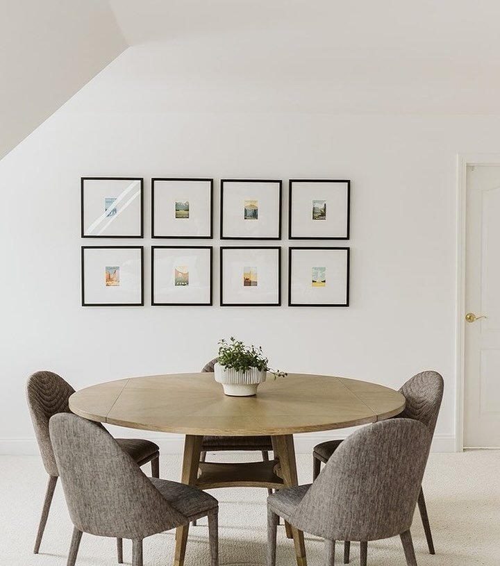
I should first clarify that the Southend dining room is not actually a room. It's more of a space between the kitchen and the living room - we'll call it a dining area. The main living space of this home is as open concept as you can imagine with one big rectangle making up the kitchen, dining area and living room. This was an important consideration in designing the space for two reasons. First, tall dining chairs or an enormous statement chandelier over the dining table would block the awesome sight line between the kitchen and the living room. Second, when a dining room is a dining area within an open concept space, it's also (typically) more casual.

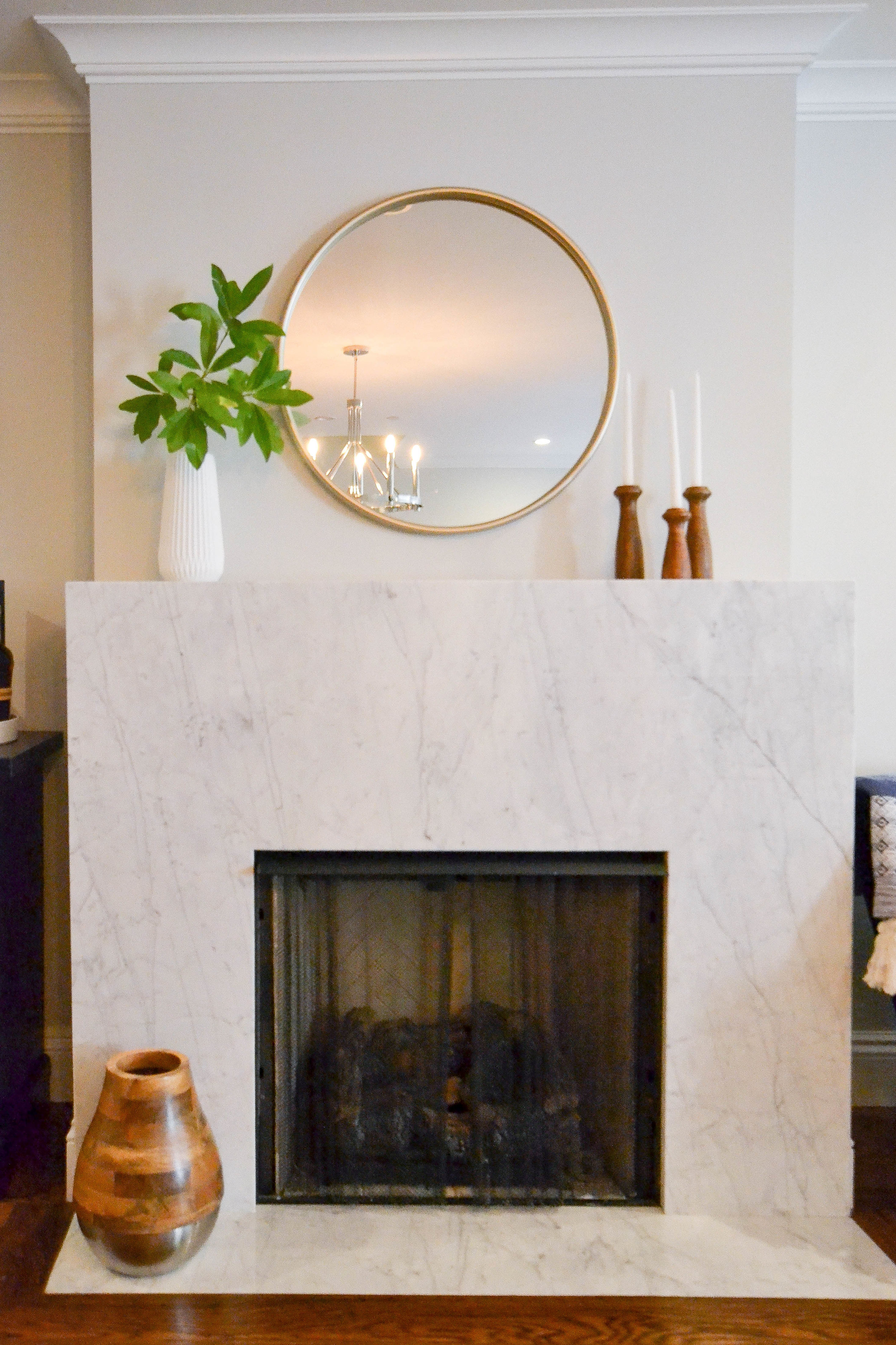
Our design for the dining area had two main spaces - the table (with chairs and a light fixture) and the fireplace.
Let's talk about the table first. It's a round pedestal table in a muted brown, gray tone. For small dining rooms (or dining areas...ahem), a round or oval table is a great option. It allows for an easier traffic flow than a square or rectangular table. The round shape feels less obtrusive than straight lines and sharp corners. The pedestal bottom (versus four legs) creates the same space-saving, airy feeling.

You may have caught our post from a couple weeks ago about a project that led us on quite the hunt for the perfect dining chair. This was that project and this beauty is the chair we found.

Like the table, it's from Restoration Hardware. It's an all-around winner for the size (we wanted something narrow in order to fit 6), the kid-friendly factor (wipeable/non-stainable), the comfort, the quality and the style. In terms of big picture design, the color contrast between the white chair and the wood table is visually interesting and leans modern. Yet, the chair and table themselves are classic styles. We repeated this mix of classic and modern throughout the entire project to create a comfortable, yet minimalist vibe.
Another example of this modern/classic mix is the chandelier. It has a somewhat classic shape. If it had a more traditional finish (maybe oil rubbed bronze) and the arms were curved, you could almost picture it over a farmhouse table. But, the sleek, straight arms and polished nickel finish take that classic shape and turn it modern.

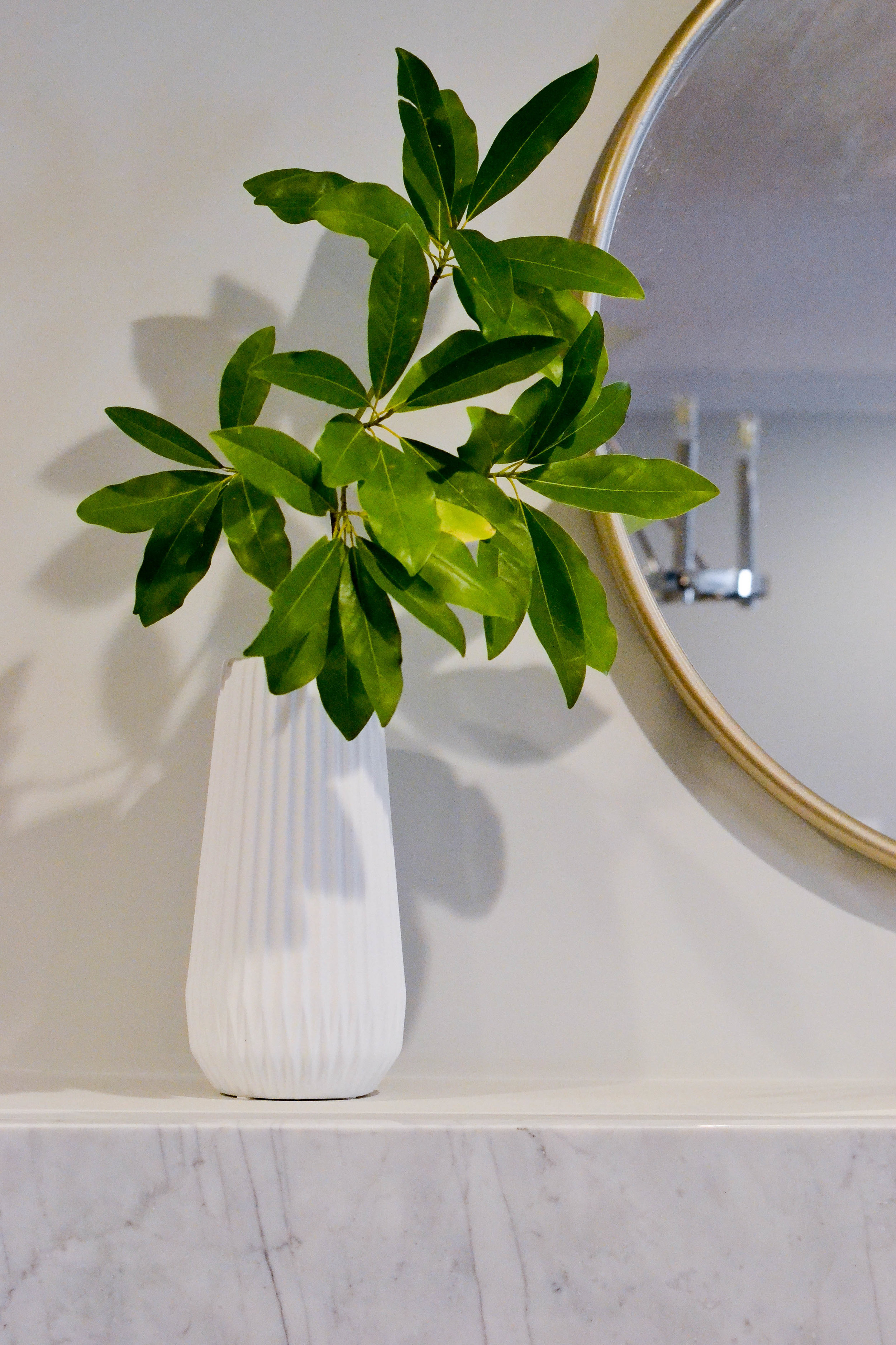
For the finishing touches in this space we...wait for it...mixed modern and classic. Like the living room, we added some natural greenery, this time in the form of good, old-fashioned back yard clippings. Never underestimate how good a teeny branch will look in a white vase. We also found some awesome wood accent pieces to contrast the super marble and super modern fireplace.


This post contains affiliate links. This means that, at no cost to you, if you click a link and make a purchase we may make a commission.
Our source list is below. And, we have one more room reveal for this project coming - the entryway. So, stay tuned!
Dining table - Restoration Hardware
Dining chairs - Restoration Hardware
Chandelier - Houzz (if you use our code: 4E318 you get 5% off!)
Mirror - Client owned
White and wood vase (on dining table) - HomeGoods
Large wood and metal vase - Target
White fluted vase - Target
Candlesticks - Anthropolgie