2022 Design Trends
/We are just a couple weeks away from 2021 coming to an end. Can you believe it? Who else feels like this year has gone by SO quickly!?
With the end of the year just about here, it’s the perfect time to make some projections for the year to come - goals, accomplishments, and of course, trends. Trends are prevalent within many industries, but especially so within the world of interior design. While timeless pieces will forever be valued, and hold a certain power, incorporating trends into your home provides some fun. Looking at the same, old style and stuff can get boring. Leaning into trends (especially in a budget-friendly way) can satisfy that need to freshen things up.
So, today, we are making some predictions for 2022 interior trends and giving you product round-ups to make them happen in your home.
THE MUTED SIDE OF SATURATED COLORS
A saturated color is a deep, rich color (the opposite of pale) - like a ruby red or a forest green. Years back, you probably heard the term “pop of color” as a way to describe using one or two bold colors throughout a space to add some energy and cohesion. Then there was a period of time when no color was the color. Spaces that were fully white or some version of light gray were IN. Big time.
We’re now seeing color return, but in a more muted way. Still bold colors - like red, green, blue and yellow. But think cranberry, not fire engine. Or olive, not lime. It’s the more earthy version of color. While color can be daunting for some people, don’t be scared. Colorful decor can bring a lot of personality without a lot of commitment.

2) Color Block Mason Jar Collection
LIGHT WOOD
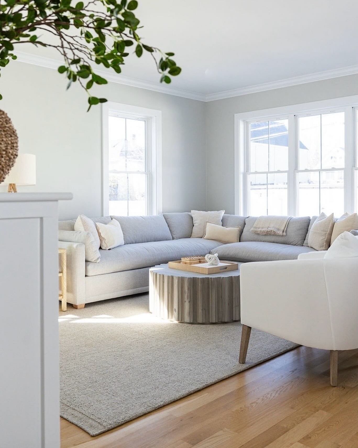
Light tones will continue to take precedent over dark tones when it comes to natural wood furnishings. Lighter wood tones (think pine, white oak and maple) are having an extended moment for good reason - they work with farmhouse, Scandinavian, rustic, modern and traditional (think old New England homes with original pine floors) styles. They are a design chameleon and have the magical nature of feeling both then and now. Lighter color in general can also make a space feel big and airy.

1) Chair with Natural Leg Finish
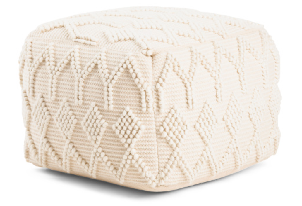
RIBBED AND REEDED EVERYTHING
Ribbing is the new cane. It adds texture…and you know how much we love texture. We talk about it a lot/too much. Texture adds interest to a space without being too dramatic. It’s a great design choice for people who shy away from color but don’t want to be boring and great for people who want to layer on all the extras that make a space WOW (because it plays well with more loud elements - like saturated color).
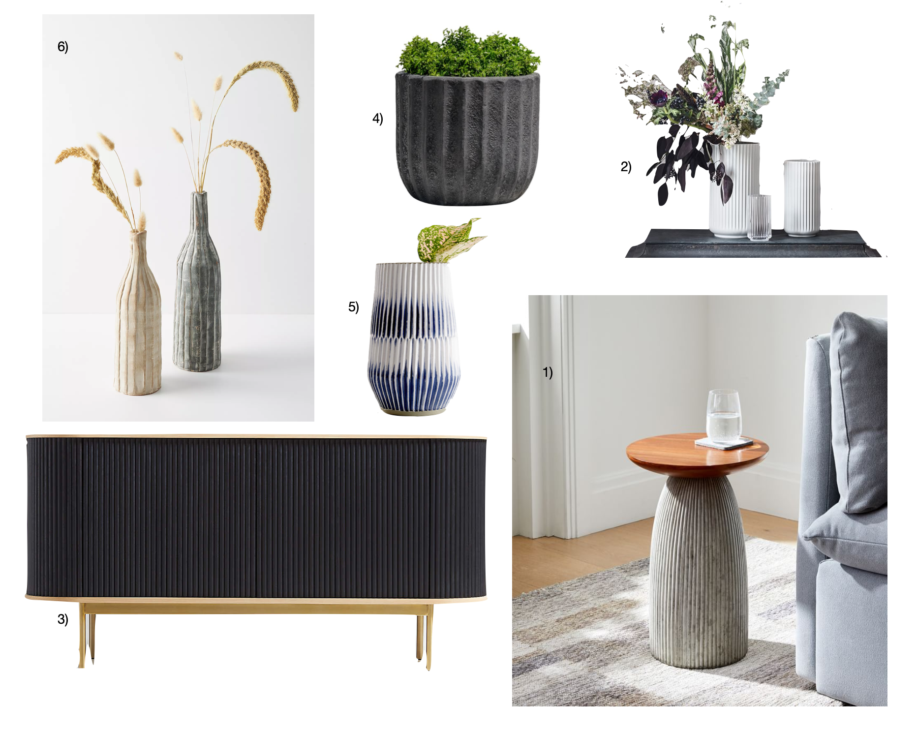
2) Lyngby White Porcelain Vases
5) Piega Small Blue and White Vase
6) Ribbed Clay Decorative Vase
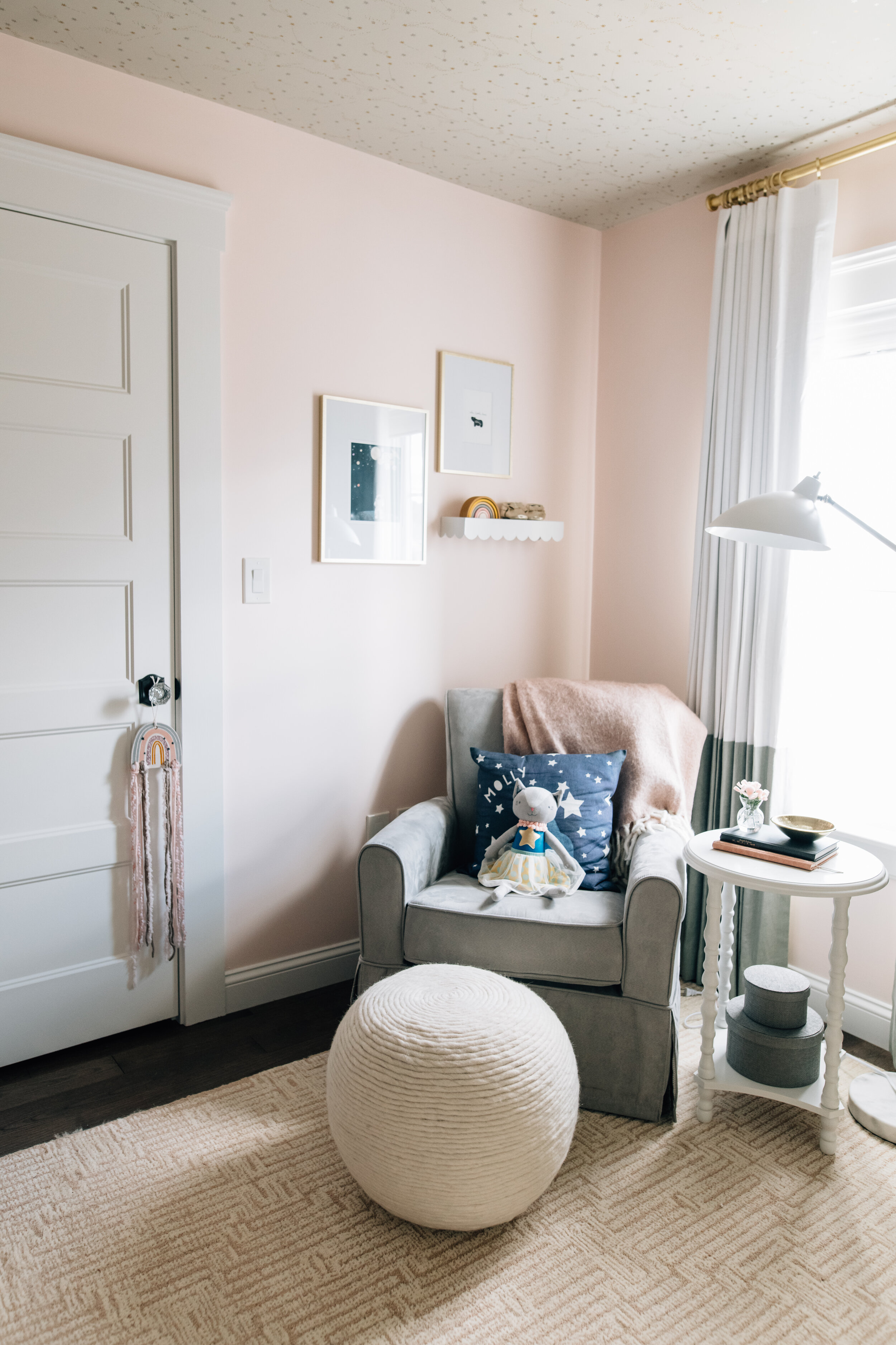
WALLPAPER
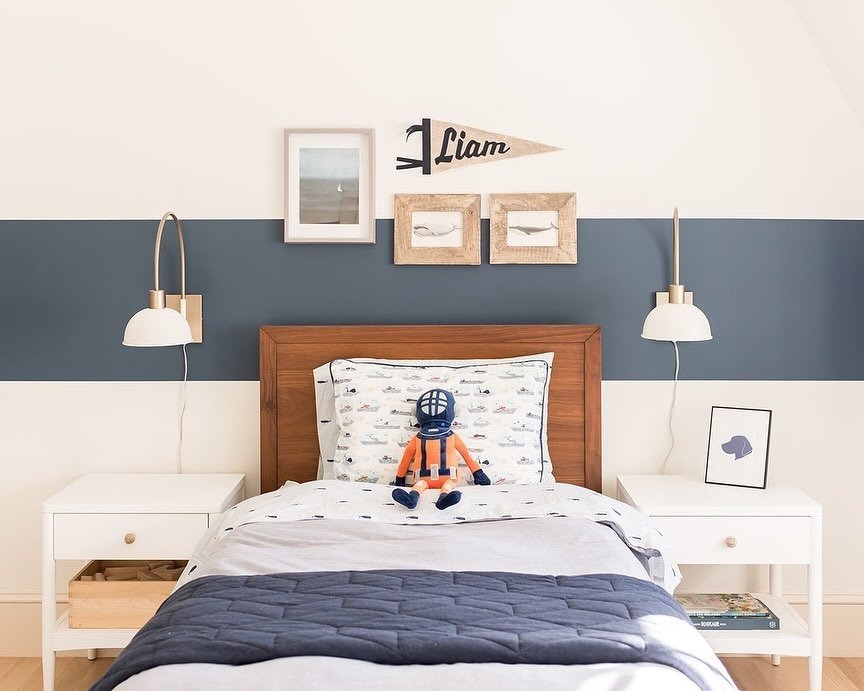
Wallpaper is actually not a trend, it’s officially the norm. We believe everyone should have a little bit of wallpaper in their home. Whether it’s the back of a built-in bookcase, in a powder room, or an accent wall in a bedroom - wallpaper adds interest/color/pattern/personality (or all of the above). Everyone wants their home to feel uniquely theirs (us too). Wallpaper is a great way to make this happen.
If you would like to see an example of a dramatic wall mural, and how it ties together the theme of a space, check out our Sevinor Boys Project to see wallpaper in action!

5) Blue Cranes
6) Gray Waves
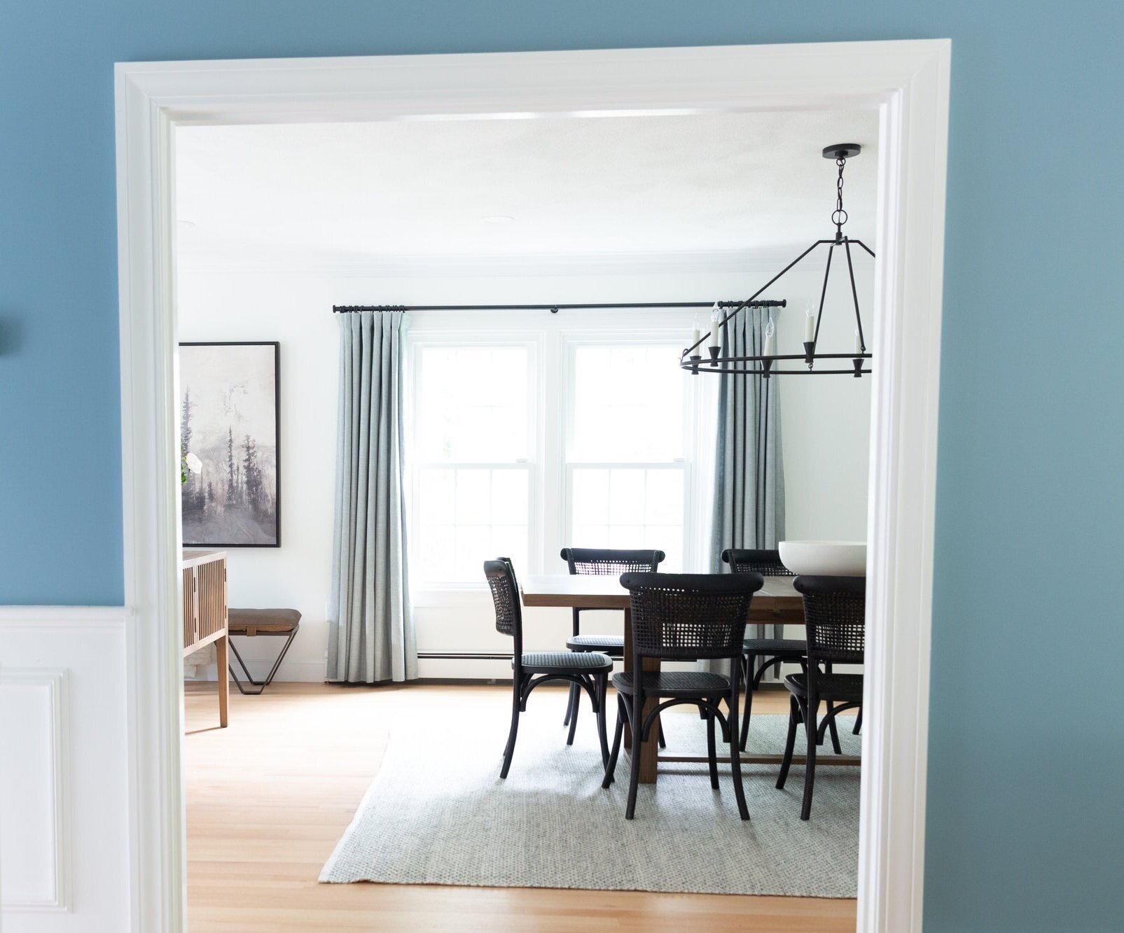
THE COLOR GREEN
Green tones were already on the shortlist for the next big trend, and then the pandemic made us all feel a desire to connect more deeply with nature. Whether it’s a forest green kitchen island or a spa-like sage rug for the primary bedroom, all shades of green are bringing the happy and the calm. A couple things we all need.

1) Faux Silver Dollar Eucalpytus Branch
3) Harris Leather Accent Chair
6) Bird Art
ARCHES
It started with the arched hutch that you are now seeing everywhere (like here), and it has extended to everything from lamps to chair backs. Is this a resurgence of art deco vibes? We like to think it’s the shape of a rainbow on the horizon.

And there you have it! While timeless pieces will always be valued, trends make life (and home) exciting and fun. We hope you all have a healthy and happy new year, and that you stick around for more blog posts next year. We can guarantee there are some you don’t want to miss.
- Nisha (I’m new here!)
*This post contains affiliate links*