April Stay Home - Free Designer for a Day (Vol. 5)

Today we’re answering a fun question about creating a guest room space in a beach house. Pretty dreamy task.

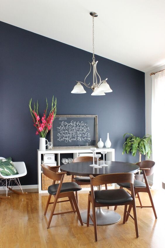
Question - I am trying to pull together a design plan for a guest bedroom. We live on the beach so I would like to keep the style casual and have a little fun in this occasionally used space. At the same time, I do not want it to look juvenile. Do you think the Mare Wave Wallpaper in GRAY would work well as an accent? ( I know you have used it in NAVY in your #GOSProspectProject

If YES, can I paper two walls, one behind the bed and the adjoining wall so that you would see it as you enter the room. Other walls are BM White Dove with cream berber carpet and bamboo roman shades. Any other advice on art, lighting, area rug to go in this space to keep it casual but not child like?

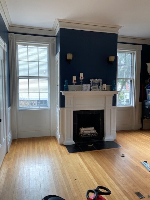
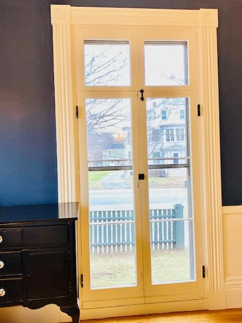
Let’s dive right into the photos so you can understand the space.

Gray Oak Studio - Guest Bedroom Transformation
Gray Oak Studio - Designer for a Day

And here are the specific walls she is interested in installing wallpaper.

Gray Oak Studio - Wallpaper Attic Bedroom
Gray Oak Studio - Wallpaper in Guest Bedroom

We say yes to both walls…and yes to the rest of the walls too. We recommend she go ALL. IN. This is a small room with lots of unique angles and it can totally handle wallpaper…everywhere. Wallpapered eves are awesome.

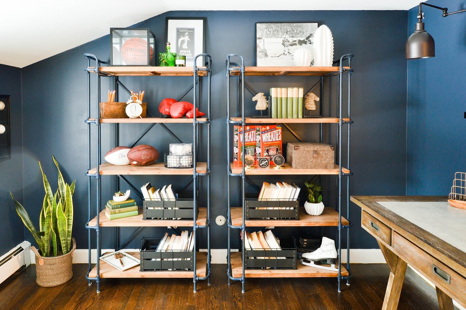
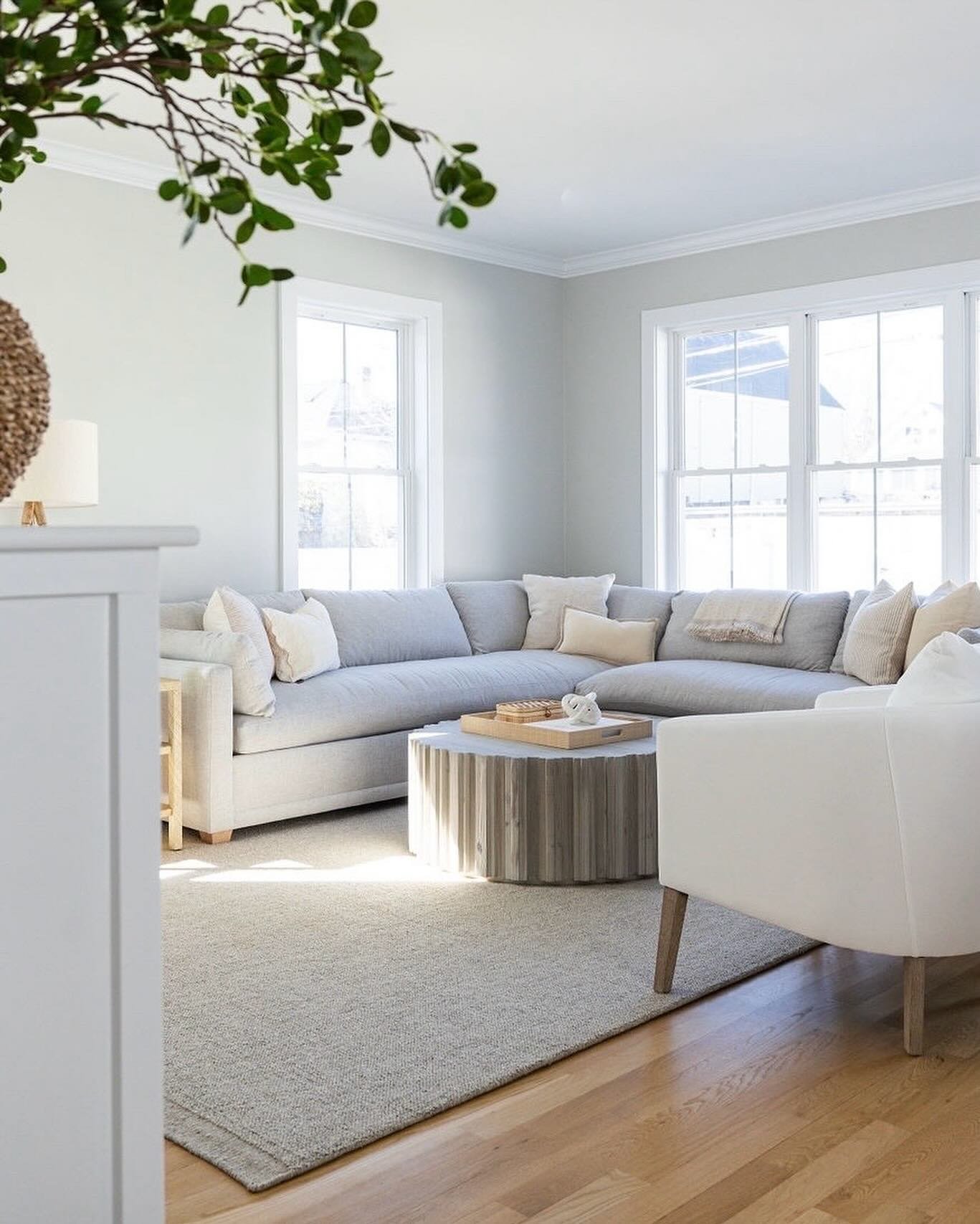
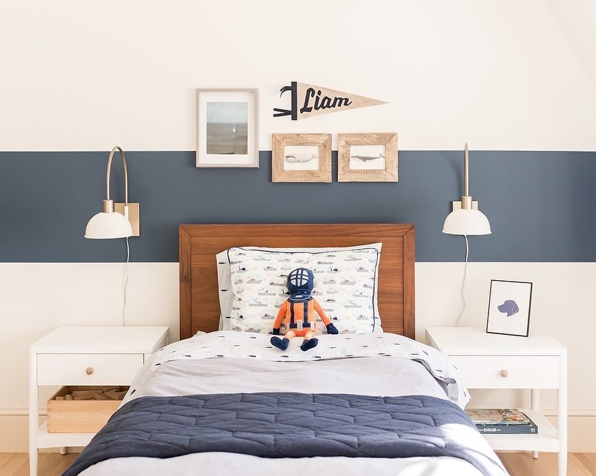
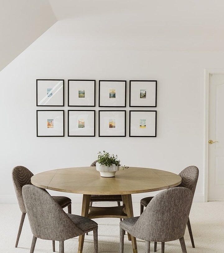
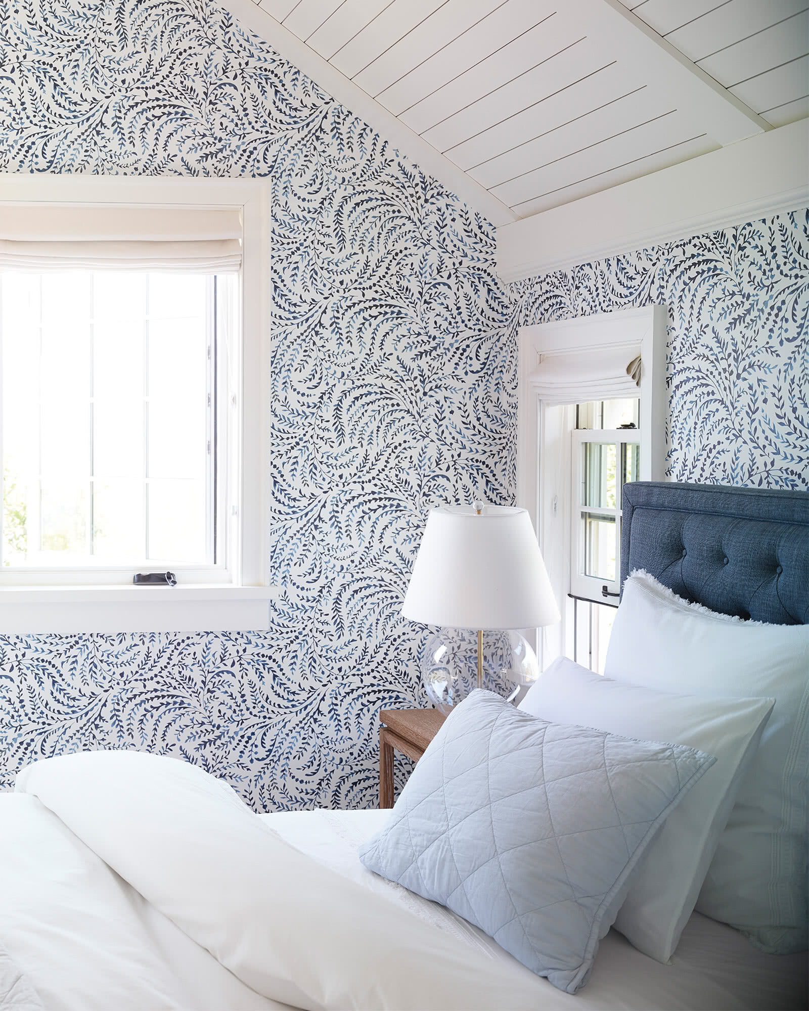
Below are some amazing inspirational spaces.

And now…our plan. First, the layout. It’s always best to have the bed facing the doorway, so you can see the door opening when lying in bed. (Here’s a great Feng Shui guide for the bedroom). It doesn’t look like there’s enough room to fit a headboard in the nook (that would be ideal - even if it means blocking the built-in bookcase), but there might be enough space on the wall next to the nook? If it’s not possible here because it blocks the closet, she should block the window on the side of the room and have the bed facing the closet.

Gray Oak Studio - Beach House Wallpaper Project

We picked a “wave” wallpaper in gray (with some blue undertones) that is “peel and stick” - it can be DIYed or installed professionally. And we have more wallpaper options below! The wood tones are light, the palette is washed out and muted. Like the beach itself, the idea is to let the textures run the show and keep the mood serene and calm. A welcoming, relaxed guest room.

Bed - $800

Chair - $300

Round Leather Pouf -$300

Rug- Price varies by size

Light Fixture - $199

Gray Blanket - $50

Body pillow - $10

Lumbar Pillow for Chair -$25

Art - Varies by size and frame choice

Wallpaper - Varies by amount needed

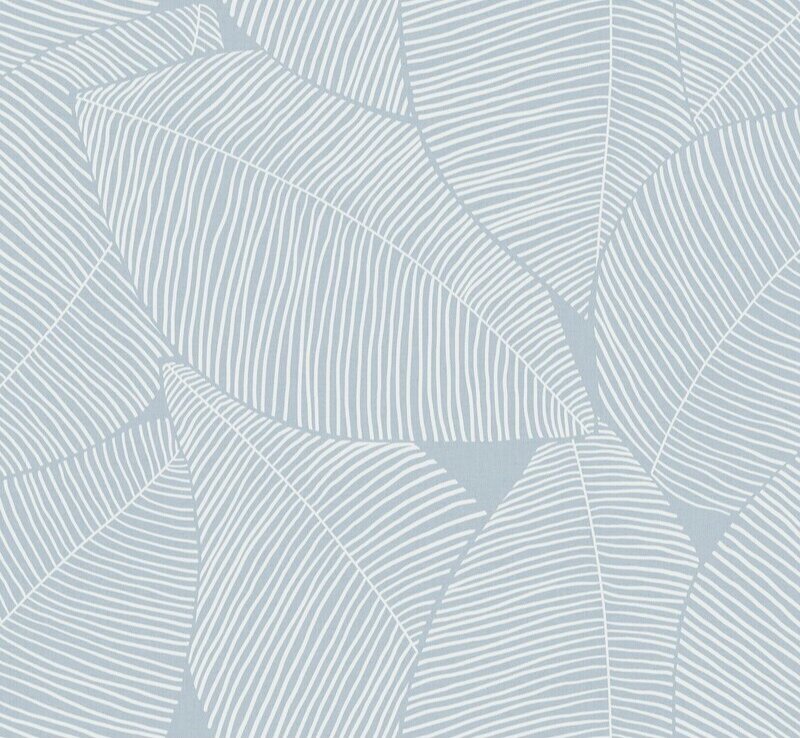
And, because we couldn’t help ourselves, below are more awesome wallpaper options.

Option 1 - We love the neutral on neutral colors and the TEXTURE. This is not a flat paper, but has a woven texture.

Gray Oak Studio - Beach House Wallpaper Option
 

Option 2 - This is a bit more modern and graphic. We love the muted blue color.

Gray+Oak+Studio+-+Blue+Leaf+Wallpaper+for+Beach+House
 

Option 3 - We love the moodiness of this pattern and the color is a bit more saturated than the others, which would give the whole space more color to contrast the otherwise neutral palette.

Gray Oak Studio - Beach House Wallpaper Wave
 

We hope she sends us follow-up photos of how it all comes together!

- Leah

*this post contains affiliate links*

April Stay Home - Free Designer for a Day (Vol. 4)

We’re back to answer more home design questions. We’ve been having so much fun reading your submissions and seeing your photos and puzzling over some virtual solutions. Today we’re tackling hardwood floor question and an asymmetrically vaulted ceiling.

Question - How do you choose the perfect color stain for hardwood floors?

This is a no-one-size-fits-all answer. There are a lot of considerations when picking a hardwood floor and each consideration impacts the stain choice.

  • Species of wood (Yellow Pine, White Oak, Brazilian Cherry, etc.)

  • New hardwood versus refinished (old) hardwood

  • Width of the planks

  • Direction of planks (across, up/down, diagonal, with a border, etc.)

  • Stain

  • Finish (the type of coating that goes over the stain to seal and protect)

Each of these considerations has many options and the interplay of each option makes for a very different end result. Here are a few general tips:

Dark versus Light Stain - From a function standpoint, dark floors show more lint, dust and fuzz. They tend to need more maintenance to appear clean (like a black car). If you’re a dog owner with tons of light-colored tiny dog hairs floating around your home, dark wood might drive you crazy as you’ll see those tiny hairs settling everywhere hours after you vacuum.

Grain of the Wood - If you want to see the natural grain of the wood, we recommend a medium-to-light finish. On the other hand, if you want a super sleek and contemporary look, a darker stain hides some of the grain and creates a more uniform look.

Direction of Plank - Choose a plank direction that allows the planks to remain as long as possible. This creates the feel of a bigger, more expansive space. If you have existing hardwood, it’s nice to match the direction of the existing planks. This way your new floors feel well incorporated into the original footprint - all one, intentional plan.

Make a Sample - Always test the exact stain on the exact wood. If you’re purchasing new floors, this is easy. Just get a sample of the raw wood and see how it handles different stains. If you’re refinishing your existing floors, you can pick a corner inside a closet or a tiny spot in a room that will ultimately be covered by a piece of furniture or rug. Different species react uniquely to different stains. It’s important to see how the “Dark Walnut” stain reacts on your specific "100 year old pine floors” rather than trust an image in a catalog. If you’re installing factory finished hardwood that comes with the stain and finish, you still want a sample. Place the sample on the floor and see how it reads next to your walls, in low light corners, next to your hard finishes (tile floors, stone fireplace, etc.).

Glossy versus Matte Finish - Matte finish is all the rage at the moment, and for good reason. A matte finish is low/no gloss without any added color and tends to be water based (low/no fumes and more environmentally friendly). A classic, high shine, polyurethane finish will yellow/orange over time and, thus, add a yellow/orange tint to the color of your floor over time. On the other hand, a matte finish is not as durable as a high shine finish. The matte finish will ding and dent more easily and even stain on the rare occasion. If you won’t be comfortable with a more worn, patinated look a matte finish is not for you.

Best Tip We Have (!!!) - Go to your friends and family’s homes (when the Stay Home order is over and it’s safe, of course!), see different choices in person and talk to the homeowner about what they love and what they don’t. Any hard finish choice is going to be a long lasting one (and expensive) so take your time and consider every option, don’t rush it.

Question - How should I deal with my asymmetrically vaulted ceiling? Any suggestions are welcome.

We had a lot of fun coming up with inspiration for this one. As a general recommendation, unique ceiling lines or unusual wall nooks and bumps can be treated in two ways: feature it or hide it. In this case, if she loves the asymmetrical wall she can draw attention to it by applying an interesting finish. If she doesn’t love it as an architectural feature, she can paint the room all one color (walls and ceiling) and let it fade away.

Let’s check out a photo of what we’re working with.

Gray Oak Studio - Designer for a Day - Asymmetrical Vaulted Ceiling

In terms of colors to make it fade - something light and bright. We would add a more substantial baseboard, the height of this room can handle something big and tall. Then paint the walls and ceiling something pale and bright.

Now, if she wants to turn this wall into a feature, we have a bunch of different ideas.

Option 1 - Paint it! This is the quickest, easiest way to highlight the unique lines. Whenever using paint to create an accent wall our general tip is: make it obvious. Don’t go one shade darker or lighter than the adjacent walls. It will end up looking like a shadow or optical illusion, leaving everyone wondering “is that a different color or just the way the sun is hitting it?”. For ideas on some of our favorite dark, saturated paint colors check out Volume 3 of this series - here.

Option 2 - Add a fireplace and surrounding built-in. With this option, the line of the ceiling becomes secondary to the fireplace and built-in. It’s just a cool, interesting bonus. This option will create a beautiful focal point for the room and really elevate the whole feel.

Option 3 - Add board and batten style molding to highlight the interesting angle and expansive height. There are a million online tutorials on how to add DIY this molding and the cost of materials is relatively minimal.

The oversized, round mirror is key to bringing this look together. Here are some good options:

Option 4 - A bookcase. This is a much bigger investment and a much bigger impact. How stunning, right?

We have so many more questions to answer! So stay tuned. And remember to sign up to receive new blog posts straight to your email so you don’t miss anything. AND remember to check out our Pinterest Board that’s dedicated to all our "Free Designer for a Day” advice - it’s full of even more inspirational images and product links related to every question we answer.

- Leah

*this post contains affiliate links*

April Stay Home - Free Designer for a Day (Vol. 3)

It’s almost the weekend and the end of Week 5 in quarantine. Is it week 5? Or week 6? or 4? Or…who knows. Let’s just keep on keeping on. Am I right?

Today we’re tackling another window treatment dilemma and a paint color question. These were all submitted as part of our Free Designer for a Day in April. We have been getting all sorts of questions through Instagram, Facebook and a good, old-fashioned email (hello@grayoakstudio.com). It’s still April (I think), so you still have time to submit your question!

Question - I need some help with a specific issue I’m having related to window treatments in my dining room. There are three windows in the room and each one is slightly different in terms of the amount of space I have on each side of the window casings. I’d love to do panels throughout, but I’m not sure it would work on the two side windows, given I’m right up against a wall. (Pictures attached) I’m also not sure if it’s okay to mix Roman shades (side windows) with panels (front window!?) If I AM able to do panels - how would you do it (e.g. thinner panels, only one on each side window, etc.) Would love any advice!! 

We worked on a window treatment problem in our first edition of this post series and talked a bunch about why window treatments can be so darn tricky. This is another example of just that - one room, 3 very different windows, what to do?

Here is the lay of the land. The two double hung windows flanking the fireplace are on a wall that is perpendicular to the floor to ceiling window.

Gray Oak Studio - Free Designer for a Day in April
Gray Oak Studio - Free Designer for a Day - Window Treatment Dilemma

All three windows have different amount of surrounding wall space. And one is a different size.

Window 1

Window 1

window 2

window 2

window 3

window 3

Our follower would love to install (drapery) panels on all 3 windows…but we’re gonna suggest (and she already knows this in her heart) that it’s not the best plan. Two reasons. First, one of the pillars of installing drapes is that you go high and wide with the rod to make sure all of the window itself shows when the drapes are fully opened. There’s no way to make that happen on Window 1, even if she uses a super thin panel. Second, this is an amazing historical home with gorgeous (original?) molding. We want to showcase the trim, not hide it.

So, what is the solution? She hinted at it in her question - go with 2 different types of treatments. Drapes for the tall window and roman shades (or nothing) on the windows flanking the fireplace. Mixing window treatments in a room is totally acceptable as long as everything ties together. Here’s a beautiful example.

In our Prospect Project, we used drapes on the windows facing the street and none on the windows facing the side yard.

Gray Oak Studio - Prospect Project - Different Window Treatments

It looks like the dining room in this house is also at the front of the house and there is likely another (possibly similar size) room on the opposite side of a center entrance. We wonder what the window treatment is on the floor-to-ceiling window in that room (…if there is one)? It’s not a hard rule, but it’s nice to match the look of window treatments on street facing windows. The symmetric and uniform look is beautiful and classic. Good curb appeal.

Here is a photo from the other street facing room in our Prospect Project. Again, drapes on the front windows and no drapes on the side windows.

Gray Oak Studio - Drapes versus roman shades

For the tall window, she should hang the drapery rod just below the crown molding and wide enough so that when the drapes are fully opened all of the window shows and (ideally) some/all of the molding. We’re total suckers for drapes in a dining room, and this homeowner clearly wants them, so this is a wonderful spot for them. Quick Note: we get nervous with drapes around radiators…don’t want to encourage any fires. So be cautious and keep the fabric away from the metal!

For the windows flanking the fireplace, she has some considerations. From a functional perspective, it depends how much privacy she wants. If privacy isn’t an issue, no window treatments are needed. From an aesthetic perspective, she might want to add a different color, add visual interest with a pattern or add a soft texture to contrast the architectural details. All are great reasons to bring a window treatment into a room and fabric roman shades will handle the task beautifully. The key will be to unite the treatments on all windows with the same fabric or complimentary fabrics (one fabric for the drapes and one fabric for the roman shades…not 3 different fabrics…don’t get too, too crazy).

One more thing to address: We love plantation shutters in historic homes. Actually, we love plantation shutters in all homes. So, of course, we considered making this recommendation here. But, we don’t know the specific location of these windows or how many windows are in the entire house. Plantation shutters are more of an architectural addition to a home, so it’s important to be thoughtful as to which windows get them and which don’t. Sort of like you wouldn’t put baseboard in just two rooms. Typically all the windows get them or just street facing windows. There is a big picture plan when it comes to shutters.

Question - What are your go to paint colors?

Our “go to” paint colors are…all over the road. The colors we specify vary by the size and shape of the room, the natural light and, most importantly, the feel we want to create. We love using whites and pale grays and beiges.

From hutchins Project (nimbus by Benjamin Moore on the walls)

From hutchins Project (nimbus by Benjamin Moore on the walls)

But, we also love a deep saturated greens and blues and grays.

from Mayberry Project (Hale Navy by Benjamin Moore on the walls)

from Mayberry Project (Hale Navy by Benjamin Moore on the walls)

And our most recent nursery need a “Hint of Pink” by Benjamin Moore.

Gray Oak Studio - Hint of Pink Benjamin Moore

Wall colors are deeply tied to the overall style of a room - there’s no one-size-fits-all solution. We did, however, recently write a round-up of favorite whites. Check it out here.

Have a wonderful weekend.

- Leah