Homestead Project - The Office

Today we're revealing the second half of our Homestead Project - the office. The overall style and feel of the office is in step with the living room, but there's something a little more fierce about this space...perhaps the blue walls.

DSC_0312-2.jpg

The wall color is Lucerne by Benjamin Moore. And we can't take credit for it - our client chose the color years ago. Should we admit that? When we saw the color during our initial consultation we collectively said, "YES." In person, it's as deeply saturated a blue as it is on your screen. It's bold. It's sophisticated. It's fantastic. 

DSC_0321.jpg

Before we dive deeper, let's back up to what things looked like before.

DSC_0213.jpg

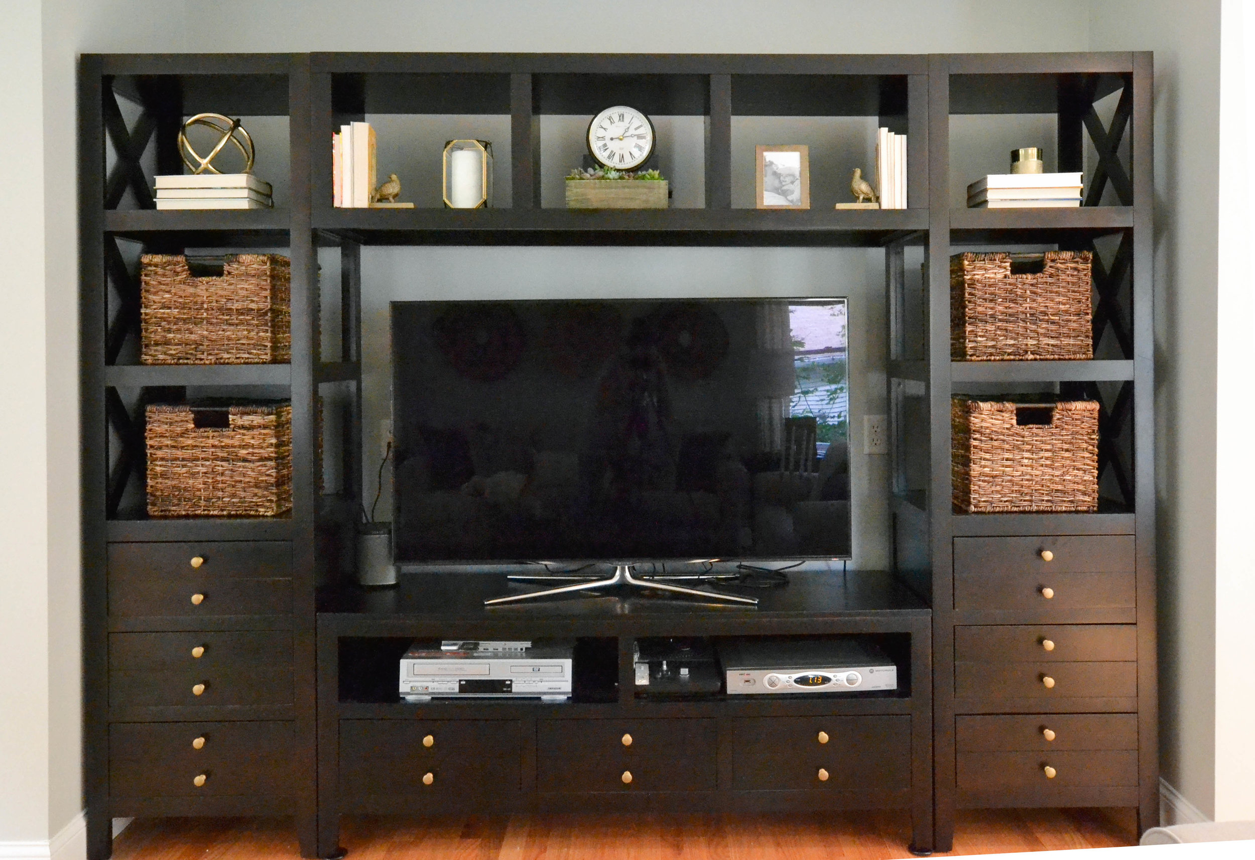
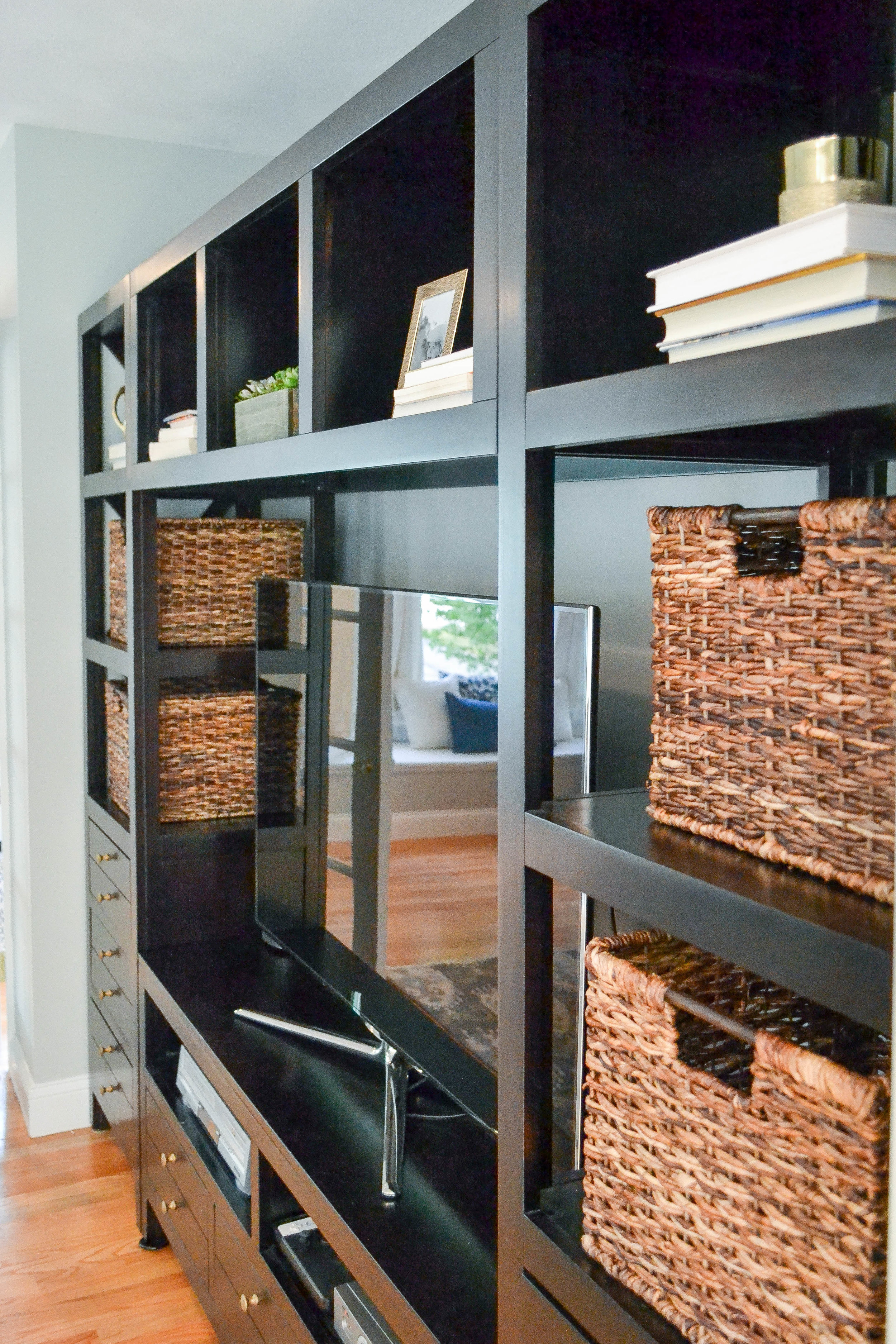
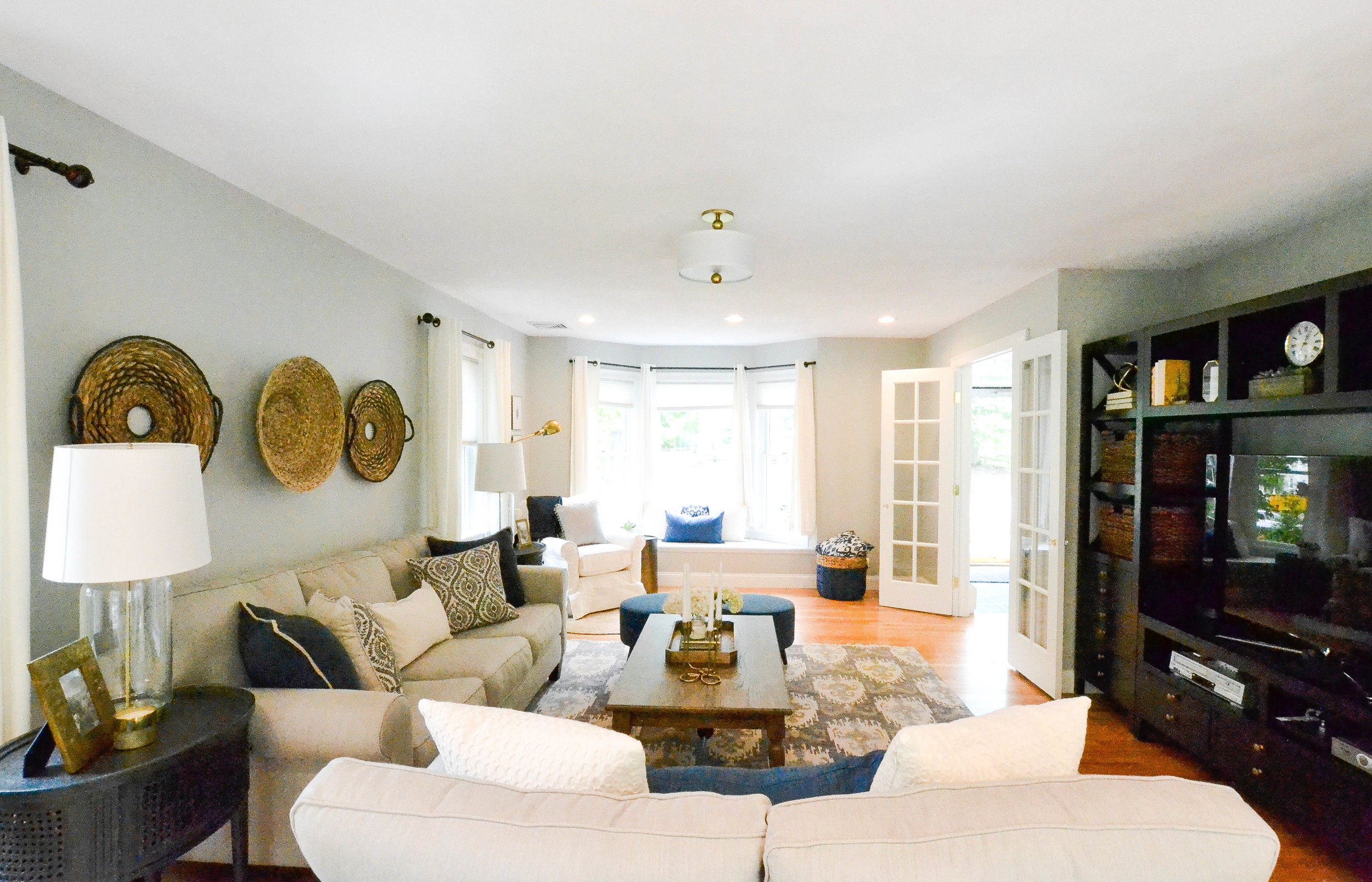
An office with a fireplace is pretty awesome. Not only did we want to highlight the fireplace, but we also wanted to turn up the cozy factor in the entire room. So, we brought in an area rug, a pair of comfy armchairs and lots of texture. 

 
DSC_0346.jpg
 

The chairs are one of our favorite finds of this whole project. They're comfortable and beautiful and sooooo reasonably priced (source list below!). The texture of the wool rug, knit ottoman and many decor details add that "let me take a break from all this office work and relax for a hot minute".

Speaking of hot...while this is an actual wood burning fireplace, it won't be used to burn wood or anything else for that matter. With function of non-priority, we worked decor and hung this show-stopping mirror to make the fireplace the central feature of the room. 

We also added the star pendant you spy in the mirror reflection. It brought some much needed overhead lighting and some eye candy.

DSC_0313.jpg

Like the living room, brass was our go-to accent in the office. And brass, like the blue walls, can pack a punch. Thankfully, there's no design rule that only allows one bold element per room. One, two or ten bold elements are completely allowed (we promise). They key is to choose bold elements that harmonize and compliment. Competition is what creates that dizzying, something-went-wrong feeling. As loud as brass and deep blue walls may be on their own, they play so very well together...they're basically soulmates.

Between the brass accents and blue walls, we decided to keep the rest of the design neutral and fairly mellow. 

BEFORE

DSC_0211.jpg

AFTER

DSC_0351.jpg

The only other "color" we introduced into the room is green, which was strictly through plants. Our clippings and succulents and mini tree are beautiful against the wall, which has a subtle green undertone. And, yes, we're using the term "mini tree" because we totally forgot to take note of the type of plant. Hashtag rookie mistake. 

***Update*** The "mini tree" is a Dracaena Massangeana, aka corn plant.

DSC_0369 (1).jpg
DSC_0352.jpg

Below is a source list for most things in this bold, blue room. Thanks for reading and enjoy!

Armchairs - Wayfair

Ottoman - Wayfair

Throw blanket - Target

Side table - Wayfair

Curtains - Target

Star flushmount light - Joss & Main

Rug - Rejuvenation (no longer available, but World Market has a very similar rug!)

Mirror - Pottery Barn Teen (currently on sale!)

Console table -  Houzz (get %5 off with our code: 4E318)

Framed dhurrie fabric - HomeGoods

Pheasant bookends - Target

Votive candelabra (on mantle) - HomeGoods

Brass clock (on mantle) - Target (on sale!)

Fireplace lanterns - Pottery Barn

Wire basket (full of birch logs) - HomeGoods


Design Tip: Backwards Books

In our latest project reveal (Homestead) we showed you how we styled a large TV unit.

DSC_0263-2.jpg

One of our styling favorites for any piece of furniture with open shelving is backward books. Backward books? Yes. Backward books.

DSC_0420-2.jpg

Practically speaking, shelves...especially bookshelves...are great for storing books. But book covers can be all sorts of wild and crazy colors, which doesn't always work for the overall aesthetic of a room. Easy solution: flip the books backwards so you see the ivory pages. Your rainbow colored book collection is instantly a neutral palette. 

DSC_0292 copy.jpg

So pretty.

DSC_0295 copy.jpg

And, so free. (The best kind of style tip)

In case you're in the market for some brass decor: gold orb / pheasant bookends / small gold lantern

This post contains affiliate links. This means that, at no cost to you, if you click a link and make a purchase we may make a commission. 

Homestead Project - The Living Room

Today we're revealing the Homestead Project and there's so much to discuss: brass, mixing black and blue, repetitive shapes (how many circles can you count?) and defining "transitional" style. Where do we start? How about here.

DSC_0225.jpg

For this project we sourced items from many, many different stores: Arhaus, Boston Interiors, Wayfair, Crate + Barrel, Target, Ballard Designs, Pottery Barn, HomeGoods...everywhere! Which is a great lesson that you don't need to buy all your furniture and decor from one store to create a cohesive feel. The general vibe is a modern take on classic stylings...aka transitional. Transitional has come to be the default description for interior styles that you can't otherwise define and we think that's because transitional speaks to most homeowners style goals these days - a beautiful (classic) with a heavy emphasis on comfort and function (modern).

Enough with the design lesson. Let's take a peek at what the space looked like before we got started.

DSC_0221.JPG

And now...

DSC_0241 (1)-2.jpg

One of the initial challenges we faced was the layout. The room is really long. It's fantastic to have a huge room, but it can be overwhelming to configure a layout that takes advantage of all the space without excessively chopping it up or awkwardly floating furniture. The ideal is to create sections of function that all connect. We're planning to copyright the term "sections of function" because it just rolls of the tongue...or not. But you get the idea - the goal is to define separate sections without completely disconnecting any one section from the others.

The first section we created (below) is what you see when walking into the living room from the kitchen. It's almost, sorta, kinda a hallway within the room. It defines the room entrance and gives breathing room to the largest pieces of furniture. 

The weathered black cabinet at the end of the "hallway" provides fully hidden storage and a mirror reflects natural light from all the windows. The decor on/around the cabinet is important for a couple reasons. First, it connects this little section to the rest of the room. Second, decor can play defense to all those piles of junk that many of us instinctively want to make. If the cabinet top is covered with a pitcher, plant and decorative box, there's less room for old magazines and dirty gym socks. Who else has a family member that leaves dirty gym socks literally everywhere???

 
DSC_0282-3.jpg
 

From this section, we turn to the meat of the room - the main seating area and the TV unit. Our client already owned the TV unit and it fits perfectly in a carved out nook within the room. 

BEFORE

DSC_0222.JPG

AFTER

Rather than start over with a brand new piece of furniture or custom built-in, and spend quite a bit of moolah in the process, we made a few simple, high-impact changes. To begin: baskets. Four proportional baskets. In order for baskets to be the home run they are meant to be, you have to choose the right size basket for the space. Something too small will minimize the function and something too big will look squished and awkward. It's a classic Goldilocks situation - it's got to be just right

We also styled with decor while leaving some negative space and hand-painted the knobs a matte brass (they were a matte silver). Brass was our go-to color and finish throughout this project. It's sophisticated, current and plays very well with black. It's also warm and inviting - just what you want your living room to feel like. We used brass in decor, light fixtures, lamps and one piece of furniture (a hammered drum table I'll get to in a bit). But, we were careful not to over do it. Too much of a good thing can be not a good thing. Even when it comes to s'mores.

 
DSC_0420-2.jpg
 

Opposite the TV unit is, of course, the main seating area. Our client has a big family and regularly hosts holidays and Sundays. This meant we needed to provide at least as much seating as the existing sectional and armchair provided...ideally more. The new sofa and loveseat accomplish the "at least as much as" and the matching blue ottomans accomplish the "ideally more".

DSC_0225.jpg

The ottomans are additional seating and equally perfect for kicking up feet. And, they're round. If you hadn't noticed, now feels like an appropriate time to point out all the circles in this room: the mirror, the light fixture, the side tables, the baskets behind the couch and the ottomans. Repeated shapes - whether they be circles or hexagons or triangles...or whatever - give a subtle feel of cohesiveness. 

DSC_0243 (1)-3.jpg
DSC_0422.jpg

Perhaps most importantly, the low profile of the ottomans connect this main seating area to the far end of the room, which was previously cut off by the sectional and feeling useless to the homeowners.

DSC_0241 (1).jpg

The far end of the room previously had a pack n play and not much else.

AFTER

BEFORE

DSC_0225.JPG
DSC_0428-2.jpg

One of the biggest changes we made in this area of the room is the addition of a built-in window bench. The goal of any built-in, window benches included, is for them to appear as if they were meant to be in the space. This window bench provides even more seating in the room for those family Sundays and the top lifts to reveal a bunch of storage (for all the toys the pack n play user will accumulate). 

The reading nook is also new to the space.

 
DSC_0255 (1)-2.jpg
 

Now the homeowners can rock, glide, read, nap and ponder life in this section of the room...or chat with the crew in the main seating area. The full room shot gives better perspective on how close and connected these "sections of function" are...say it with us "sections of function"...still doesn't have a good ring to it...

DSC_0234 (1)-2.jpg

We had so much fun designing this room and we hope the homeowners have so much fun living in it. Can't you picture a serious game of Apples to Apples or Cards Against Humanity (depending on how you roll) going down on the coffee table?

DSC_0423.jpg

For even more photographs of the space, head to our Portfolio. And below is a source list.

This post contains affiliate links. This means that, at no cost to you, if you click a link and make a purchase we may make a commission.

Black cabinet - Joss & Main

Brass round mirror - Target

Textured brass tall vase - Target

White pitcher - HomeGoods

Wood box - HomeGoods

Gold leaf shadow box art - HomeGoods

Rug - Houzz (get %5 off with our code: 4E318)

Sofa and Loveseat - Boston Interiors 

Coffee Table - Wayfair

Tray (on coffee table) - West Elm

Brass candelabra - HomeGoods

Side tables - Arhaus

Ottomans - Target

Lamps - Target

Ivory honeycomb pillows - Pottery Barn

Blue pillows with burlap trim - Pottery Barn

Patterned pillows - HomeGoods

Baskets with black trim (behind couch) - World Market has similar baskets (we snagged these from Target on clearance and they're no longer available) 

Center basket (behind couch) - HomeGoods

Baskets (in TV console) - Target

Standing lamp - Ballard Designs

Glider and slipcover - Crate and Barrel

Round jute rug - Wayfair

Gray pom pom pillow - Nordstrom

Throw blanket - Target

Hammered brass drum - Target

Blue and natural basket - The one we grabbed from Target is no longer available. Here is a similar sized floor basket also from Target.

Brass frames - HomeGoods

Blue fern art - South Pacific Prints

Light Fixture - Wayfair