Art for your Living Room (and All Your Other Rooms Too)

Through a couple fun Instagram polls we learned that design advice about living rooms is the most sought after. Which makes sense. It’s the most used room in the home and we’re in our homes more than ever these days. Plus, there is so much opportunity for simple and truly transformative changes in the living room. So, today, we’re kicking off a series on living room design advice with a post about art.

Art is one of the key elements that completes a room. It brings personality. It elevates a space to something a bit extra interesting and bit extra special. If you were to scroll through photos of some of the most universally coveted living rooms, you would undoubtedly see beautiful art on the walls. So, where do you look for art? And how do you choose a specific piece? And then…what about framing it…or just wrapped canvas? And what about gallery walls?

There are a lot of choices when it comes to art. And we have some great resources for making a plan and executing the plan you make.

Pinterest

Pinterest is a key resource for finding inspiration for wall decor. You can find all sorts of big picture ideas (gallery walls, large scale art, non-traditional wall decor, etc.). You can also find specific pieces. But, it can be confusing where to even begin - what search words to use. We have a Pinterest Board full of different styles of art, all of which we love. You can find some wonderful pieces and you can also find key words to use to search for more options.

Below is a snapshot of our board.

Etsy

We use Etsy more than any other website when searching for art for our clients (and ourselves). And here is a trick you might not know: when you find a piece of art that you like, but it’s not quite right, first click the art to get to the details page. Then, scroll to the bottom of page until you get to where it says “You may also like”. You’ll find a lot of similar options. It can be a rabbit hole, but it usually reveals exactly what you’re looking for.

Gray Oak Studio - Etsy Artists you may also like

One more tip, many Etsy shops have an Instagram account. If you are drawn to an artist, check out their Instagram feed. You’ll see all the newest pieces they’re adding to their shop and you’ll also see different ways the art is framed and incorporated into rooms.

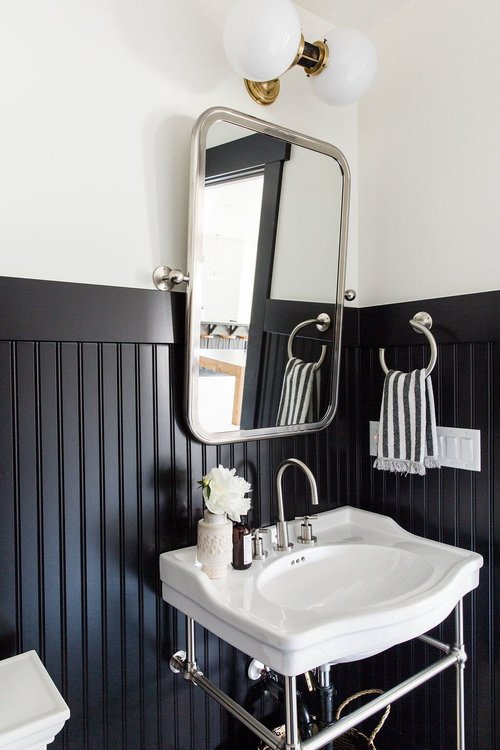
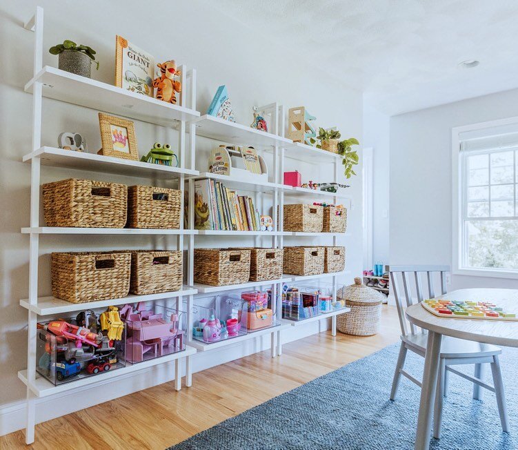
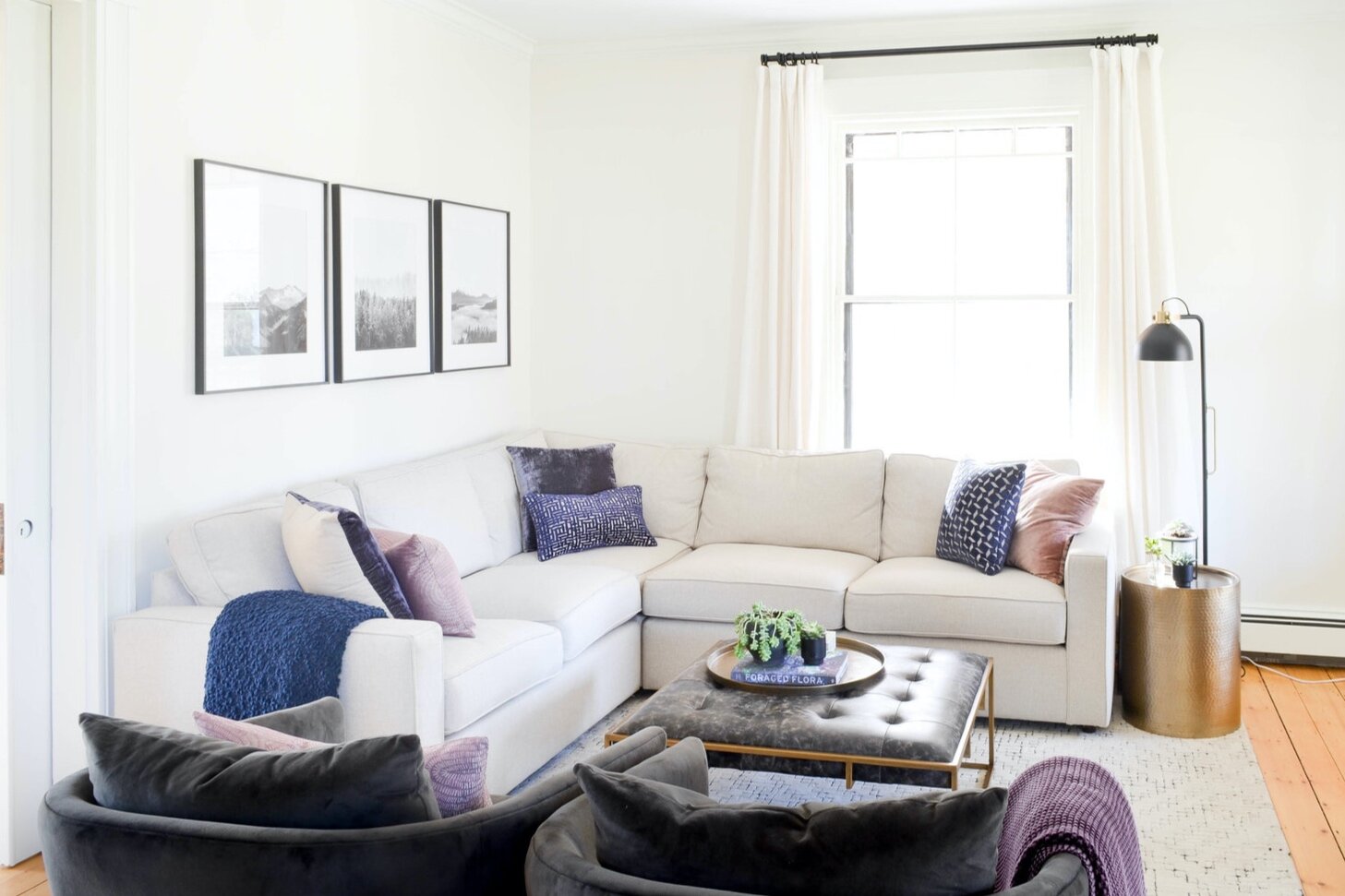
We want to share one of our favorite Etsy artists - Rachel Elise. Rachel Elise has a shop full of gorgeous, abstract pieces with a sprinkle of botanical pieces. They are all digital files that you can instantly download and print at home or through your local print shop (Staples, Costco, etc.). And they’re all $4.99. We used a series of prints in our Prospect Project Nursery and a single print in a gallery wall in our Lovell Living Room.

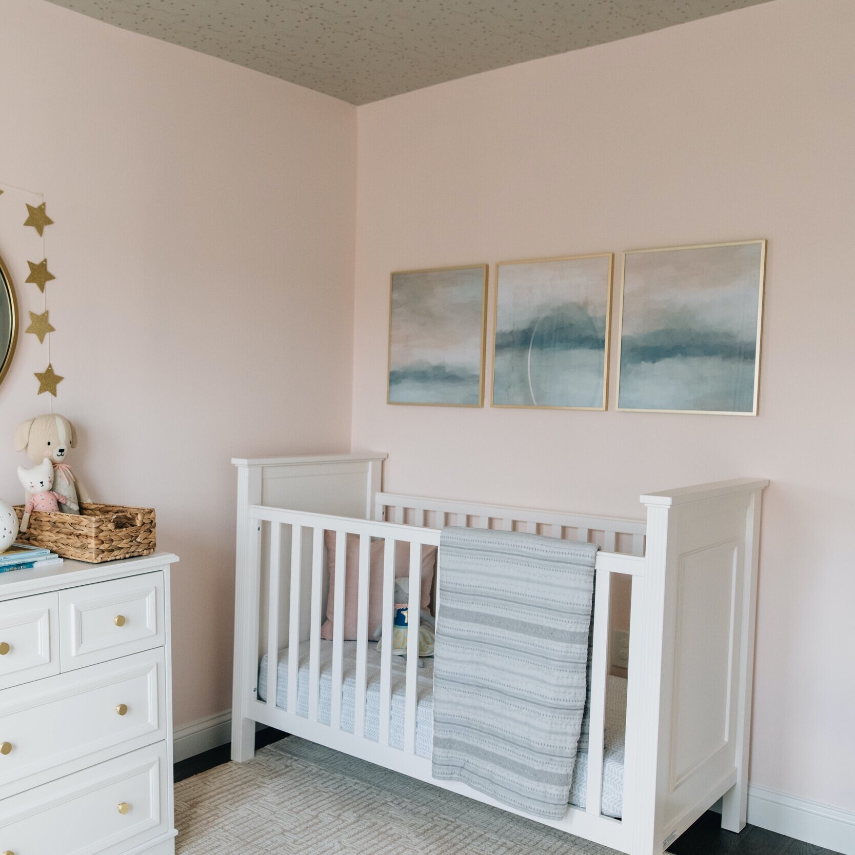
Here’s a glimpse of her shop to get a sense of everything she offers. Something in every color combination. It’s all so beautiful and serene.

When choosing a frame for your art, we are big fans of CB2 frames and West Elm frames. We also use Pottery Barn frames, but like to warn that some Pottery Barn mats are not a true white. They’re creamy cream.

Minted, Artfully Walls and Iamfy

When you’re not looking for a DIY (purchasing the digital image, printing the digital image, finding the right frame, purchasing the frame, and putting it all together), we suggest Minted, Artfully Walls and Iamfy. There are endless pages of gorgeous art with frame and mat options. And all three websites have lots of filtering options when you search - color, size, theme, etc. It’s a one stop shop to find the art, choose the frame and have it all arrive at your doorstep.

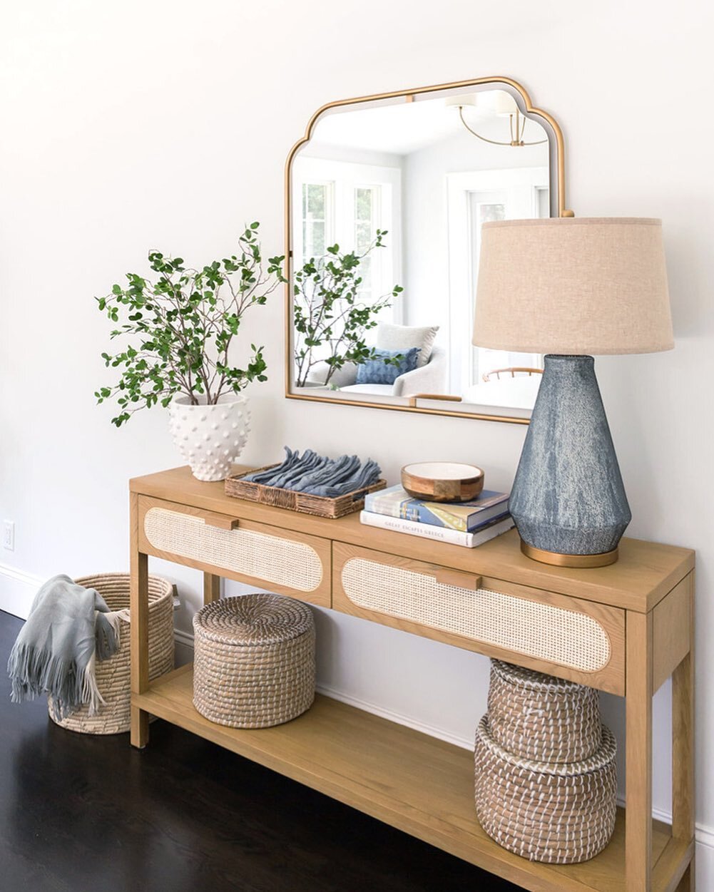
We used a beautiful cloudscape from Artfully Walls for our Stafford Family Room.

Art Hanging Guide

Once you’ve found your inspiration on Pinterest, found your piece of art (or several pieces) on Etsy or Minted or Artfully Walls or Iamfy, it’s time to know where and how to hang them. First, not every wall needs a piece of art. In fact, typically just one wall per room needs art. Less often, two walls. There can be an instinct to fill every blank space with something, but resist that urge. You don’t need to fill every space and art is not always the answer when you do.

The large scale option. We love this option because it’s a statement and creates such a mood for the entire space. On the other hand, it’s a big commitment…that statement and mood you’re creating. It’s also not the most budget-friendly option. Bigger pieces come with bigger prices (mostly because of the frame).

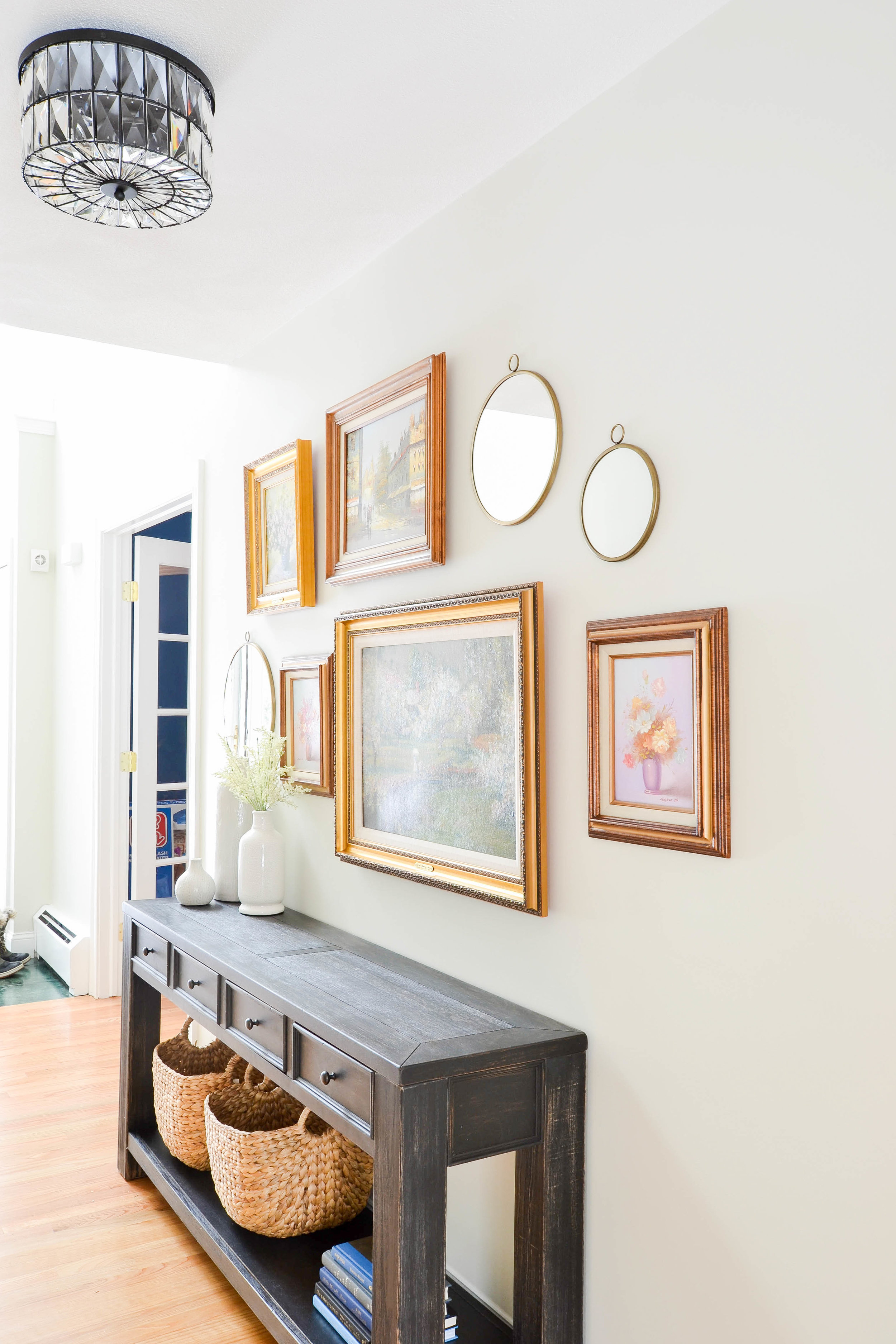
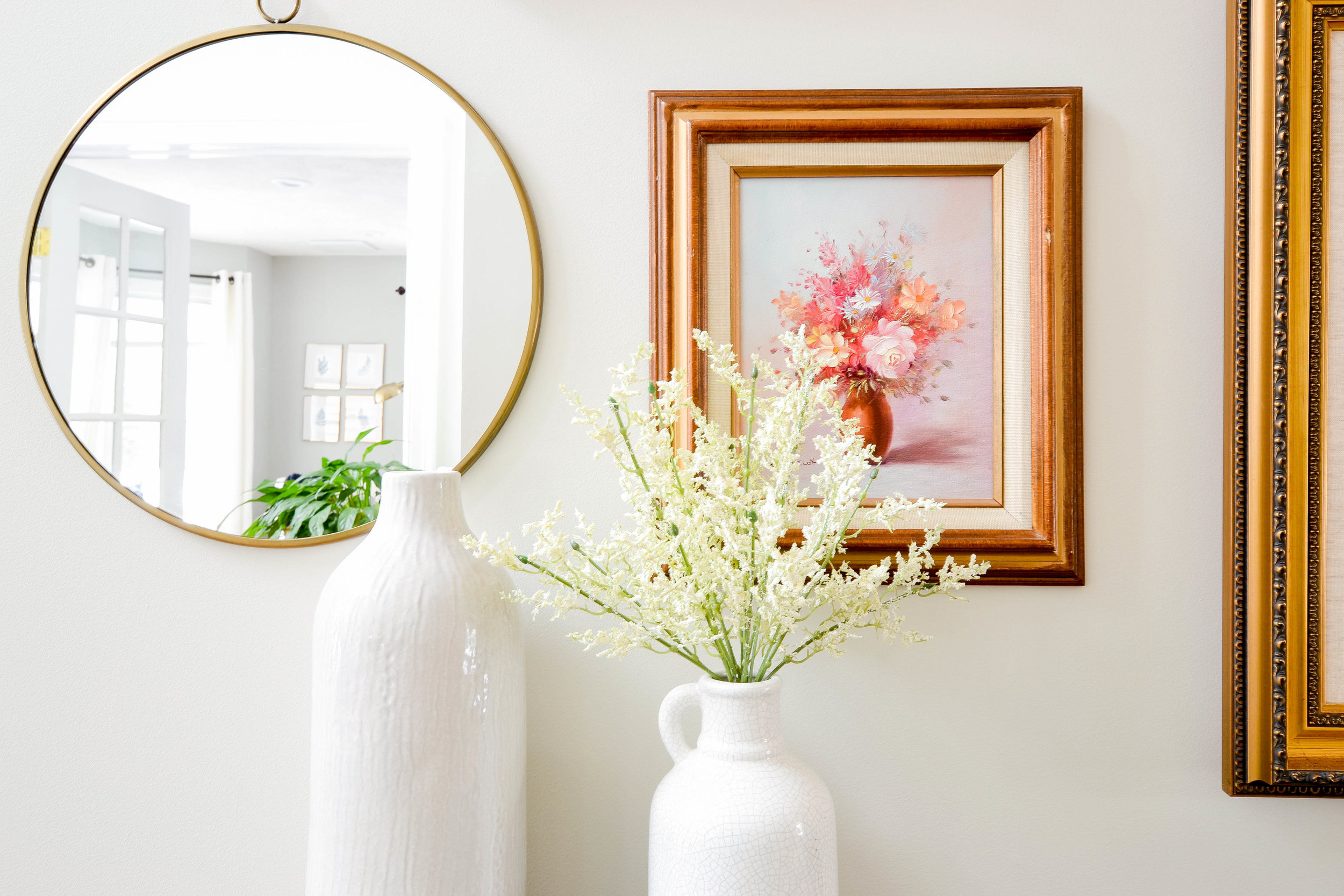
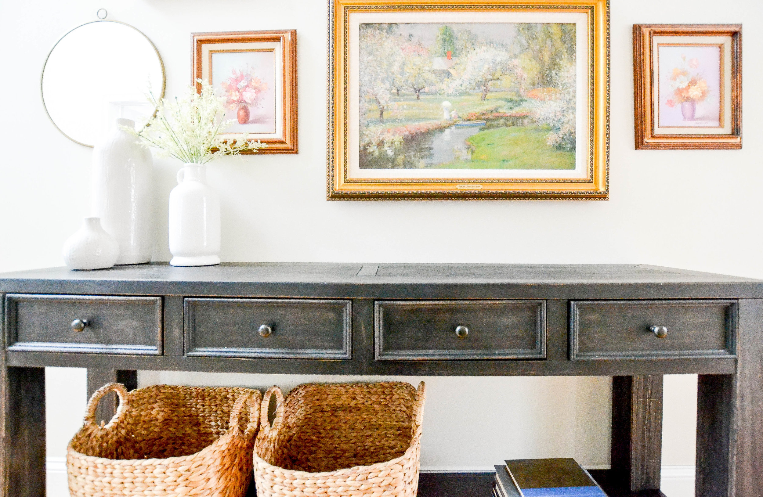
The fail proof, three piece, eclectic gallery. Eclectic galleries can be intimidating because there are so many micro-decisions. You’re choosing multiple pieces of unique art, multiple unique frames, different size everything. The goal is for everything to compliment, not match. It’s a tricky endeavor. But, we have a formula.


1) Choose one color and make sure all three pieces incorporate that color.

2) Choose one large piece and two smaller pieces. The larger piece will go on one side and the two smaller pieces will be stacked next to it.

4) Choose two matching frames and one non-matching frame. Maybe two stained wood and one brass, two gray and one white, two thin black and one thick black.

5) Frame two pieces with a mat and one without a mat.

Scroll back up to our Lovell Project and you’ll see this formula in action. And now you can visualize it many different ways - the larger piece on the right, different frame colors, etc.

The grid gallery. This is great for a big and entirely blank wall. And also for someone who doesn’t want to deal with too many choices (as needed with an eclectic wall). You measure out the wall and plan for maximum coverage. Don’t forget to include the space between the frames in your calculations. If you have a piece of furniture grounding the wall, then your gallery is just above the furniture top. If you have millwork on the lower half of your wall (wainscoting, beadboard, etc.), then your gallery is just on the top half. If you have a fully blank wall, go for it - floor to ceiling. Here are some tips:


1) Hang the frames approximately 2” apart. For larger frames you can stretch the distance to 3” apart.

2) Smaller frames will read more busy, so choose simple art (black and white photographs, minimal abstract series, etc.)

The series of three. If you’re looking for something truly easy, this method is for you. This is extremely similar to a grid gallery, but it’s just three frames hung in a horizontal row. The human eye loves sets of three because there’s a natural center. You can go slightly more interesting and bold with the art because the scale is in the mid range (not a huge commitment, not a busy cluster) and keep the frames matching.

Stay tuned for a lot more in this series on living room design advice. And leave us a comment or send us an email with your question! We’ll answer everything we can.

- Leah

*this post contains affiliate links*

Homestead Entryway Reveal

Today we have a fun, little reveal for you. You may remember the living room and office transformation from Homestead? Today, we're revealing the Homestead entryway. Our design focused on one wall within the entryway - you could say it was more of a refresh. Speaking of refresh, head to our Instagram or Facebook accounts later today to learn who won the Spring Refresh Giveaway!!!

Okay, back to the reveal. If you follow us on social media, you may have see this video way back in December (eek, can't believe that was 3 months ago!). 

This is from the Homestead entryway and it's our favorite method for creating a gallery wall. We cut pieces of paper in the size of each frame/mirror/decor and hang everything in place with painter's tape before we starting nailing. It's one thing to look at your gallery on the floor and another to look at it on the wall. This method also helps when it comes to hanging everything up. We mark where the nail should go on the paper. We've found this method to be easier and more accurate than measuring. 

Here is what the space...really the wall...looked like before. 


And here's what it looks like now.

 
Entryway Transformation - Gallery wall and Console Table
 

Our tried and true entryway formula is texture + mirror + storage = success. And, yes, of course we applied it here. We painted the walls, changed the light fixture, created a gallery wall and replaced the bench with a console table (you may recognize this console table from our Pilgrim Project), making sure to incorporate texture, a mirror (in this case 3) and storage.

Painting the walls had a huge impact. This color is November Rain by Benjamin Moore. It's a really soft, subtle gray that works well with beige tones. 

Gray Oak Studio Homestead Entryway - Gallery Wall

The gallery wall was a fun puzzle, as all gallery walls are. The gorgeous oil paintings in their vintage gold frames are owned by our client. She let us go through her collection and pick the few we wanted to include. We love how the set of round brass mirrors contrast the shape of the frames and their style - the frames are ornate and vintage, the mirrors are simple and modern.

{Design Tip}: We love using Command Velcro Strips to hang unusual wall decor. These round mirrors don't have hardware on the back to hang them. No prob. We slapped on some velcro strips and problem solved. Be sure to check the weight of the item you're hanging and the weight limit of the strip you're using. 

Like the gallery wall, the color palette is also both vintage and modern. Nothing like black, white and gold. 

 
Gray Oak Studio Homestead Entryway - Gallery Wall closeup
 

We added texture with faux flowers, which can be replaced with fresh flowers or different seasonal stems.

Gray Oak Studio Homestead Entryway - White vases and flowers

The baskets on the bottom shelf of the console table add more texture and more hidden storage. Double whammy. 

Gray Oak Studio Homestead Entryway - Gallery Wall and Console Storage

And here's a side-by-side Before and After shot.

BEFORE

AFter

Little space, big transformation.

Next week we have another interview with a BIG TIME designer. Happy Monday and have a great week.

- Leah, Sonia & Michele


*This post contains affiliate links*

Predictions for What's Hot This Year

With February almost upon us, it's now or never to make some predictions for what is gonna be HOT this year. But before we dive into our thoughts on what should be on everyone's radar, we asked a few of our fellow designers to share their worthy opinions. Like...

STUDIO MCGEE

You read that extra large print correctly - Shea McGee of Studio McGee! We asked Shea if she would share her 2018 predictions with us, and she was kind enough to give us her thoughts on what interior design trends to pay attention to in the coming months. So, get out a pen, pencil, crayon, sharpie, whatever...here's what she had to say: 

"This year, I'm hoping that we'll continue to see more refined rustic aesthetic coming in finishes, furnishings, and even accessories. I love the warmth that raw textures brings. Also, whether it's in wood form or painted, I love the dimension that vertical paneling gives a space." - Shea McGee

You know how much we love texture and we totally agree that natural and raw finishes are a current, yet timeless way to bring them into your home. Here are a couple visuals to demonstrate Shea's insight (they both come from Studio McGee's Park City Canyons Remodel). The raw wood stools and floating shelves are giving that "refined rustic aesthetic" and the skinny, vertical, black paneling is a fresh twist on all that horizontal shiplap we've been seening for the past few years.

2static1.squarespace.com.jpg

CC AND MIKE CREATIVE

We were also lucky enough to get some predictions from CC and Mike Creative. You may have read the awesome interview they gave us last month (click here to read it). CC also gave us her predictions for 2018 trends, we just saved this wise nugget until now:

"I am in love with the green tones and recently painted our dining room Benjamin Moore’s Dark Harbor and couldn’t be more pleased with the results. I also painted our pool bathroom Benjamin Moore Newburg green. I think the navy and jewel tone trends will continue into 2018. I also predict that we will continue to see more and more return to natural wood cabinetry in kitchens and bathrooms. I love the return to natural wood, especially paired with patterned tile floors!" - Carissa of CC and Mike Creative

Well, you know how much we LOVE green these days, so we were so pleased to hear that CC is on board with our current obsession. Also really interesting to hear similar thoughts to Shea McGee when it comes to natural wood. 

This is CC's dining room in Dark Harbor. Completely and utterly stunning.

 
modern-home-design-2-of-28.jpg
 

BRIA HAMMEL INTERIORS

And the fun continues with a prediction from the insanely talented Bria Hammel of Bria Hammel Interiors. Here is what she told us about the 2018 trends she's predicting (and loving): 

"We are so excited for the new shift towards traditional styles. I never really got on the mid-century bandwagon but so happy to see more brands and designers embracing this updated traditional look coming on. Finally people aren’t afraid to use pink and florals, but in a really fresh cool way. We have never had so many male clients open to us adding a soft feminine color to their rooms as they are now! Bring on the classic pinstripe fabrics and floral wallpaper!" - Bria Hammel

We couldn't agree more. While we do love mid-century furnishings and stylings, nothing is more timeless than traditional. And if there's anyone who hasn't gotten on board with pink yet, even after the millennial pink craze, it's officially time.  

2406-LeMay_001-c-1400x687.jpg

This gorgeous living room is from Bria Hammel Interior's Mendota Heights Townhome project. You can see where she's going with this pink, floral, traditional prediction - subtle and soft and completely inviting. PS - keep your eye out for a full blown interview with Bria next month. She had so much design wisdom to share with us and we are excited to pay it forward!

GRAY OAK STUDIO

And, last but not least, us. What are OUR design predictions for this glorious new year? We think cozy is the name of the game this year.

Everyone wants to live in a space that is beautiful, but, more than anything, feels like home. Hence the absolute rage of modern farmhouse style (Thanks Chip and JoJo, we all owe you). While we don't think modern farmhouse is going away just yet, but we do think that it's taking a more streamlined turn. A little more minimalist, a little more traditional. We think neutral palettes will rule, and not just gray, but all neutrals. From white to beige to taupe to tan to...alright, fine, gray.

Natural wood and natural fibers are part of this neutral trend. Like Shea and CC, we think that raw woods are just at the beginning of their climb to HOT HOT HOT. And with that, we'll see a lot of mixing of wood tones. You don't have to buy everything in "walnut stain" anymore. Just like you can mix and match throw pillows, you can mix and match wood finishes, you just need to find the right balance. Finally, pops of deeply saturated color (black, caliente red, blue and, of course, green) will provide the whimsy and fun that every space needs to give it some personality and interest.

mayberry photo.jpg

And there you have it. Documented predictions ready to be affirmed...or WAY OFF (Swim? Swammi? Slippy? Slappy? Swenson? Swanson?)

- Leah, Michele & Sonia